


Concentric logos are those that feature, in whole or in part, a centre or common axis. This often manifests as offset lines, or a logo constructed from multiple parts with their own common axis or centre point. This approach can lend a simple shape an element of distinction, or allude to some aspect of a brand or service.

Concentric logos can also have a radiant quality to them, and can be combined with other logo construction techniques to add further intrigue or a hypnotic visual interest, ultimately serving memorability. For example, changing the line thickness on a concentric logo, as done by Iwao Yamaguchi for Yamachan Planning, can emphasise its radiant effect. Using concentricity can also allude to more lateral notions such as influence and communication.

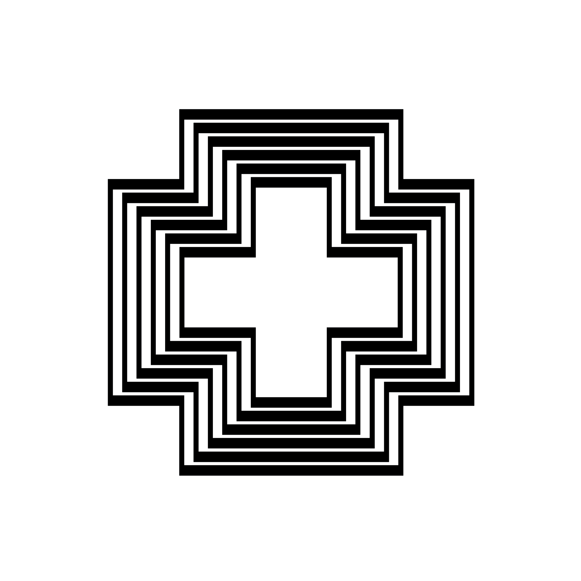
Linda N. Reuter used concentric shapes to great effect, giving dimensionality to a cross for Kimberly-Clark Corporation.

Using stepped shapes that transition one inside another, can suggest growth or change. And finally, and a slightly more common use would be in the textiles industry, with parallel concentric lines evoking an association with threads and cotton reels.
Want more examples of concentric logos? Search ‘Concentric’ on LogoArchive.


Thank you for subscribing to Logo Histories. If you enjoy reading this short you may also enjoy these resources from the same team:
Brand Archive – Research tool for brand designers.
LogoArchive Website – Searchable modernist logo archive & research tool.
LogoArchive Shop – Vintage design books & LogoArchive Zines.
BP&O – Contemporary design editorial.