Eye, Bee, M
Paul Rand's logos for IBM, 1957-72
This post is supported by LogoArchive – The home of historical logos. Discover over 4000 of history’s best designs from the world’s finest designers. Always find the logo inspiration you need for your next project here.
The logo and corporate identity design of International Business Machines (IBM) is perhaps most distinguished by its approach as much as it is by its results. Loose but profound and operating on the assumption that any theme or device is doomed to become “hackneyed” or “dated”, two constants where settled on, to reflect quality and “the contemporary”.
This notion came out of a close collaboration between IBM Chairman Thomas Watson, outside consultant Eliot Noyes–who dedicated his time to developing the IBM program but not as an employee–and renowned designer Paul Rand, who Noyes brought in as a “graphics consultant’’.
Noyes and Rand worked together, not on a dogmatic and extensive design policy with exclusively extrinsic concerns but rather a programme developed to foster intrinsic change within the company, which would then manifest itself outwardly and more significantly.
One initiative of Rand’s, perhaps best exemplifying the cultural shift towards design, was the setting up of the IBM Gallery in New York. This was a place for IBM staff and the general public to go and experience the work of international designers. One such exhibition was “Toys and things”, a display of the works of renowned Japanese designer Shigeo Fukuda.
As noted by Rand, in cases where companies are as complex as IBM, which reach across many countries, the only realistic framework should be “good design” and the use of a distinctive logotype to identify and unify.
Flexibility, versatility and adaptability where the principle concerns governing the design of the logotype. Its configuration was simple, designed to minimise problems of compatibility with other typefaces whilst also being distinctive, to meet aesthetic and practical requirements and accommodate changing international needs. This can be seen in the evolution of the logotype in 1956, 1967 and 1972.
The first iteration (1956), a solid or outlined set of letterforms, sought to present a grounded and balanced appearance. Square counters in the “B” helped to differentiate the logotype from other typefaces and support visual recall in the viewer. Different line weights were used to create three different versions to satisfy different needs and scales.
The second iteration of the IBM logo (1967) presents viewers with a cryptic visual language. Some have read the introduction of lines as being linked to the scan lines of a CRT screen. However, the truth lies in the idea of authority, and the notion that stripes appear like a security device to protect signatures from being counterfeited. These stripes were also meant to give the logotype the impression of speed, efficiency and dynamism.
An 8-bar version (1972) introduced further flexibility, particularly in unusual use-cases such as die cutting, embossing and engraving. The 13-bar version was then to be employed across formal documents that included contracts and certificates.
In 1981 Paul Rand was asked by IBM to design a poster to support its new “THINK” motto. His response is the now iconic Eye-Bee-M rebus where images of an eye and bee stand in for the I and B, with the 13-bar M clearly linking it back to the company and logotype. This continues to be used today in modified versions for use in black and white and at different scales. It could be argued that this is the fourth version of the IBM logotype.
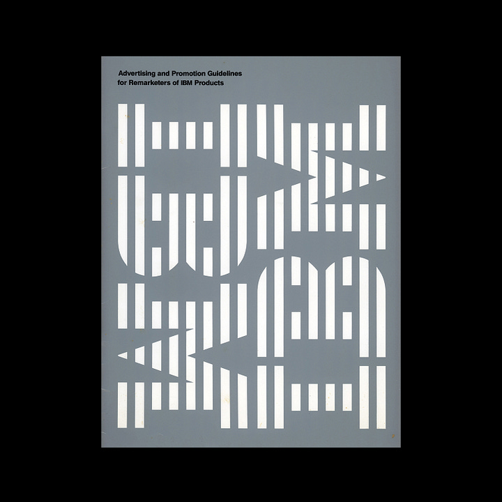
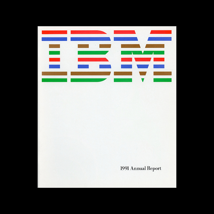

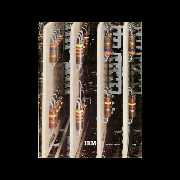
The notion of “good design” as a driving force for IBM’s communications was guided by the efforts and continuity of Eliot Noyes, who hired designers and outside studios with shared values and vision. This created a diverse visual language for IBM, always appropriate to its context, beautifully arranged and communicative. This would sometimes see the logotype used as the key design element, and at other times, as just a small signature. Just as Rand intended.
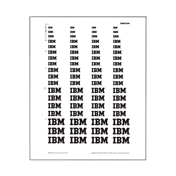

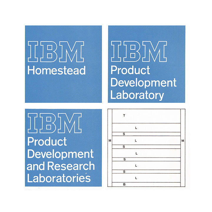
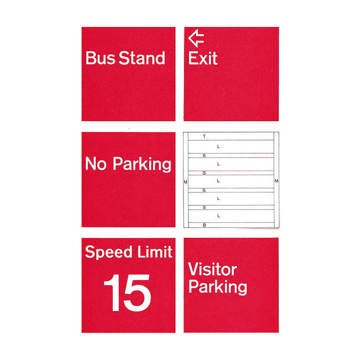
As well as the logo, Rand and the extended design team developed my other aspects of the IBM visual identity, many of which have not been widely documented, including office signage, above.
The foundation work done by Rand for IBM, with Thomas Watson, and Eliot Noyes set a positive trajectory for IBM, outwardly expressing a creative and collaborative centre through design and exhibitions, loading the logotype with meaning, so much so that it remains a powerful asset that is still in use today.
If you enjoy reading this you may also enjoy these resources from the same team:
Brand Archive – Research tool for brand designers.
LogoArchive Website – Searchable modernist logo archive & research tool.
LogoArchive Shop – Vintage design books & LogoArchive Zines.
BP&O – Contemporary design editorial.


