
Graphic Arts USA was part of a broader initiative to present the ‘vibrant’ and 'experimental world’ of 1960s American graphic arts to audiences in the former USSR who were only accustomed to ‘Socialist Realism’, an art style sanctioned and controlled by the government of the time.
Other exhibitions that were part of the USIA international initiative also included Industrial Design USA, Textiles USA, Ecology USA and Research and Development USA.
Graphic Arts USA showcased fine art prints, fabrics, book design, corporate identity, logos, advertising design, cartoons, record covers, posters, packaging design, 3D signs and displays. It also had a fully-equipped print shop.
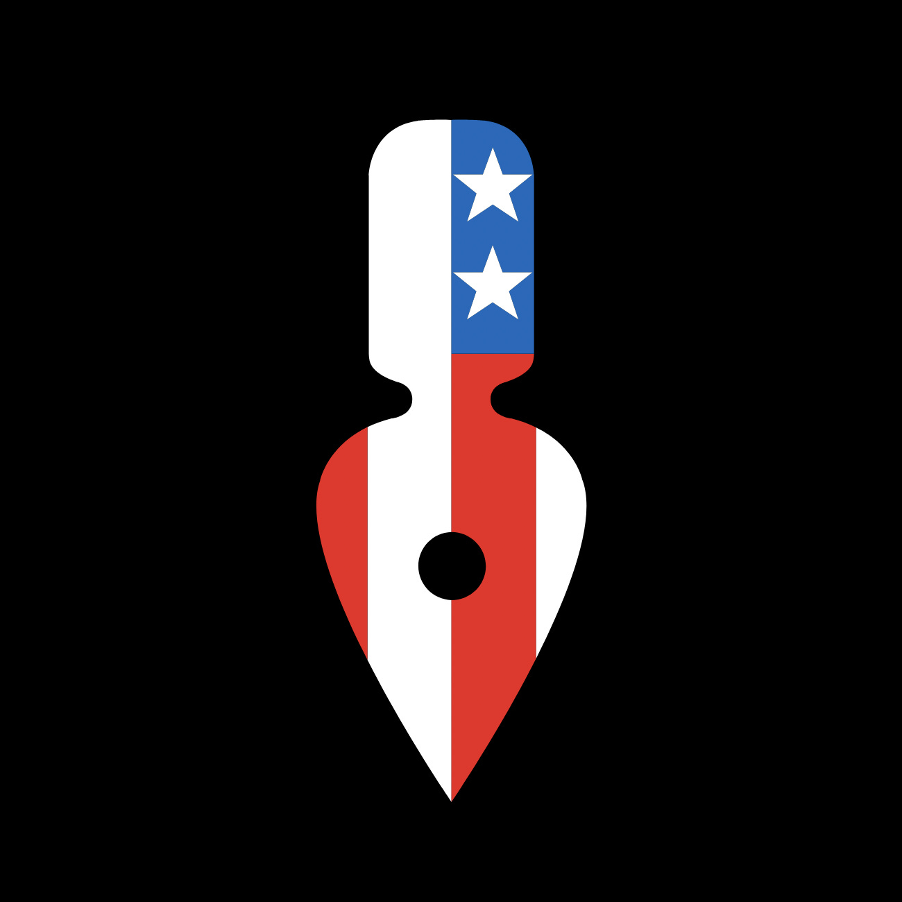
To accompany the exhibition, as with others before and after it, would be a souvenir ‘portfolio-brochure’. This would be available to visitors for free, and was printed in an edition of 200,000 copies. On the cover was the exhibition symbol designed by New York design studio Chermayeff & Geismar. This would also be used for posters, catalog covers and souvenirs, as well as other display items.
Chermayeff & Geismar write that, at the time, it was important that the symbol embody the national aspect of the initiative as well as the visual and artistic focus.
The studio devised a symbol that combined ‘two seemingly unrelated ideas, a pen nib and the American flag’ feeling this would best symbolise the exhibition theme. This image proved to be an effective icon, most notably on a black background and as banners outside the exhibition hall.
Thank you for subscribing to Logo Histories. If you enjoy reading this short you may also enjoy these resources from the same team:
Brand Archive – Research tool for brand designers.
LogoArchive Website – Searchable modernist logo archive & research tool.
LogoArchive Shop – Vintage design books & LogoArchive Zines.
BP&O – Contemporary design editorial.


