This post is supported by LogoArchive – The home of historical logos. Discover over 4000 of history’s greatest designs from the world’s finest designers. Always find the logo inspiration you need for your next project. Start here.
Meiji Dairies Corporation (明治乳業株式会社, Meiji Nyūgyō Kabushiki-gaisha) was founded in 1917 as a producer of dairy products.Over the following decades, it expanded its operations into the manufacturing and distribution of a full range of food products for the Japanese market.
In 1986, ahead of its 70th anniversary, Meiji Dairies Corporation sought out a new corporate identity. This intended to help bring into alignment the company’s graphic communication with its expansion plans, create a system that would establish a consistent image of the corporation as it moved into new non-food related markets and support its people-focused mission to enhance and contribute to the better health and well-being of all.
In the words of Meiji President at the time Seizo Shimamura, Meiji has been cognisant of the continuous changes in the condition of the environment and in the public's growing awareness and appreciation of health values. And with this in mind, Meiji have sought to make a continuous and concerted effort to fulfil those needs and expectations.
To help Meiji further this mission and bring a cohesive and systematic efficiency to product and service expansion, the corporation worked with Igarashi Studio (Takenobu Igarashi, Yukimi Sasago, Debi Shimamoto, Ichiro Takahashi, Kazuhiro Hayase & Honami Morita) to devise a new design policy. This would cover all aspects of the corporation, from staff uniforms to packaging to signage.
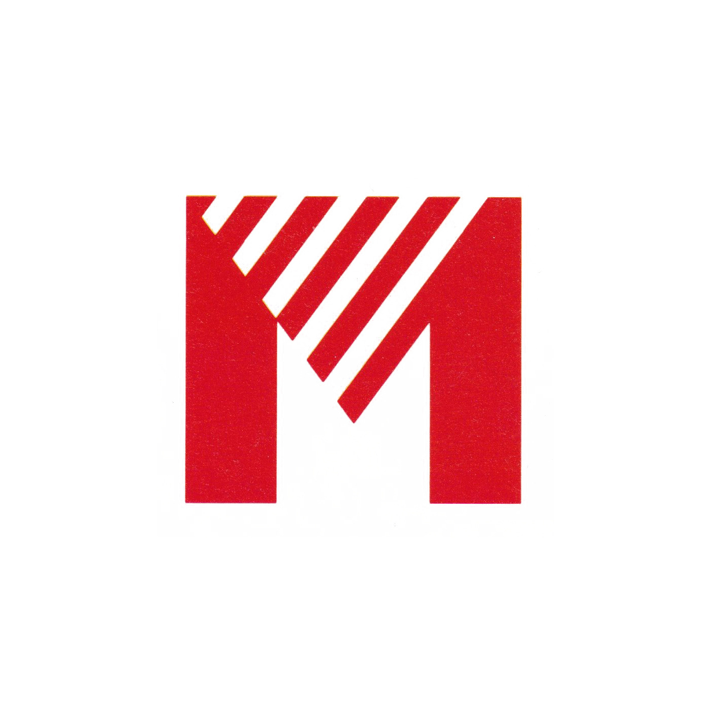
The design devised by the Igarashi Studio teamwas based around the initial "M" of the Meiji name. In its composition–a stable form with a diagonally striped counter space–the new logo intended to express the company's ‘vitality’ and ‘prospects for continued growth’ in the years leading up to the 21st century.
The inherent balance of the ‘M’ and the consistent line weight given to the diagonal lines alluded to notions of ‘corporate sturdiness’ and ‘reliability’. And the suggestion of upwards growth was developed further in the positioning of the full logotype at an angle within a box.
The six stripes introduced into the logo and logotype where given a specific representational value. These were the human body, life, culture, medicine, food and health. They symbolised the roles and areas of business in which Meiji was actively involved with. This striped motif became a bold graphic element across packaging and its impact elevated in conjunction with a bright red. This red was standardised throughout the visual identity and signified ideas such as ‘emotion’, ‘warmth’ and ‘humanity’.
The logo was applied consistently and throughly throughout Meiji, and specifically across stationery, printed matters, brochures, vehicle livery, signage, uniforms, packaging of products, and many other items.
Later, through restructuring of the company, the company was renamed Meiji Daries and later merged with Meiji Seika to become simply "Meiji". The logo didn’t survive these changes, and in 2009 was dropped.
Thank you for subscribing to Logo Histories. If you enjoy reading this you may also enjoy these resources from the same team:
Brand Archive – Research tool for brand designers.
LogoArchive Website – Searchable modernist logo archive & research tool.
LogoArchive Shop – Vintage design books & LogoArchive Zines.
BP&O – Contemporary design editorial.