Logo Histories

Logo Histories

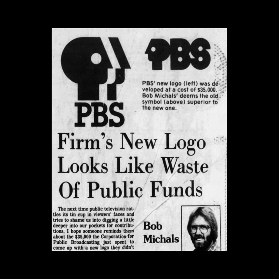
Bonus Content: Firm’s new logo looks like waste of public funds!

In 1984 Bob Michals weighs in on the new PBS logo.

Richard Baird's avatar
Richard Baird
Dec 01, 2021
∙ Paid
PBS logo criticism, 1984

Bob Michals, Palm Beach Post, Monday, April 16th, 1984–Having spent a couple of years with advertising agencies myself, I know all the arguments about the importance of a striking corporate logo, but it seems to me the Public Broadcasting Service has got to have something better to do with our money than pay for the modification of a symbol I, for one, …

User's avatar

Continue reading this post for free, courtesy of Richard Baird.

Or purchase a paid subscription.
© 2026 Richard Baird Ltd · Privacy ∙ Terms ∙ Collection notice
Start your SubstackGet the app
Substack is the home for great culture