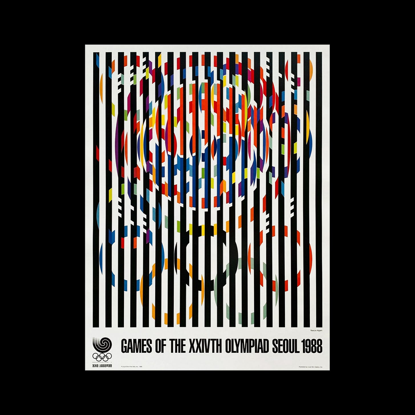
A message of peace
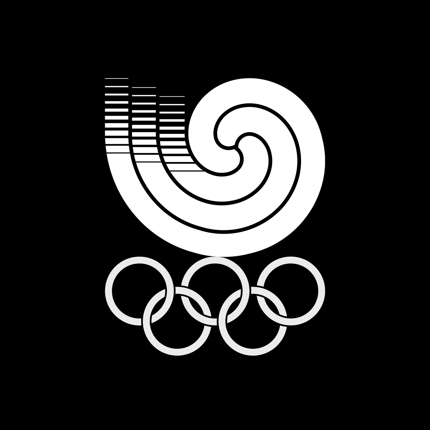
Yang Sung-Chun's 1983 logo for Seoul '88
If you enjoyed reading Logo Histories also check out these projects:
LogoArchive Website – Searchable modernist logo archive & research tool.
LogoArchive Shop – Vintage design books & LogoArchive Zines.
BP&O – Contemporary design editorial.
Extra Issue – Unlocking opinion and insights from the past.
The 1988 Summer Olympics, officially known as the Games of the XXIV Olympiad, took place in the South Korean city of Seoul between September 17th and October 2nd. Just as Tokyo 64, the design for the logo for Seoul 88 was the result of a competition. However, rather than pre-selecting a number of designers to contribute proposals, it was open to all. The competition was advertised across the country through print media and radio, and to the international expatriate community by way of South Korean embassies.
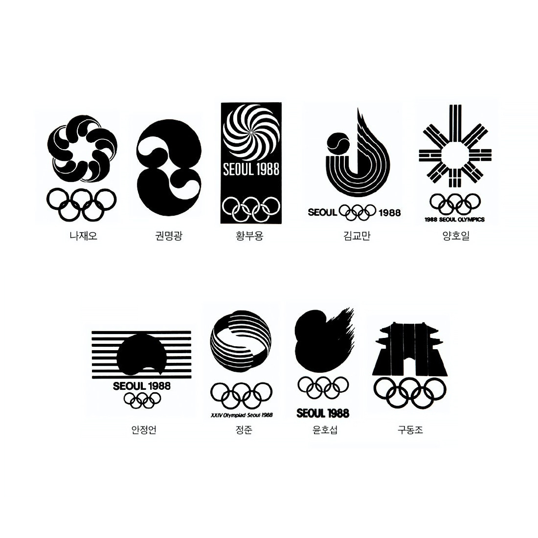
The competition was initiated in 1982 by the Organising Committee of the 1988 Seoul Games, the SLOOC. As was accepted at the time only the winners would receive compensation. For first place the prize was ₩3m, with second and third place receiving ₩1m each (around $9,000 and $6,000 adjusted to 2022 rates). The designers whose work was not selected went home empty handed. When the competition closed in December of 1982 there was a total of 924 submissions. Read on to see some of those submissions.
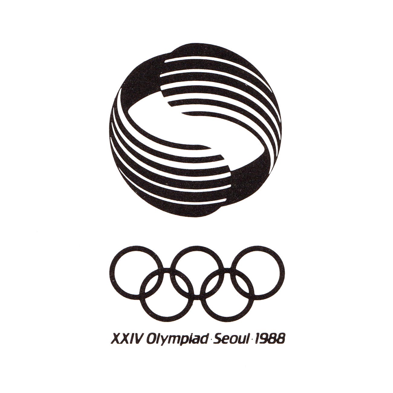
Unfortunately, just like Expo '70 before it, the decision to use a committee led to conflicting opinions and difficulties in selecting a clear winner. Following the initial round, a second phase was added to the competition. This invited the joint second-place winners to present, along with eight others, a round of further proposals from which the committee would then select a winning entry.
A total of twenty six proposals from ten designers was produced, these were reviewed in 1983, from which a shortlist of three was selected. From these the eventual winning design by Professor Yang Sung-Chun of Seoul National University was chosen.
Sung-Chun’s proposal and winning design was based around what is known as a tri-coloured taegeuk, a South Korean variant of a traditional, symbolic and widely-used motif in Korean culture. This is made up of three interlinked spirals of red, yellow and blue that represent heaven, earth and humanity. This motif appears in rituals and as decorative elements on fans, in folk art and in the handicrafts and as an architectural element on the gates of Korean houses.
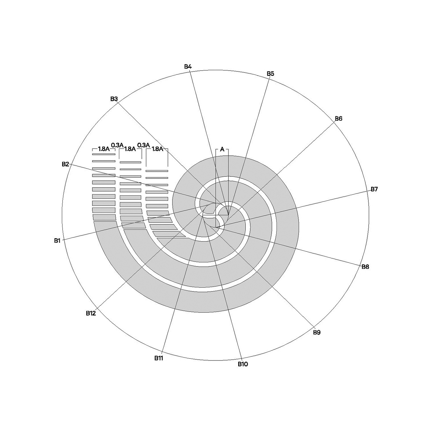
Sung-Chun sought to develop the motif by accentuating both the inward and outward motions, and integrating the centripetal and centrifugal forces that were inherent to the Sam-Taegeuk.
Within the context of The Games, the inward motion represented the coming together and harmony of people from across the world. The outward motion symbolised progress, eternal peace and “well-being of mankind through the realisation of the Olympic ideal.” [1]
The Olympic rings set below the symbol and then followed by the lettering “Seoul 1988” in either Latin or Korean characters. This was then used in full colour, as a single colour, or knocked out of a solid colour.
The dynamic aspect of the Sam-Taegeuk, and by extension, the logo created by Sung-Chun, can also been recognised in other aspects of The Games communication, and in particular the official poster. This employed a dramatic tunnel effect using computer generated imagery, a first for The Games. In the spirit of team work, the poster itself was a collaborative effort, combining the skills of Cho Jonghyun working on the gradation of the rings, Japanese designer Kenda Etsuo rendering the glowing rays and photographer Hyungu Yu capture the motion of the torch runner.
A second poster, “Message of Peace, 1988” designed by Israeli sculptor and artist Yaacov Agam found a compelling intersection, bringing together the lines and dynamic aspects of Sung-Chun’s logo and the artist’s own striking optical-art.
Paid subscribers get 10% off all items in the LogoArchive Shop. Use discount code: LASHOP10 at checkout.
If you enjoyed reading Logo Histories also check out these projects:
LogoArchive Website – Searchable modernist logo archive & research tool.
LogoArchive Shop – Vintage design books & LogoArchive Zines.
BP&O – Contemporary design editorial.
Extra Issue – Unlocking opinion and insights from the past.


