


Siemens AG and the 1966 umbrella mark
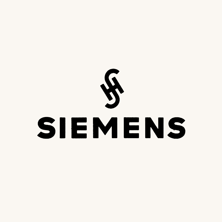
When Siemens AG was formed on 1 October 1966, merging Siemens & Halske, Siemens-Schuckertwerke and Siemens-Reiniger-Werke, it inherited decades of what its own historians describe as “branding chaos”: a sprawl of subsidiary marks designed with little regard for consistency. Rather than commission something new, Siemens promoted the existing Siemens & Halske mark – one of the company marks Hans Domizlaff had designed in the mid-1930s, with an S&H monogram set above the SIEMENS word mark – to umbrella mark for the whole group, and reinterpreted the monogram as standing for the “House of Siemens”.
It did not last. Within seven years the monogram was gone, and the deciding voice was not a designer but the psychologist Reinhold Bergler, whose empirical studies tested how people actually read the mark.
Key Takeaways
A monogram that could not be redefined
Siemens reinterpreted the S&H monogram as the “House of Siemens” in 1966, but test subjects went on reading it as Siemens & Halske.
Research over in-house preference
Two pilot psychological studies by Reinhold Bergler compared eight new logotype variants with the existing marks, and rejected the advertising managers’ favourite.
The name becomes the mark
In 1973 Siemens dropped the monogram entirely and made the SIEMENS name, in its existing lettering, the company mark.
Go behind the logos. Explore 200+ in-depth and meticulously researched logo histories revealing the designers, design decisions and ideas behind the world’s most iconic logos and important brand identities.
→ free previews
→ join here
Continue reading to discover how Siemens tested eight alternative logotypes, and why its own favourite was judged faddish and facetious →
