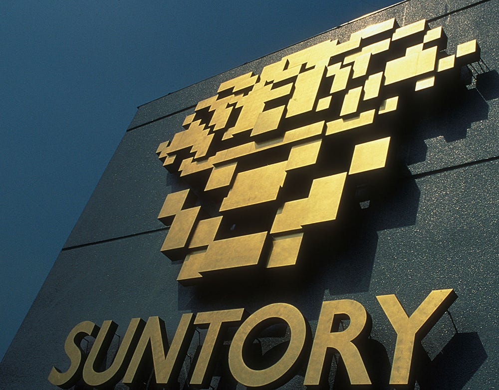
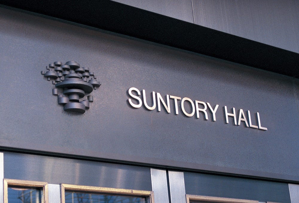
Suntory Hall Logo, 1986
Takenobu Igarashi's 1986 logo Tokyo's Suntory Hall.
This post is supported by LogoArchive – The home of historical logos. Discover over 4000 of history’s greatest designs from the world’s finest designers. Updated every single day. Always find the logo inspiration you need for your next logo or branding project. Start here.
To celebrate its sixtieth year of whisky making and twentieth year of beer brewing, Japanese beverage company Suntory opened Suntory Hall in the Autumn of 1986.
The venue would be Tokyo’s first ever dedicated concert hall, and was a modern acoustic marvel, created with the goal of pursuing ‘the world’s most beautiful sound’. This had been the realisation of a dream held by Keizo Saji, the president of Suntory Ltd.
Construction began in the late 1970s and the hall opened in October 1986. To coincide with the opening, Takenobu Igarashi and his team at Igarashi Studio were commissioned to develop a logo. Taking inspiration from the past and infusing this with a conceptual dimension, Igarshi devised a striking and unusual mark that would signal a new era for the Tokyo music scene.
Suntory was founded in 1899 as a producer and seller of grape wine, later expanding out into spirits. It launched a square bottled whisky in 1937 which featured a heraldic crest in the European rather than Japanese tradition of family emblems. This featured two lions either side of a shield with a ribbon beneath.
Igarashi presented ten logos. One of these was at the mid-point between the heraldic shield and the kanji character ‘hibiki’, which means ‘resonance’. Through a process of reduction and abstraction an eventual integration was achieved between these two images, the historical and conceptual. Despite the logo’s pixel-like quality, this process was done entirely by hand.


It the logo was described as symbolising Suntory's corporate stance of “contributing to the creation of people's lives and culture through emotional resonance with all things.'' President Keizo Saji immediately liked it and the decision was made to move forward with the design.
Suntory Hall was the first concert hall in Japan to adopt ‘vineyard-style’ seating whereby the audience sat around rather than in front of the stage. The goal of this seating style was to create ‘the world’s most beautiful sound’. Perhaps it is this, or the grape wine origins of Suntory that led to the appealing grape colour used with the logo. This would be later changed to a burgundy, and used in blue for a special premium whisky launched to celebrate the opening.
After the logo was settled on, it occurred to Igarashi–who had spent time previously exploring the intersection of type and sculpture with his ‘alphabet sculptures’–to try developing a three-dimensional version. The logo was symmetrical so, if you were to connect either side with an arch, a three-dimensional shape is formed and created a ‘sort of an arch-alphabet’. This became a three-dimensional ‘sound’ sculpture that was placed at the hall's entrance. Alongside this, and channeling his experience working at the intersection of art and architecture, Igarashi devised signage that interpreted the logo in number of material ways, each with a unique sense of depth, and playing with light and shadow.
A few years later, Suntory adopted the name for their first premium blended whisky. And shortly after the logo, which had accumulated a lot of favour, was also used as the Suntory Ltd logo, from 1991-2005. However, in 2005, as Suntory continued to expand and diversify, its corporate logo was changed to the current logotype. Suntory Hall retains the logo today, with amendments only to the logotype, replacing uppercase Helvetica with a serif.
Thank you for subscribing to Logo Histories. If you enjoy reading this you may also enjoy these resources from the same team:
Brand Archive – Research tool for brand designers.
LogoArchive Website – Searchable modernist logo archive & research tool.
LogoArchive Shop – Vintage design books & LogoArchive Zines.
BP&O – Contemporary design editorial.


