
The Centre National des Arts – What's the concept?
A look at the concept behind Ernst Roch's 1967 logo for The Centre National des Arts.


What’s the concept?
The Centre National des Arts is a performing arts organisation and national arts centre in Ottawa. The project was launched in 1967 to coincide with Canada’s centennial celebrations and was opened two years later in 1969.
The centre features a distinctive architectural formation of hexagonal structures created by Polish-born architect and theatre design consultant Fred Lebensold. This was conceived as a ‘three-dimensional concrete landscape’ and ‘the Canadian Shield in miniature’.
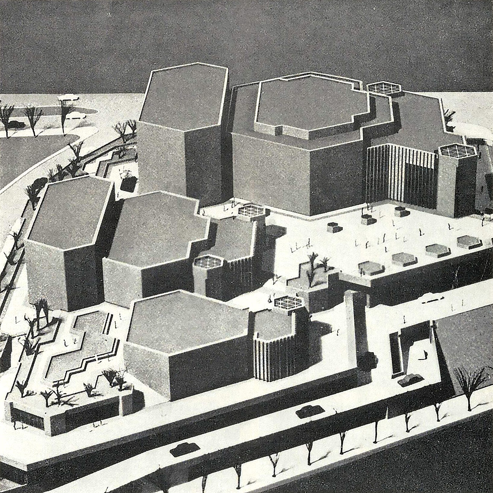
The unique architectural formation of the three theatres and connecting buildings informed the direction of Enrst Roch’s logo design for the centre which features three interlocking hexagons.
As well as reflecting the centre’s architecture, the three shapes also symbolised the three performing arts; drama, dance and music. The logo was used throughout the centre and applied in print using purple.

Snail Logos
For some reason, the Japanese have favoured this small gastropod mollusk in the past and used it as a symbol for a whole host of businesses and brands. Often rendered in a cute and playful way, the spiral of the shell provides a distinct graphic motif that draws the eye in. Not often seen today in logo design, but it’s familiarity, slow but purposeful movement and shell offers designers an opportunity to play.


Thank you for subscribing to Logo Histories. If you enjoy reading this short you may also enjoy these resources from the same team:
New! Portal – Design-driven jobs board and applicant management.
Brand Archive – Research tool for brand designers.
LogoArchive Website – Searchable modernist logo archive & research tool.
LogoArchive Shop – Vintage design books & LogoArchive Zines.
BP&O – Contemporary design editorial.