
The Wool Ball
Franco Grignani’s 1964 logo for Woolmark.


For wool manufacturers, a new and innovative competitor emerged during World War 2: synthetic fibres. By the early 1960s, wool growers around the world were coming to the realisation that these fibres - nylon, polyester, and acrylic - were a serious threat to the wool trade as the synthetic alternatives imposed upon the market price of wool.
The managing director of the International Wool Secretariat (IWS), Mr Bill Vines, sought out to establish a ‘quality’ stamp for wool products with the goal of improving the global image in the mind of consumers. This was part of a five-year plan by IWS to expand world wool promotion. This would involve IWS establishing a series of national wool trademarks, unified by a clear and consistent design that would be promoted until reaching household-status. The Woolmark ‘promise’, signified by the graphic identity, would give buyers the confidence that the product not only met precise quality standards, but also guaranteed to be made from natural, renewable, and biodegradable wool.
A jury of internationally-known experts were invited to select the logo. Of these jurors, one would unknowingly design the winning logo; Franco Grignani, an Italian architect, graphic designer and artist known in Italy as a master of optical graphic design.
At the end of 1963, not long before his departure to London where judging would commence, a mysterious ‘Mr Spiriti’ approached Grignani. He worked as an appointee for the advertising agency working for Italian Pure Wool Secretariat and also oversaw the collection of the designs that would be exhibited by the selection panel. He was eager to submit the collected proposals to Grignani. However, the designer was not at all impressed by any of the designs, so disappointed in fact, that he planned to step down from the jury.

Mr Spiriti stopped Grignani in his tracks, worried by the disappointing reaction, and put forward the suggestion that Grignani himself should submit a design of his own. Being a member of the jury, he was unable to enter under his own name therefore Mr Spiriti would submit the design on his behalf.

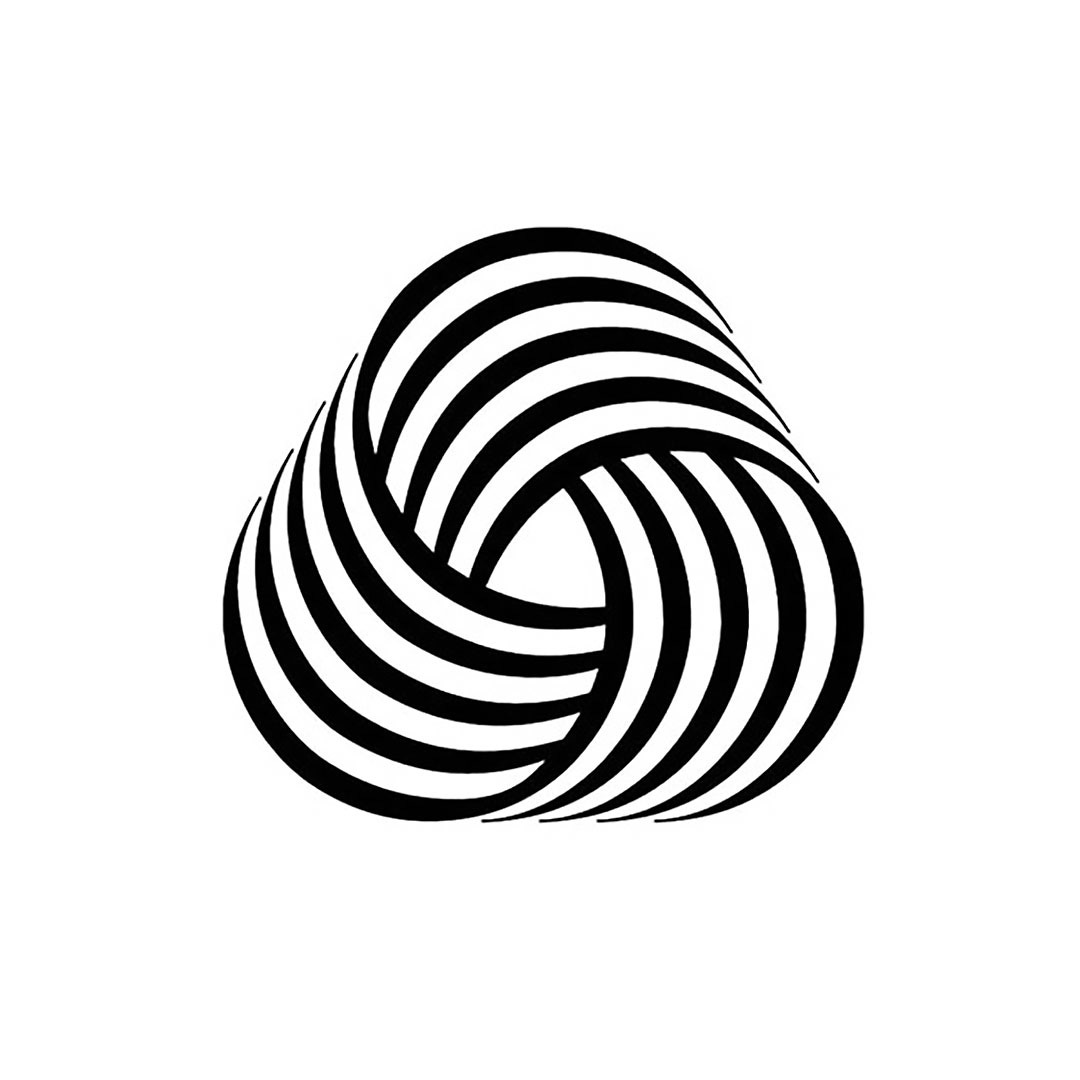
In the designer’s signature style, a logo was created by arranging three black and white-striped bands criss-crossing into a formation similar to a mobius-strip. In the development process, he also created several variations by experimenting with the different thicknesses of the lines.
In the modernity of the symbol, and through Grignani’s distinct op-art style, the impression given of wool was one of softness, longevity and continued value and relevance.

Among the eighty-six competitors, the jury immediately and unanimously favoured this striking logo. Not only was Grignani in disbelief, but the designer would also vote against his own design until the end - owing to the embarrassing nature of the situation.
Mr Spiriti had shortly died after the selection, so the design’s author could not be confirmed. Grignani chose not to reveal his authorship, except only to collaborators.
For a long time, Milanese designer and art director Francesco Saroglia falsely took the credit of being the symbol’s creator, appearing in staged photographs supposedly in the process of ‘designing’.
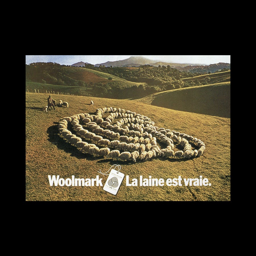
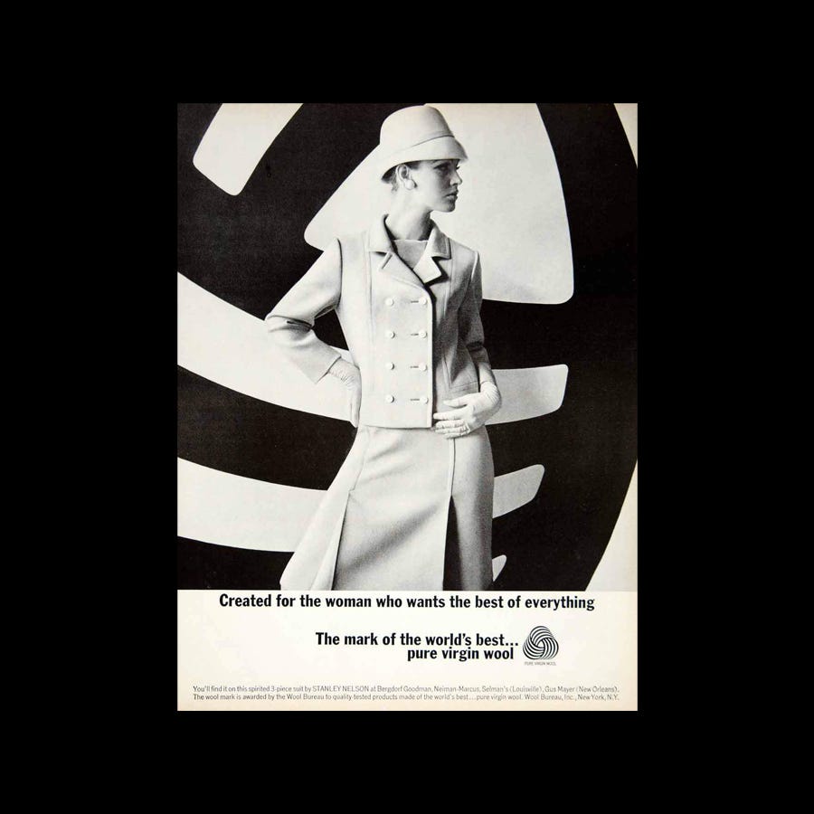
Announced in Britain in January 1964, and later launched in the September of that year, it was no surprise that the remarkable logo had a significant impact on the wool industry - succeeding in its goal to reinvent the perception of wool worldwide. For this, Franco Grignani did not receive, or even ask for, a single penny.
Remaining unaltered since its inception, the design continues to be uniquely memorable - a reputation that deserves to be aligned with the design’s true creator.
This Logo History, with permission, was based on an original article ‘The quite strange story of the best logo ever’ written by Emiliano Camera Grignani, the grandson of Franco Grignani. To read this and discover more about Franco Grignani’s work, click here.
If you enjoyed reading Logo Histories also check out these projects:
LogoArchive Website – Searchable historical logo archive and research tool.
LogoArchive Shop – Vintage design books and LogoArchive Zines.
BP&O – Contemporary design editorial.
 | A guest post by
|