
The USIA tours the USSR!
Lance Wyman's USIA Ecology Exhibition logo.


The United States Information Agency Ecology Exhibition was part of a cultural exchange program with the USSR, touring countries throughout the Soviet Block during the height of the Cold War. It was also part of the Federal Design Improvement Program, which was an ambitious initiative to raise the standards of design within United States Federal agencies, which also included NASA and the EPA, amongst nearly forty others. LogoArchive and Standards Manual covered this in the latest LogoArchive Extra Issue.
In 1971, the newly formed Wyman & Cannan–Lance had just arrived back from his time in Mexico and set up with Bill Cannan–landed the covetable role of designing the exhibition which would be themed around the environment. Seeing a bigger opportunity to develop this further, Wyman & Cannan’s team, made up of Bill Cannan, Lance Wyman, Wallace Toscano and Ogyu Masahiro proposed a new creative concept around a balanced equation.
This equation sought to resolve positive and negative concerns around the environment. These included productivity and consumerism, waste and pollution, regulation and protection. This was brought to life through a visual language of plus and minus, and a narrative thread of problems and solutions that structured the exhibition.
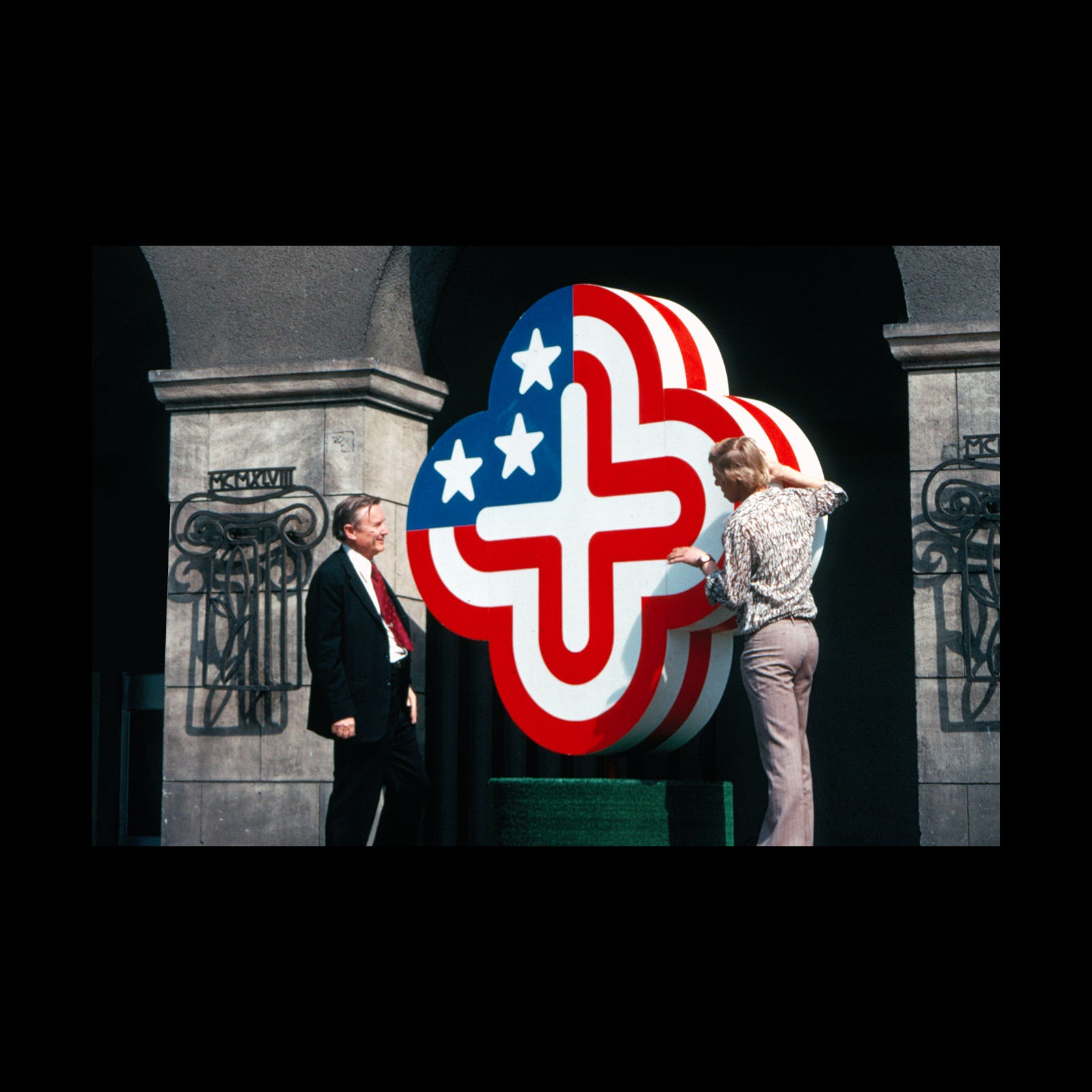
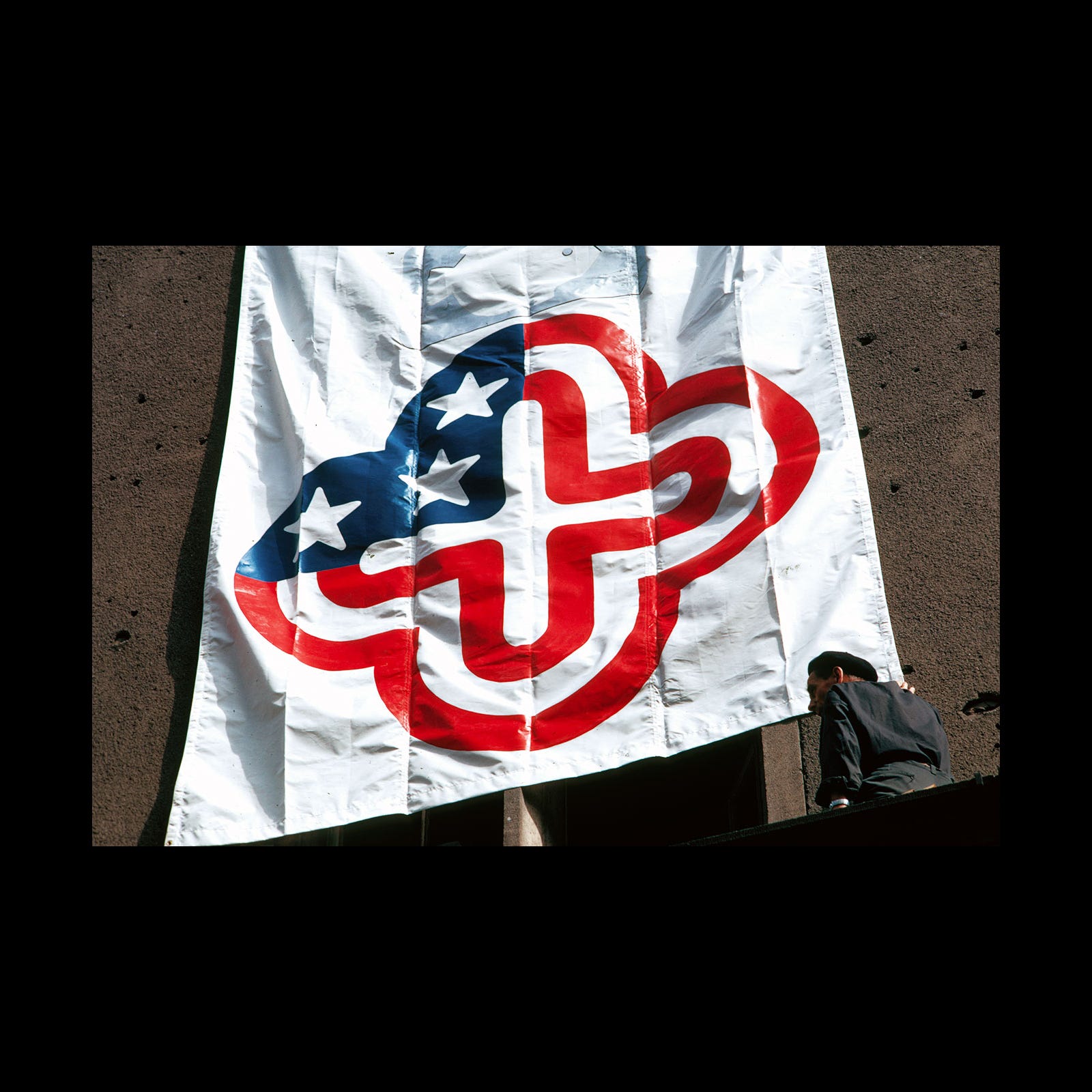
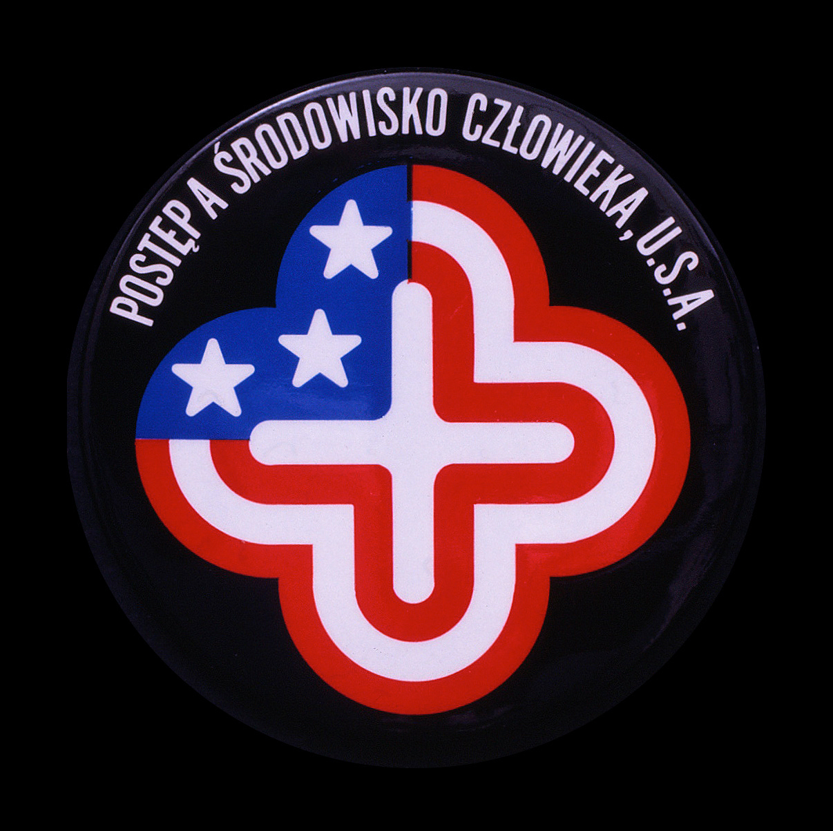
Lance Wyman developed a logo to support the story, distil the concept and promote the exhibition. Taking the equation concept, Lance created a logo that focused on positivity, employing a bold yet soft and inviting plus motif.
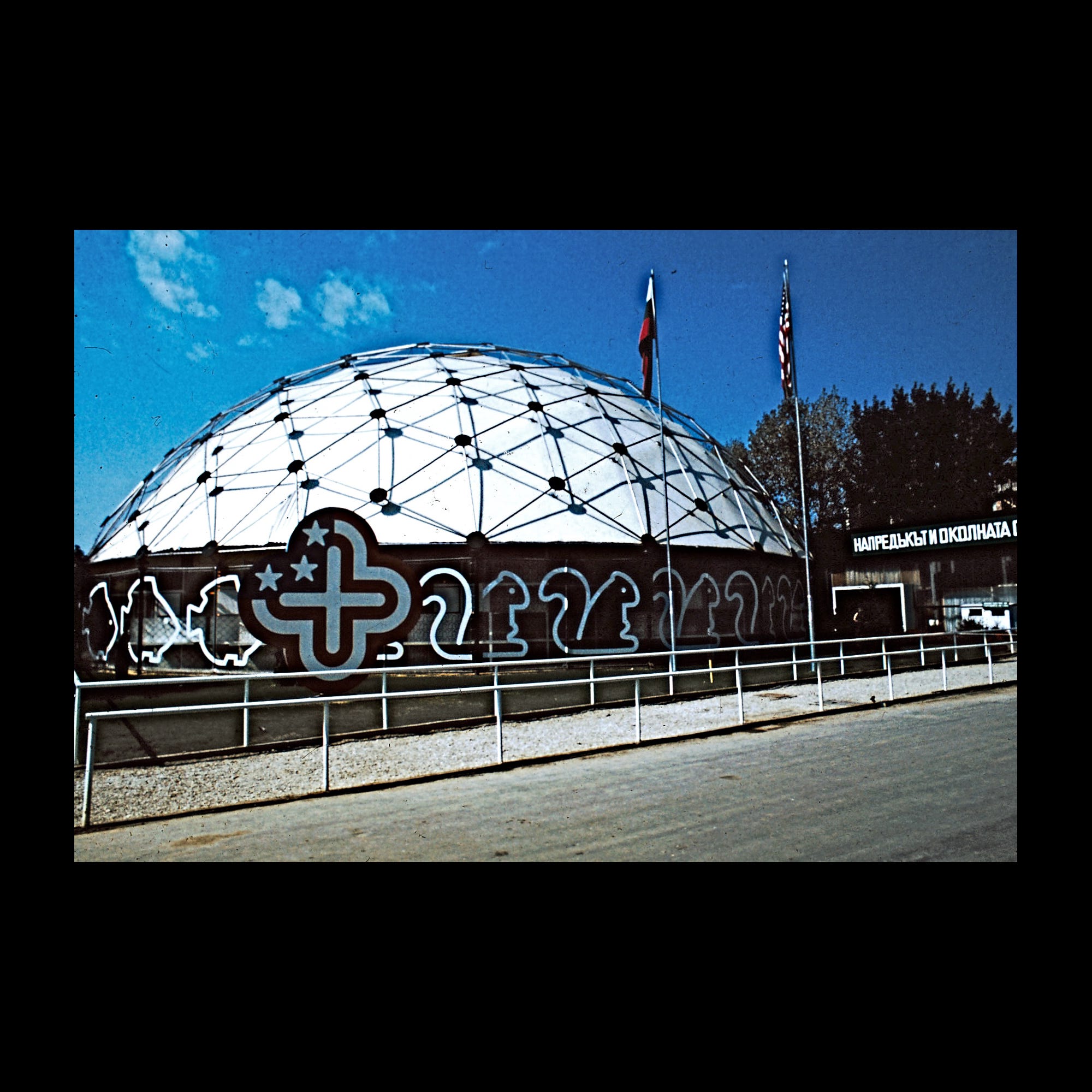
By introducing the Stars and Stripes the plus motif took on a new, distinct and national aspect. This latter detail was important as the exhibition travelled throughout the members of the Soviet Block. The stars of the States were reduced to just three, representing land, sea and air.
For those that would like to receive new modernist logo stories every week and support our ongoing research, consider upgrading to become a LogoArchive member.