Zexel Logo, 1991
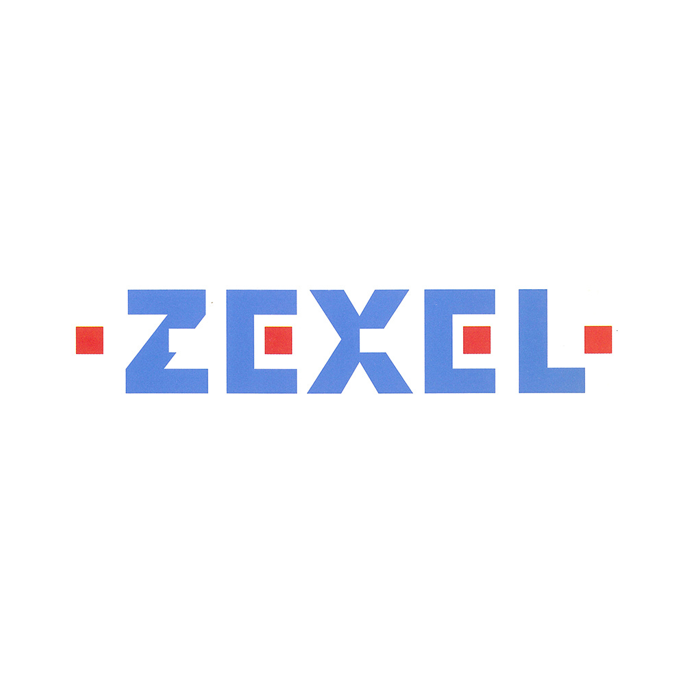
PAOS' 1991 logo for Japanese automotive-related parts maker Zexel.
This post is supported by LogoArchive – The home of historical logos. Discover over 4000 of history’s greatest designs from the world’s finest designers. Always find the logo inspiration you need for your next project. Start here.
In 1991, and on the 51st anniversary of its founding, the Japanese car parts company Diesel Kiki Co., Ltd. introduced a new corporate identity designed PAOS.
This followed a meeting with shareholders, that agreed to change the name to ‘Zexel’ as a statement of a determination to refresh the ‘minds and bodies’ of the corporation and catalyse corporate development ahead of the 21st century as it developed its international business.
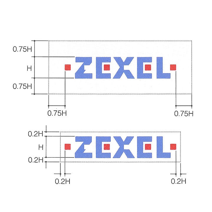
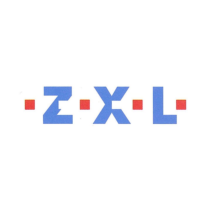
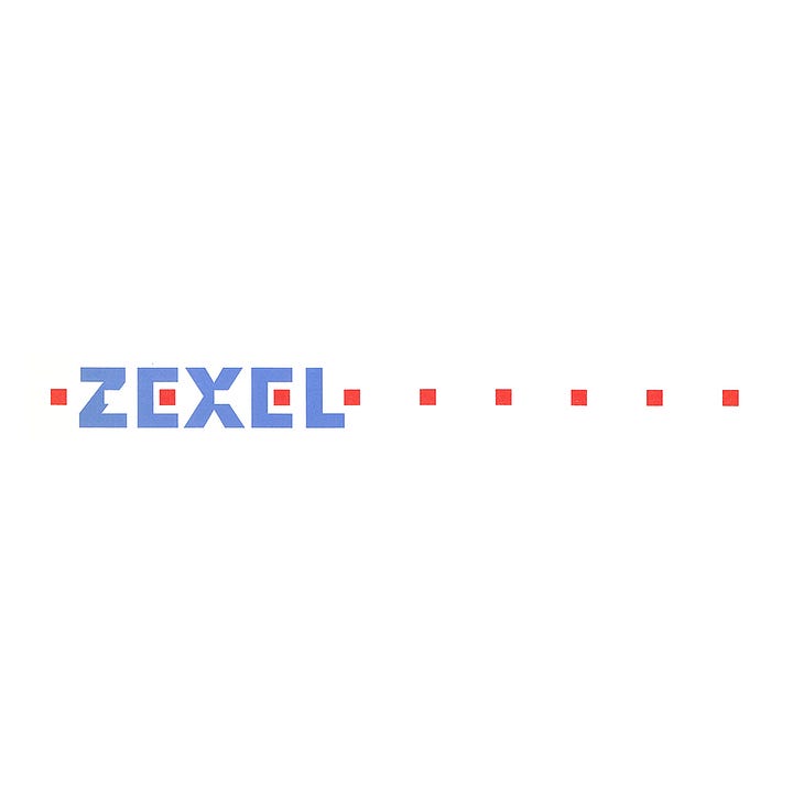
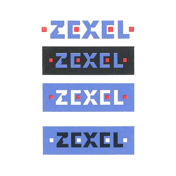
While having steadily grown as a manufacturer of automotive-related parts and supplies, the changing international and socio-economic environments demanded a new future-focused policy. This new policy intended to address increased competition (and the continuing need to be distinct within the market, with a clear technical and philosophical difference) and proactivity rather than passively respond to changing consumer needs.
More specifically, the goals of the design policy where to: establish a clear image for the corporation that would respond progressively to the information age; rebuild and reorganise the corporate philosophy; prepare it for future business expansion and product/service diversification; establish a corporate structure that flexibly responds to changes in the social and market environment; and actively respond to globalisation.
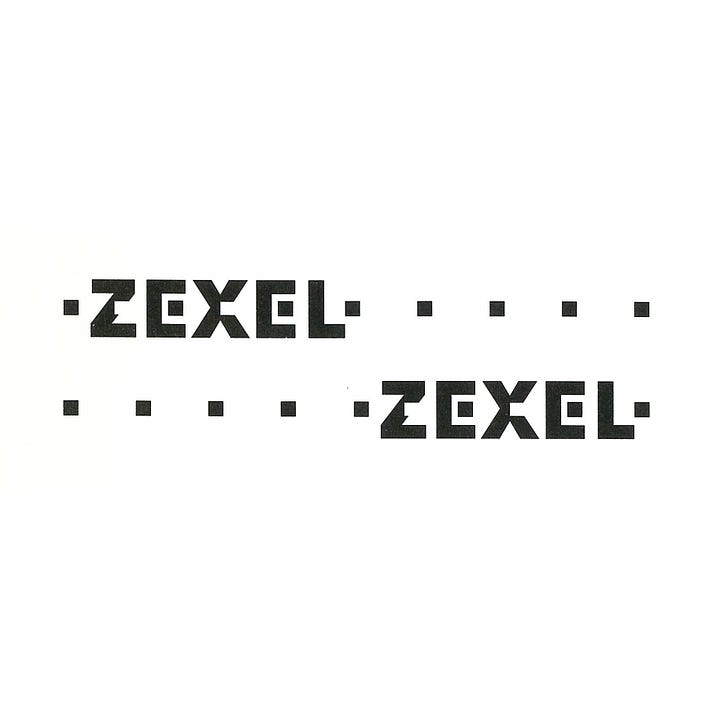
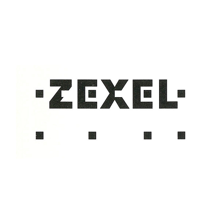
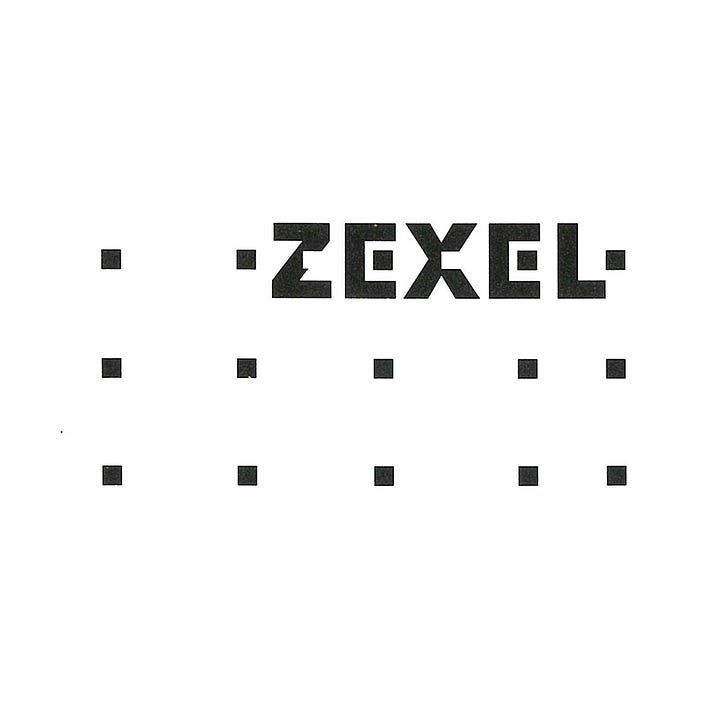
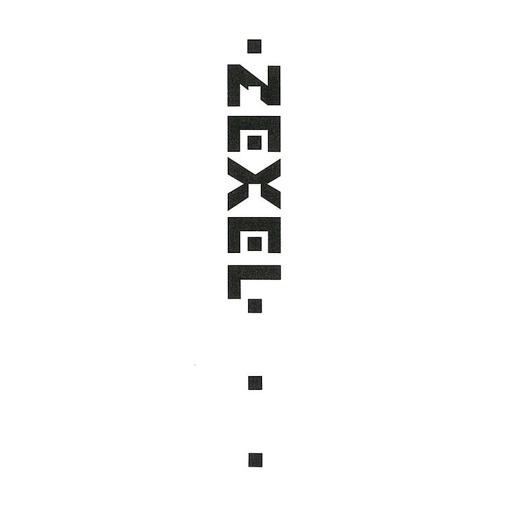
The new name addressed the globalised market conditions. This inherited the vested value of the old company name (Zexel can also be pronounced as ‘diesel’), whilest also expressing a new internationalised image.
The new company name was given the following meanings. The sound of ‘Zexel’ condenses the vested value of ‘Diesel’ for the local market and expresses the positive will to make Zexel an "EXCELLent" company. ‘Z’ originally meant the ultimate or perfection, and "EXcEL" is derived from the Latin word excellere, meaning excellence in the achievement of something specific.
To put it simply, it was felt that the Zexel name appropriately expressed the attitude of a corporation aiming for technological perfection and excellence.
Along with the company name change, a corporate symbol and new visual identity design was developed. The new symbol would serve as the core of much of Zexel's communication activities from 1991 onwards.
The ZEXEL symbol was described at launch as a powerful linear logotype. The use of precision squares and square cuts to the letters, lined up along a centre line, provided the overall sense of a high level of technical perfection, both precise and innovative.
Further, the symbol suggested, through repeated shapes and the flexibility of its use, progress, business expansion and business diversification based on ‘unique precision technology’ that ensured ‘a prosperous life for employees and contributing broadly to society and culture.’
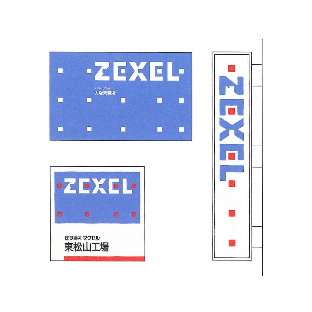
The Zexel logotype is distinct in its function as an adaptable mark with many possible configurations, addressing a vast and growing number of applications, from small labels to large format signage, and across both the wholesale and consumer markets.
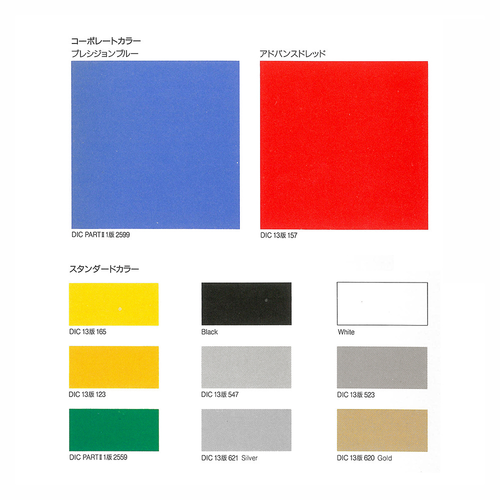
The corporate colours were named “Precision Blue” and “Advanced Red”. This furthered the notions of technological innovation, and advanced the ideas of ‘trust’, ‘humanity’, ‘dynamism’ and a unique culture.
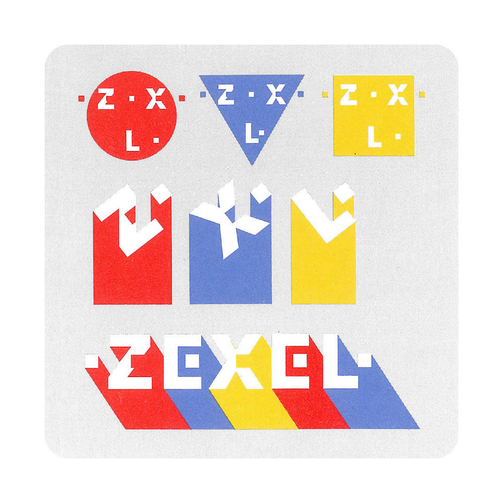
PAOS developed, alongisde a logotype, a diverse set of related graphic assets used to link product packaging with advertising and corporate fleet of vehicles. In conjunction with colour this leant the visual identity a distinctly playful and accessible quality, unlike its more austere competitions.
Based on the basic policy of "establishing a clear image" and "utilising it as a management and marketing tool" to "pursue the merits of standardisation", a dynamic design system was developed and implemented around these often playful and colourful design elements. This system afforded the Zexel marketing team a degree of creative freedom, moving from more technical image towards one that would respond to social and cultural shifts.
Following a reorganisation in 2000, Zexel was placed under the Bosch umbrella. Zexel parts can still be bought packaged with the Zexel name and featuring the basic logotype developed by PAOS.
Thank you for subscribing to Logo Histories. If you enjoy reading this you may also enjoy these resources from the same team:
Brand Archive – Research tool for brand designers.
LogoArchive Website – Searchable modernist logo archive & research tool.
LogoArchive Shop – Vintage design books & LogoArchive Zines.
BP&O – Contemporary design editorial.


