I bleed in six colours
Rob Janoff's 1977 logo for Apple Computer.
This post is supported by LogoArchive – The home of historical logos. Discover over 4000 of history’s best designs from the world’s finest designers. Always find the logo inspiration you need for your next project here.
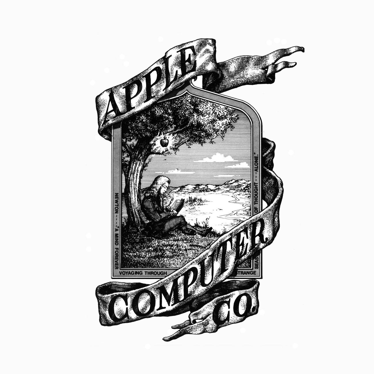
Prior to 1977, the American electronics company Apple Computer had been using as its logo an illustration depicting Issac Newton sitting under an apple tree. Wrapped around it in latin was the inscription "Newton....A Mind Forever Voyaging Through Strange Seas of Thought… Alone” which was drawn from Wordsworth's autobiographical poem The Prelude. Created by Ron Wayne, an early partner of Steve Jobs, it was drawn with pen and ink, and in an etched illustrative style.
When the Apple II was at the prototyping stage, it became apparent that, not only was Wayne’s logo unsuitable in practical terms (difficult to reduce down and apply to a plastic injection moulded body of a computer), it didn’t reflect the cutting edge nature of the technology, which would be the first of its kind to introduce a colour screen.
Jobs came to advertising agency Regis Mckenna with the task of coming up with a logo for Apple, to be used on the Apple II personal computer.
The objectives, as later recalled by Rob Janoff, the designer in charge of the project, was to; make computers appear friendly; use colour; and appeal to non-users. After a trip to a fruit market, and after hundreds of sketches, Janoff landed on a simple memorable shape with a bite taken out of it to imply scale, and avoid it appearing like a cherry.
Two versions were presented, one with and one without a bite “just in case [Jobs] thought the bite was too cute”. Further, variations on these two options were presented. These included a striped version, a solid colour version and metallic version, knowing that full colour wasn’t always a priority or just too expensive.
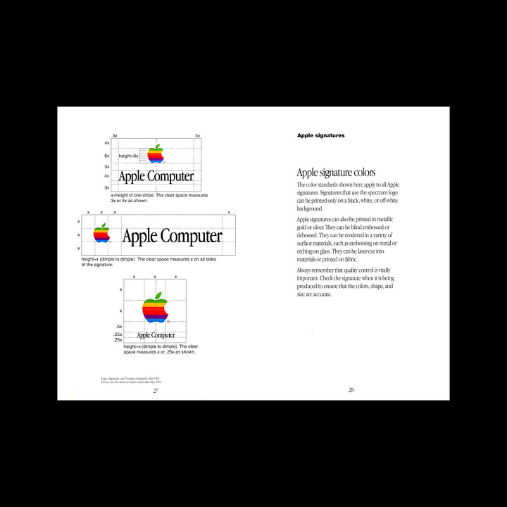


The striped version appealed to Jobs. The Apple II was the first computer that had a colour monitor, and the brand needed to broaden its appeal. It was felt that a colourful stripped logo appeared accessible and was reflective of the innovation that was happening at the time.
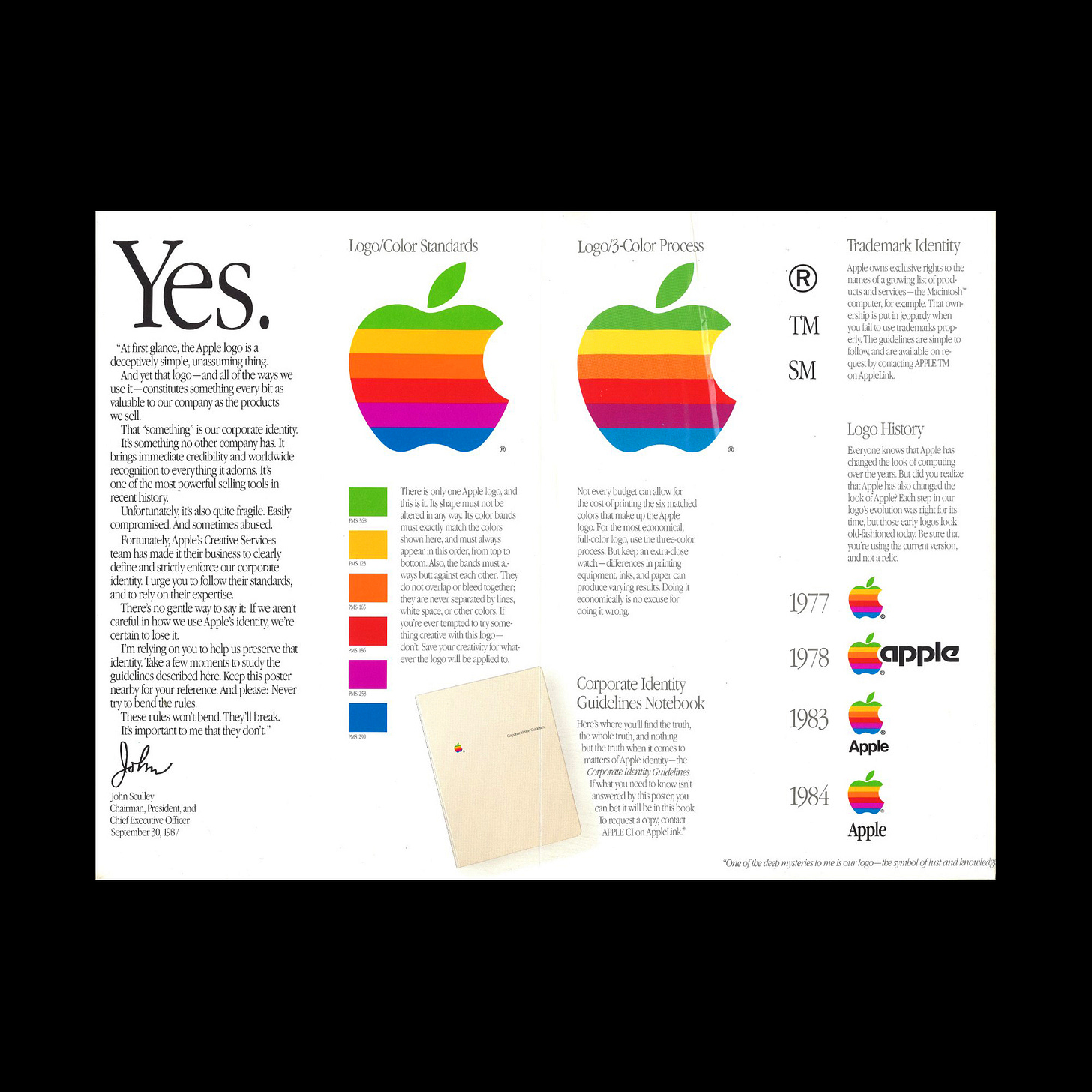
The logo would be made up of six colours, each given a Pantone colour value. An account executive, at the logo presentation, raised concerns about the expense of producing stationery this way, however, his concerns were waved away. Although a four colour process would later be used, much of the early materials featured these bright spot colours.
The Apple logo was basic and not technical, universal not abstract, and warm in its use of colour. It is this combination that proved to be the ‘winning formula’, and was launched alongside the Apple II. The warm inviting use of colour and the universality of form reflected a new era of technological progress but also the more human-centred and familial experience people now expect of Apple and gave Apple its differentiating factor.

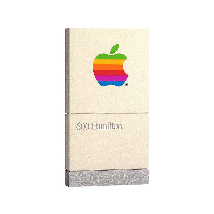


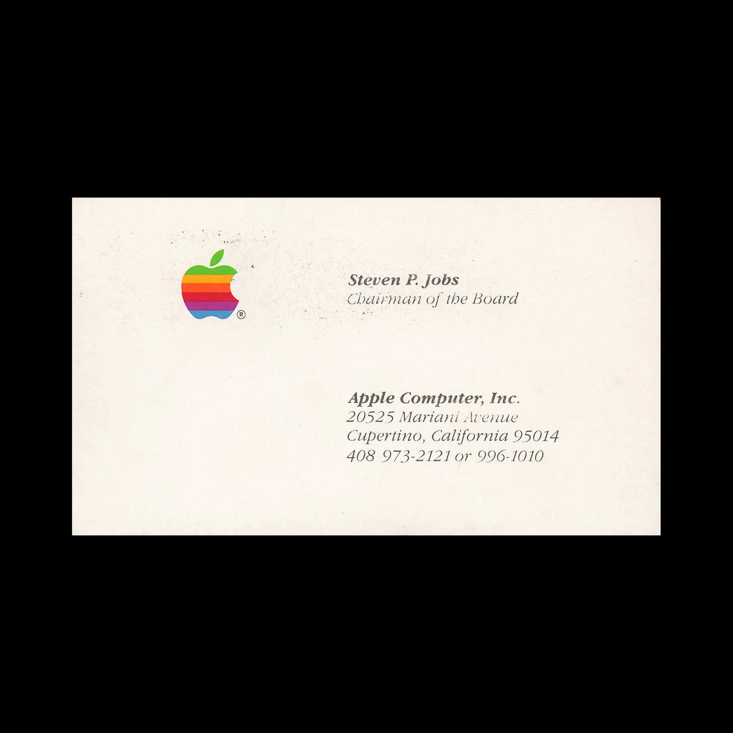
When Jobs returned to a soon-to-be bankrupt Apple in 1998, following his ousting in 1985, the story goes that he asked a staff member still working there, all those years later, why had they not left? They answered, “because I bleed in six colours”. Although the logo has undergone a number of small iterative changes, the silhouette designed by Janoff remains, and has provided the company with creative potential throughout its ad campaigns and event introductions.
Want to see more assets from the 1987 Apple brand guidelines? You can, head over to Brand Archive.
If you enjoy reading this you may also enjoy these resources from the same team:
Brand Archive – Research tool for brand designers.
LogoArchive Website – Searchable modernist logo archive & research tool.
LogoArchive Shop – Vintage design books & LogoArchive Zines.
BP&O – Contemporary design editorial.





Discover hundreds of logo stories just like this one here: www.logohistories.com Please share :)