


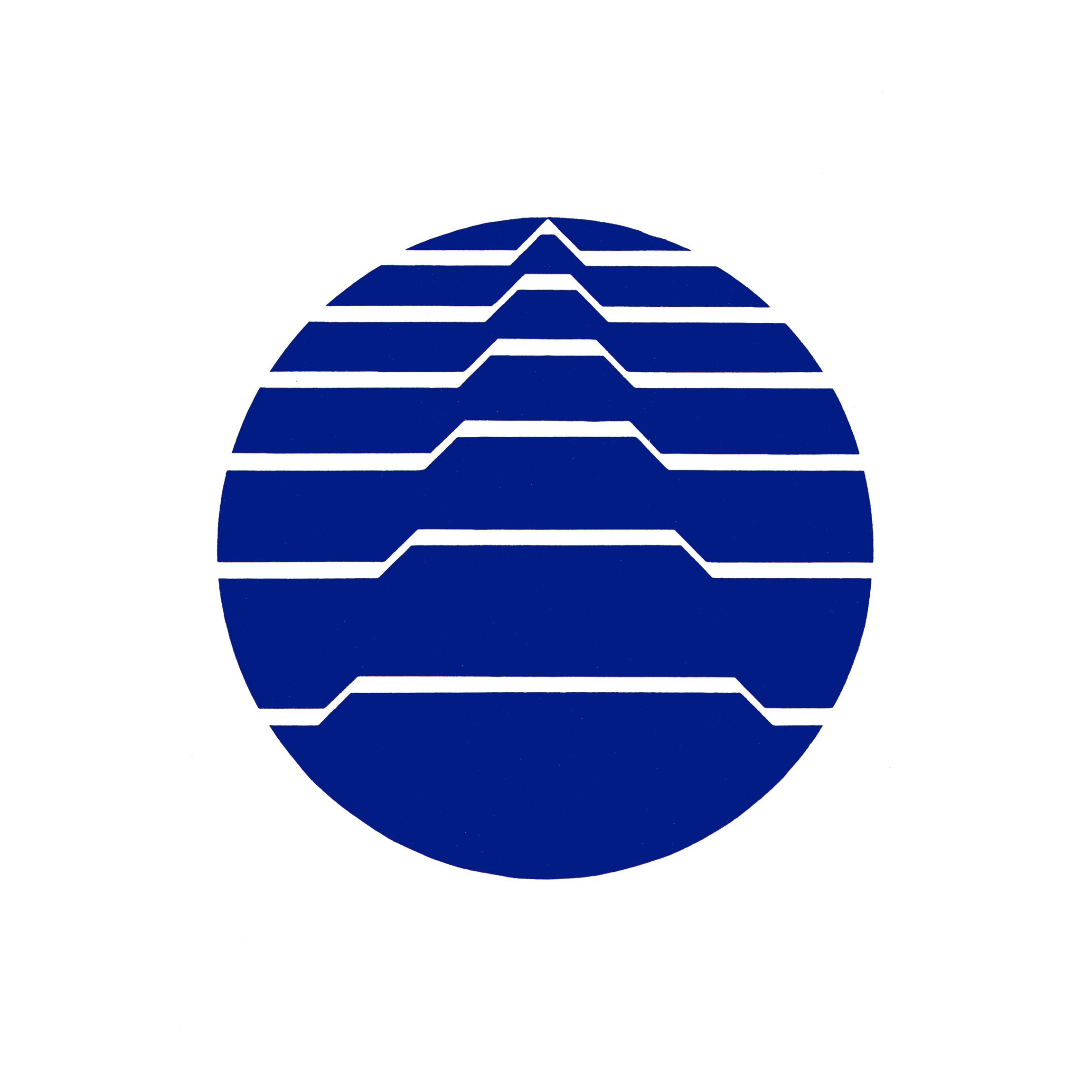
At the request of Japan, the Bureau International des Expositions (BIE)–the intergovernmental organisation in charge of overseeing and regulating World Expos since 1931–called on the governments of the 34 member countries to establish a ‘uniform logo’.
Each country was asked to submit three design proposals to the BIE Publicity Committee in Paris who would make the final decision. In Japan, an open competition was initiated and jointly sponsored by the Foreign Ministry, Ministry of International Trade and Industry and the Japan World Exposition Association.
Masaru Katzumie, who was working as a design adviser to the Association, was asked to serve as chairman of the selection committee. Katzumie had experience working with selection committees. He had overseen the design of symbols for Expo '70 and the Meiji Centenary, and would later go on to manage those of the Sapporo Winter Olympic Games and Expo ‘75.
Katzumie was not in favor of an open competition, but recommended Zenichi Mano, Ryuichi Yamashiro and Ikko Tanaka as committee members. Joining them would be Government representative Hagiwara and World Exposition Association Chairman Sugano.
Explore more like this in Japanese Logos →
Go behind the logos. Explore 200+ more in-depth and meticulously researched logo histories that reveal the design decisions and ideas behind the world’s most iconic logos and important corporate identities.
→ free previews
→ join here


Out of the 44.628 designs submitted, one top design and five honourable mentions were selected, and the top three were sent to Paris. The logo that won the domestic competition in Japan depicted a wave like form and was designed by Ueda Hiroyoshi and Furumura Makoto. This was accompanied by a logo of interlinked figures by Tooru Sawamura and a globe intersected by lines forming a raised pyramid by Matsushima Masanori.
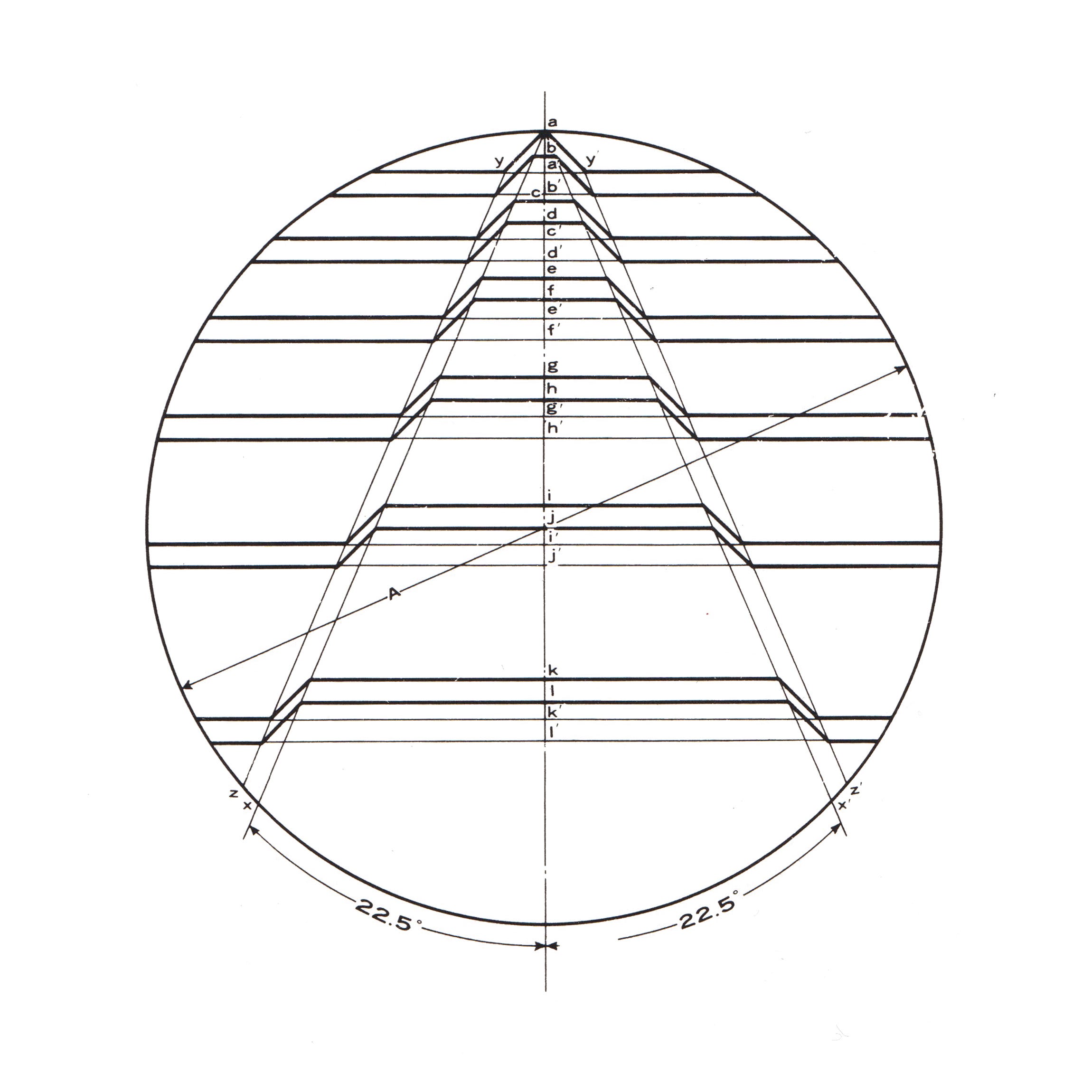
Katzumie reached out to friends in London and Paris about sending experts from ICOGRADA to the Publicity Committee to help with the selection process, however, this appeal did not succeed. From the submissions sent in from the 34 members of the BIE, it was one of three designs submitted from Japan that was selected as the official logo. Although the logo by Ueda Hiroyoshi and Furumura Makoto was favoured domestically, it was the one selected as the third best in Japan that was awarded first place. This logo continues to be used by the BIE today with only a slight amendment to the lines that saw these opened up to improve recognition when reduced down.
Want more in-depth articles? Check out LogoHistories’ extensive collection of Japanese LogoHistories
Japan Railways Logo, 1987

Having accumulated a growing amount of debt the national railway of Japan was privatised in 1987 and split into seven for-profit railway companies; six regional passenger services and one freight service. These were collectively called the Japan Railways Group or the JR Group.
Expo '85 Logo, 1981

Tanaka’s symbol was a bright blue triangle. This represented the mountains that surrounded Tsukuba, with the three points signifying ‘humans’ ‘living’ and the ‘environment’ and three parts of the exhibition: ‘mankind’, ‘housing’, ‘environment’.
A hot triangle

This post is supported by LogoArchive – The home of historical logos. Discover over 4000 of history’s greatest designs from the world’s finest designers. Updated every single day. Always find the logo inspiration you need for your next logo or branding project.
Thank you for subscribing to Logo Histories. If you enjoy reading this short you may also enjoy these resources from the same team:
Brand Archive – Research tool for brand designers.
LogoArchive Website – Searchable modernist logo archive & research tool.
LogoArchive Shop – Vintage design books & LogoArchive Zines.
BP&O – Contemporary design editorial.