Progress and harmony of mankind
Takeshi Otaka's 1965 logo for Osaka's Expo '70.
This post is supported by LogoArchive – The home of historical logos. Discover over 4000 of history’s greatest designs from the world’s finest designers. Always find the logo inspiration you need for your next project. Start here.
In 1965 the committee of the Japan World Exposition Association began its work to select the theme for the Osaka Expo, due to take place between March 15 and September 13, 1970. Following a series of meetings, the theme of this 1960s Expo was selected to be "Progress and Harmony of Mankind”, and a competition was initiated to solicit designs for the official Expo symbol from graphic designers throughout the country.



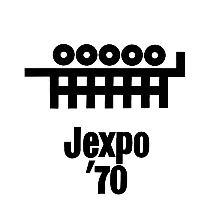
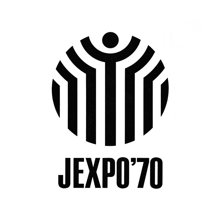
15 individual Japanese practitioners and 2 studios were invited to submit work. These included designers Yusaku Kamekura (Shell, Fuji Bank) (top left), Ikko Tanaka (Expo ‘85) (top right), Kazumasa Nagai (Expo ‘75) (bottom left) and Shigeo Fukuda (bottom right). Many of these early proposals carried with them the original name of the exhibition, tentatively titled ‘Jexpo ‘70’, which would have been a departure from the convention of previous expos.


Other submissions came from KAK Co. Ltd (top left), Ryuichi Yamashiro (top right), Koji Kato (bottom left) and Masayoshi Nakajo (bottom right).



And finally, proposals were also received from Iwao Hosoya (top left), Tadashi-Ohashi (top right), Tetsuo Katayama (bottom left) and Yuichi Nishiwaki (bottom right).
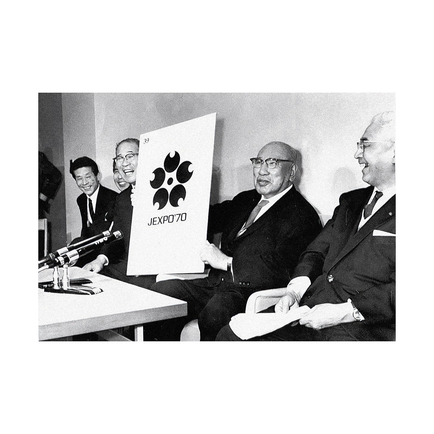
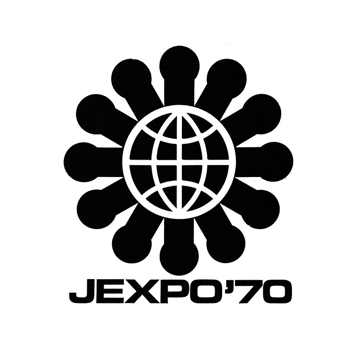
Out of 48 entries, 16 were selected in the first round, 5 were selected in the second round and finally 1 in the third round. This was designed by Isao Nishijima (above). However, Taizo Ishizaka, chairman of the Expo Association, rejected the proposal of two interlinked globes depicting East meeting West and a sun above, dismissing it as “too conceptual, difficult for a general audience to grasp”.
The Expo Association asked the designers to submit further work. Ishizaka and three vice-chairmen joined the selection committee. In April 1966, the now instantly recognisable form of the cherry blossom logo by local Osaka-based designer Takeshi Otaka was selected in an ‘almost unanimous’ decision. Writing in Issue 85 of ‘Design’ Vice-chairman Masaru Katzumie described the logo as very “Oska-like, delicious and cheerful, and with a symbolism suitable for the mark of the World Expo”
On the logo itself, the central motif was derived from the Sakura tree, more widely known as cherry blossom, the national flower of Japan. It was felt that this would be easily recognised by an international audience and clearly associated with Japan. Its five petals represented the five continents, interlinked by their circular arrangement, participating in the Japan World Expo. The circle at its centre was Japan with the surrounding space being a place in which ideas flourished between collaborative partners. The formalised geometry gave it distinction, and the ability to be reduced down and printed on stamps or scaled up to large format banners.
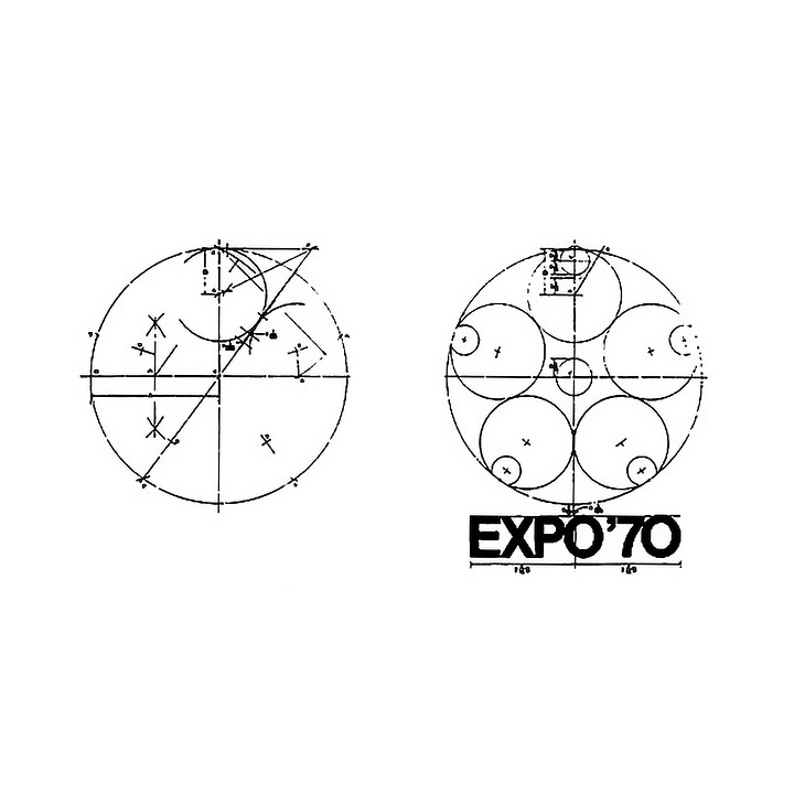

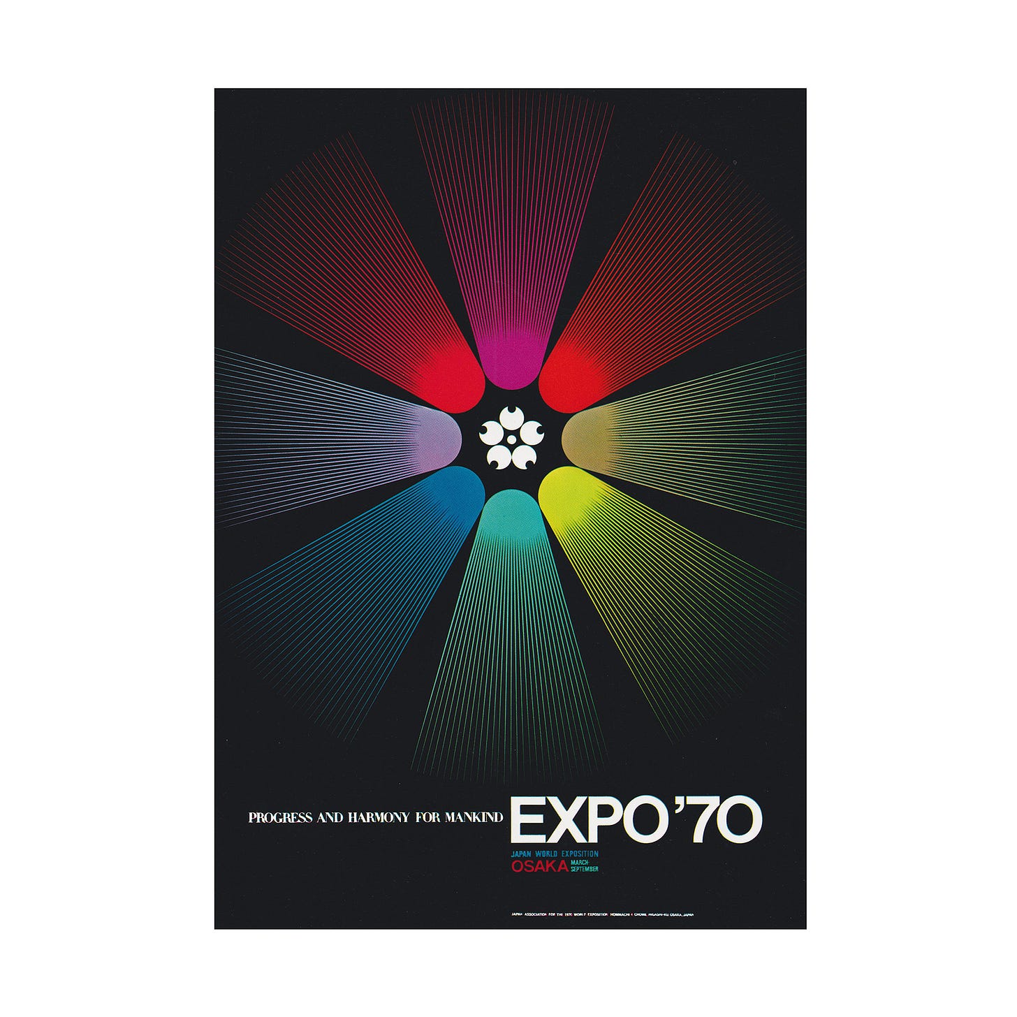
Although designed by Takeshi Otaka, much of its power came from the work of Yūsaku Kamekura who designed the international poster. Although Kamekura did submit a logo to the competition, he is often incorrectly credited as the designer of the cherry blossom logo.
Thank you for subscribing to Logo Histories. If you enjoy reading this you may also enjoy these resources from the same team:
Brand Archive – Research tool for brand designers.
LogoArchive Website – Searchable modernist logo archive & research tool.
LogoArchive Shop – Vintage design books & LogoArchive Zines.
BP&O – Contemporary design editorial.


