


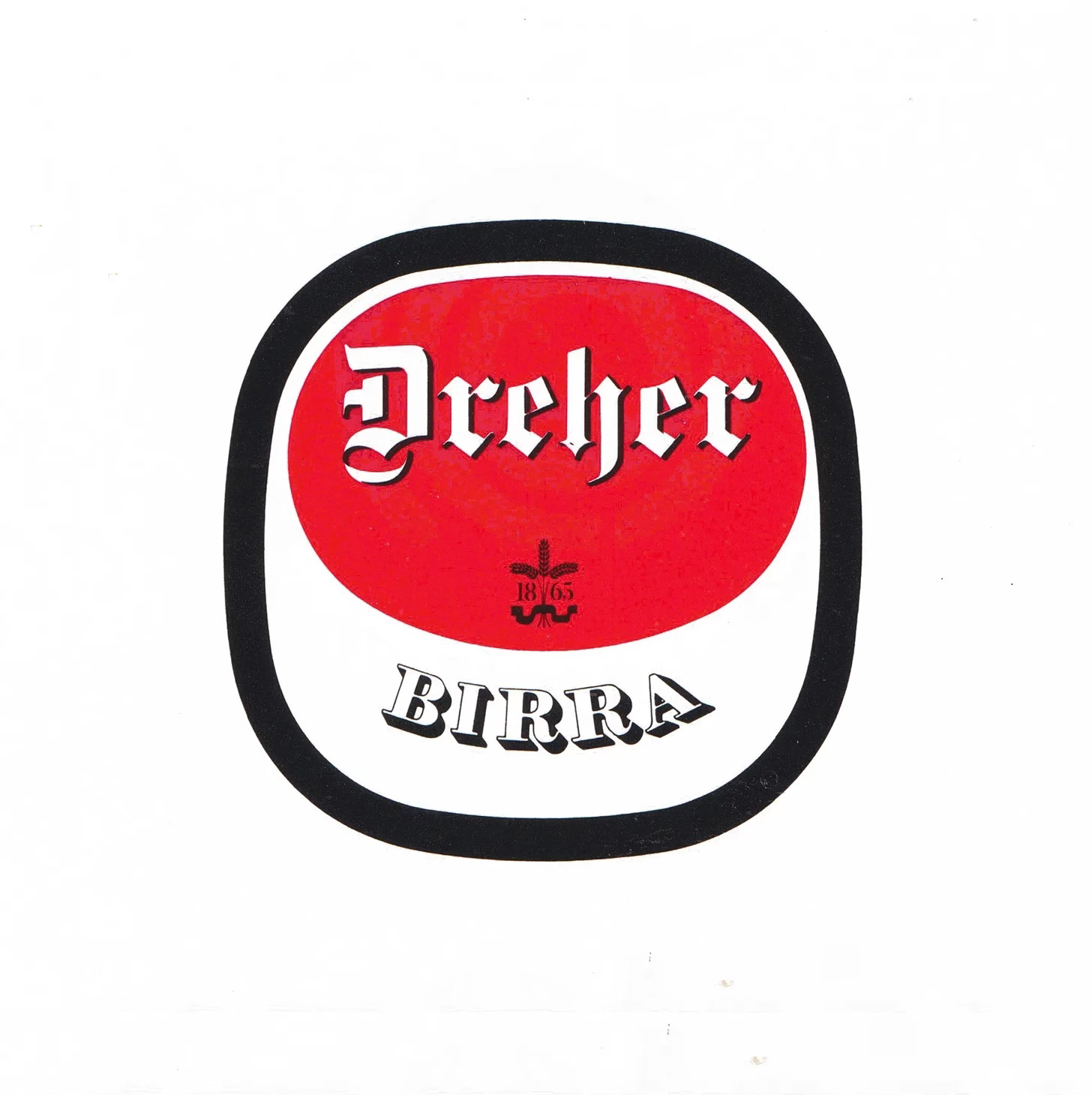
A return to the original bottle label
The Dreher brewery in Trieste dates back to 1865. Between its founding and Bob Noorda’s involvement in the 1966 rebrand, its visual identity had become fractured and incoherent. Small changes over a long period of time had created a multitude of iterations across labels, packaging and signage. The rebrand would introduce a new logo and set of corporate identity guidelines with the intention of bringing every expression of the brand into line.
In order to accommodate the growing number of applications, Noorda devised a new logo. This responded to two needs. The first was to return to the shape and essentials of the original bottle label. The second was to make the logo easier to reproduce at any size and on any material.
The logo kept the label’s central red oval and the Dreher name, but placed these within a square-based outer form so it would make for better signage. The palette was reduced to three colours, white, red and black, so they could be reproduced economically on any surface.
A gothic Dreher and a shaded Birra
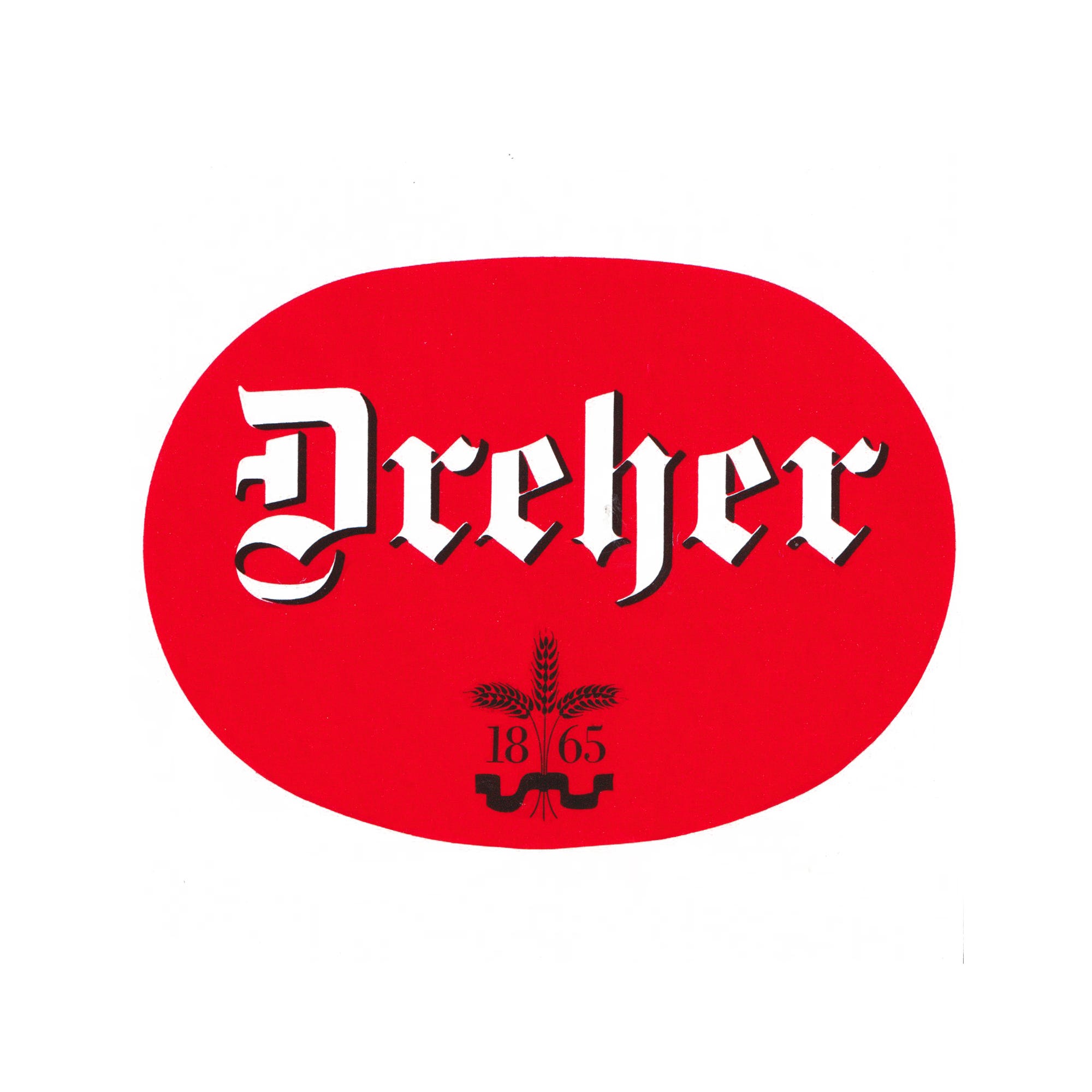
The Dreher name kept the gothic lettering used on its bottle labels. Over the years, like many brands that have used sign writers and suffered inconsistent printing, this had picked up variances, so it was returned to its original character. Fette Gotisch from 1860 was used with a drop shadow to give the name greater emphasis. Revisions were also made to the wheat sheaf to improve legibility and reproduction at different sizes.
The guidelines also stressed the importance of the word Birra. A brand name, they argued, should tell consumers what the product is from its very first appearance, without losing the sense of tradition important in brewing. With this in mind, Birra was set in Thorne Shaded.

Key Takeaways
Back to the bottle label
Bob Noorda’s 1966 logo for Dreher returned to the shape and essentials of the brand’s original bottle label, keeping the red oval and the Dreher name.
Built for reproduction
A square-based outer form and a palette of just red, white and black made the mark easy to construct and reproduce at any size, on any material.
Tradition with clarity
Dreher was set in a restored Fette Gotisch with an added shadow, while Birra, in Thorne Shaded, made clear what the product was.
Go behind the logos. Explore 200+ in-depth and meticulously researched logo histories revealing the designers, design decisions and ideas behind the world’s most iconic logos and important brand identities.
Continue reading to discover how the Dreher mark was sized for signage, how the BIRRA DREHER logotype worked and why the manual had to be strictly followed →
