


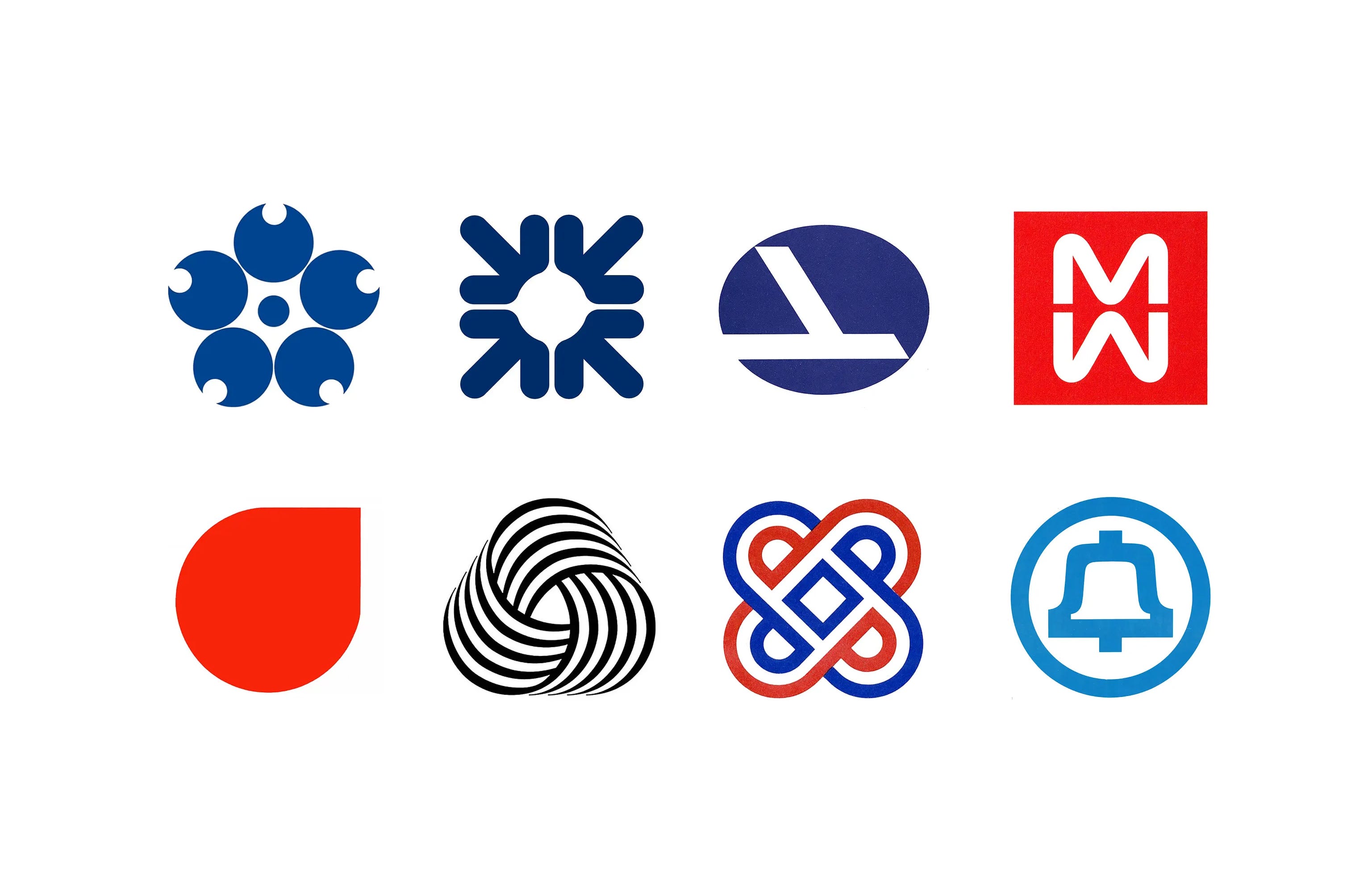
Prior to the world wars, company logos were often literal or drew on historical and heraldic imagery. Some illustrated a product; others used ornate lettering, crests or monograms to suggest heritage, provenance and craftsmanship. These approaches suited businesses and brands whose reputations relied on a specific trade or had a focused product line.
The two world wars accelerated industrial change. Manufacturers adapted their factories and expertise to meet military demand. Biscuit-tin makers, for example, began producing military supplies and munitions. These shifts developed new skills and manufacturing capabilities that could later be applied to consumer products. For some companies, peace brought opportunities to enter new markets and countries, supported by expanded facilities, experienced workforces and economies of scale.
Such diversification gave many a reason to reconsider their visual identities. A logo depicting one product could struggle to represent a business making many different things. Abstract symbols offered greater flexibility, allowing a single logo to unite different activities and remain relevant as the company evolved.
Abstract geometric forms replaced illustration, lettering, coats of arms and other familiar imagery. Designers were increasingly willing to give businesses logos that had little or no obvious meaning when first encountered.
The advantage was that these types of logos could be easily applied to a growing range of products and packaging formats. They could be heat stamped, embroidered, moulded into plastics and later, faxed. Simple geometric forms could easily be translated into physical signage abroad without the need for complex written instruction. And with the growth of television and increasingly sophisticated reproduction methods, there was an increasing need for logos that were simple, immediate and distinctive.
There was also the optics. Companies first to adopt new principles for corporate identity design were able to differentiate themselves. The use of simple forms, solid colour, functional type and rationalised layouts projected the image of modernity, and a bold new vision for future. They also gained credibility when paired with novel and advanced consumer products and services.
This was a radical shift: a logo did not necessarily need to explain a company. Meaning and value could be created over time.
Modernism had already established a visual language through art and architecture, book and poster design, a new generation of designers and consultancies were bringing these principles into corporate identity. The result was an extraordinary period of experimentation.
In 1960, Chermayeff & Geismar’s Chase Manhattan logo demonstrated the potential of pure abstraction. Its four geometric elements had no literal relationship to banking, yet through repetition and consistent application the unfamiliar shape became identifiable with the institution. Initially in four colours, it would later be reduced further down to just one, it was so striking at the time.
Other designers approached abstraction differently. Letters could be transformed until they sat somewhere between typography and image. Negative space could carry meaning. A handful of lines could suggest movement, connection or scale without depicting any of them literally.
These were not simply exercises in simplification. They reflected a changing understanding of what a logo could and increasingly had to do to be successful.
Rather than illustrating what an organisation made, the logo could become an identifier in its own right: a distinctive visual form onto which familiarity, reputation and meaning would gradually accumulate.
This idea would profoundly influence the development of corporate identity. Here are some of the logos from the 1960s documented by Logo Histories.

Chase Manhattan Bank, 1960
Chermayeff & Geismar
Four geometric elements arranged around an empty square created one of the defining abstract corporate symbols of the period. Initially unfamiliar, the mark demonstrated how repetition could turn pure geometry into corporate recognition.
Read the history of the Chase Manhattan logo →

British Transport Docks Board, 1965
A single line folded into a bollard provided Britain’s nationalised ports with an identity that could immediately be recognised across signage, vehicles, equipment and printed material.

Randstad, 1967
Ben Bos
For Randstad, abstraction became a way of representing something less tangible: the relationship between people and employment. Ben Bos developed a deceptively simple symbol from a two mirrored forms.
Discover the Randstad identity →

RCA, 1967
Lippincott & Margulies
RCA’s logo reduced three letters to bold geometric forms. The result sat somewhere between wordmark and symbol, retaining the company’s initials while giving them the immediacy of a pictorial mark.

National Giro, 1969
FHK Henrion
FHK Henrion’s work for National Giro demonstrates how simple forms could allude to a story or idea. The G of Girobank assumed a ‘double meaning of a circular arrow propelling a dot which symbolised a coin.’ The word ‘giro’ was derived from the Latin ‘girare’ - going around, so the letter also became symbolic, ‘Giro helps your money go around’.
Read the National Giro story →
From meaning to recognition
The most important shift of the decade may have been conceptual rather than stylistic. A logo no longer had to communicate everything at first glance. Instead, designers could create something distinctive, reproducible and memorable, then allow the organisation itself to supply its meaning over time. An abstract logo began empty and became valuable through use, an idea that now seems completely ordinary today.