EXPO67 Logo, 1963
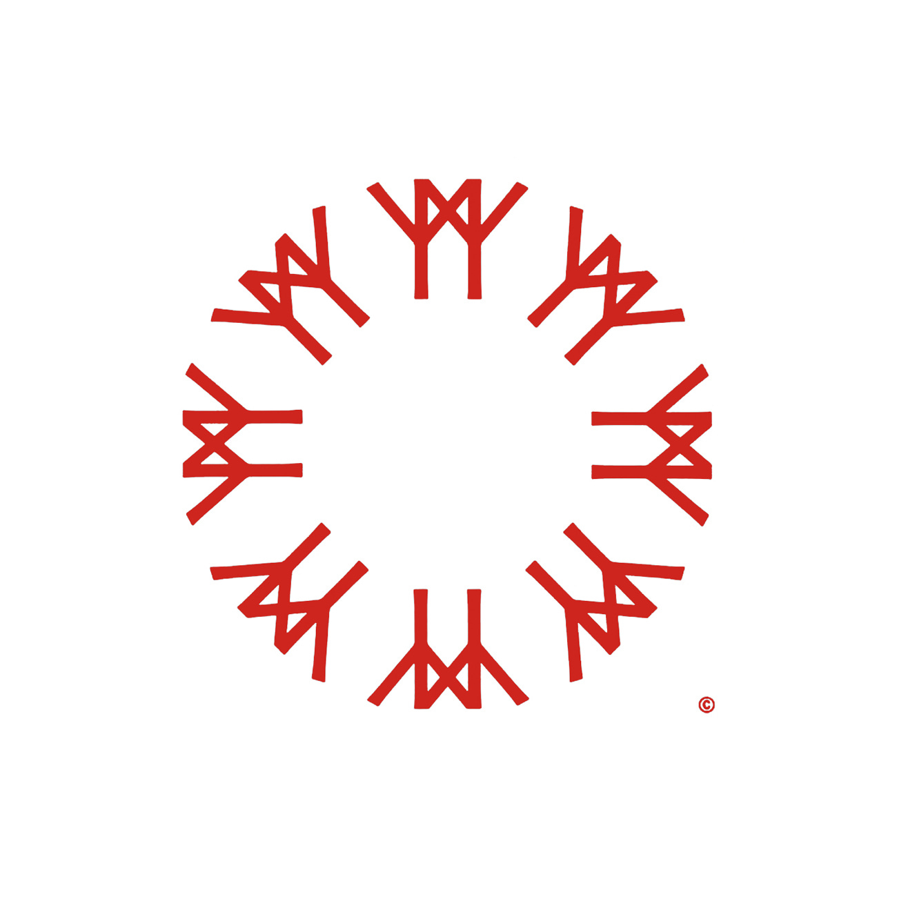
Julien Hébert's 1963 symbol for EXPO67.
This post is supported by LogoArchive – The home of historical logos. Discover over 4000 of history’s greatest designs from the world’s finest designers. Always find the logo inspiration you need for your next project here.
The theme of the 1967 World Exhibition (shortened and stylised to EXPO67) was ‘Man and His World'. It took place in Montréal and ran from April 27th to October 29th. The exhibition sought to depict humanity's exploration of the physical world, its drive to discover, understand and create; how individuals assimilate, organise and utilise knowledge for self-improvement; and, as social beings, seek to live in peace and harmony with fellow humans.
The theme was both intellectual and spiritual in nature, demonstrating how material wealth and human mental capacity have shaped human history and development. The exhibition would both entertain and inform, and offer national and international exhibitors an opportunity to showcase their products to millions of visitors.
As a design challenge, it was the first time that a graphic programme of official and commercial signage had been applied in the country at such a large scale, which was said to be the equivalent of a thousand-acre city. This vast scale required the advanced planning of a modular system which would be integrated into a ‘master planning concept’. As part of this plan would be the design of an official EXPO67 symbol, with Y. M. & B Advertising Art being invited by Communications Manager Guy Beaudry to deliver initial concepts in 1963.
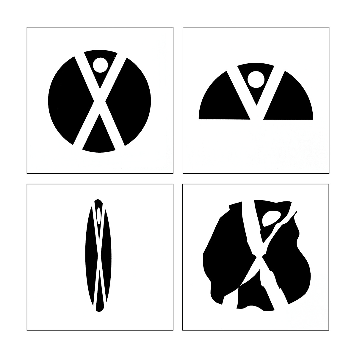
20 initial sketches were put forward by Y. M. & B Advertising Art but the general feeling was that they were ‘dismissal’. The industrial designer and professor Julien Hébert, along with Jacques Guillon, Ernst Roch, Frank Lipari and Allan Fleming were invited by Claude Robillard, director of planning, to submit additional concepts for consideration. Ernst Roch delivered a simple concept of a figure representative of man, knocked out of a circle or globe. Above, an example of a legibility study to test the recognisability of the symbol in different conditions. These included full view, partial view, at an angle and distorted on a flag.
The basic unit of the EXP067 symbol devised by Julien Hébert is an ancient cryptogram representing a figure drawn as a vertical line with outstretched arms and forming one part of a runic script that dates as far back as c.160CE. As an ‘alphabet’, these runes represent early written communication between peoples but also contains one of the first known abstract representations of ‘man’. This was coupled, copied and rotated to form a globe, which would be understood as a universal gesture of both kinship and solidarity with the international community, graphically interpreting the theme and fitting for a World Expo.
The symbol, in its simplicity, afforded those working with it a flexibility to fit many different types of applications. The symbol could be blind embossed, colour embossed or engraved. It could be reduced down to stamp size, and scaled up to signage without loosing any of its significance and identifiability. The slightly chiseled forms of the symbol, reflecting the stone-card origins of the runic reference was also mirrored in the typeface Optima which was used for the accompanying logotype. Univers was then deployed as EXPO67’s secondary typeface.
Despite the now obvious intellectual and graphic elegance of the form its recognition as the official EXPO67 symbol was very nearly derailed by bureaucratic squabbling. As Roger La Roche recounts in his article ‘A Controversial Logo’ from May, 2017, “what was supposed to have been a quick and simple operation took on unimaginable political proportions”. Read his full account here.
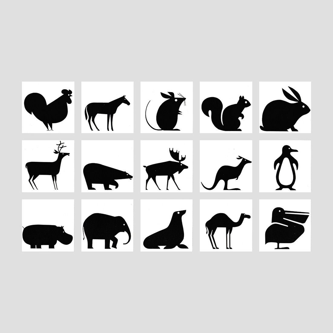
The design of EXPO67 was a monumental effort, and required a team of experts to carry out key tasks. One of which was the creation of pictograms. Animals in black silhouette were used to identify the various areas of the two giant parking lots, each of which accommodated roughly 12,000 cars. These were created by renowned Canadian designer Burton Kramer. Further pictograms were developed by Harry Boller for general amenities. These were printed black, except those activities that were prohibited and as well as the first-aid cross.
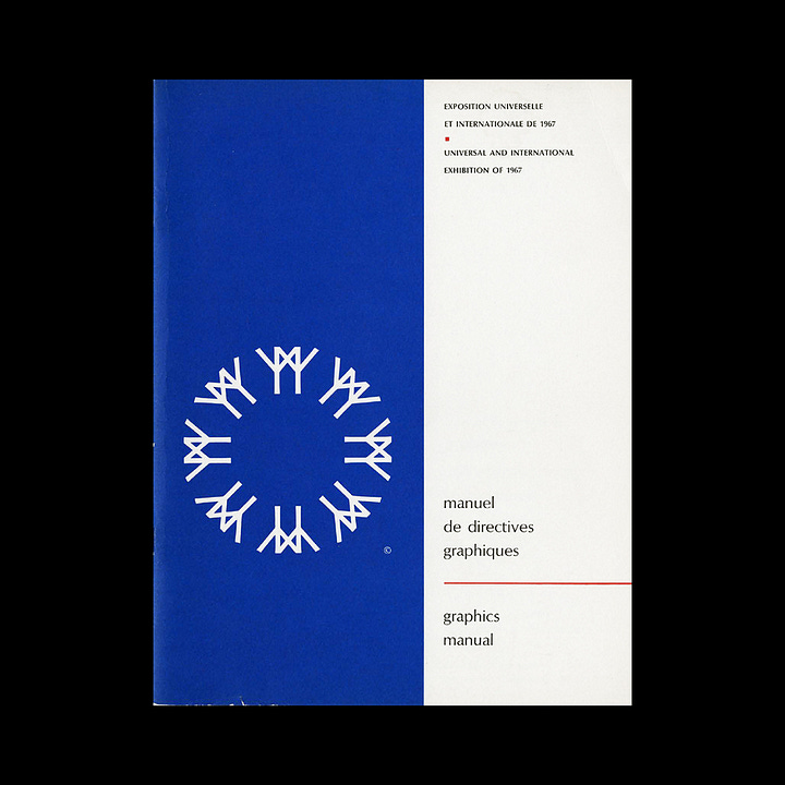
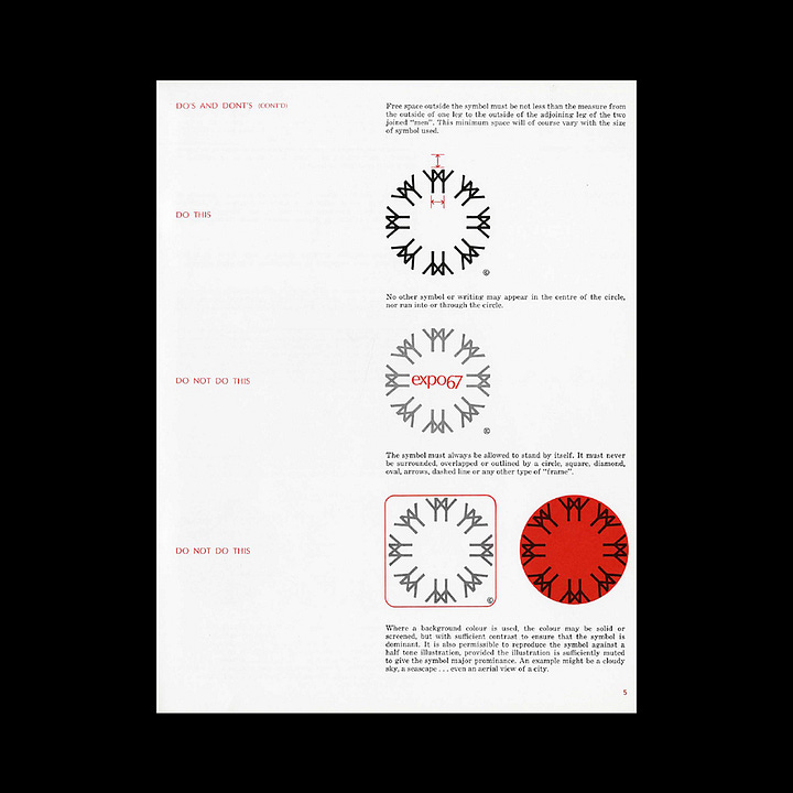
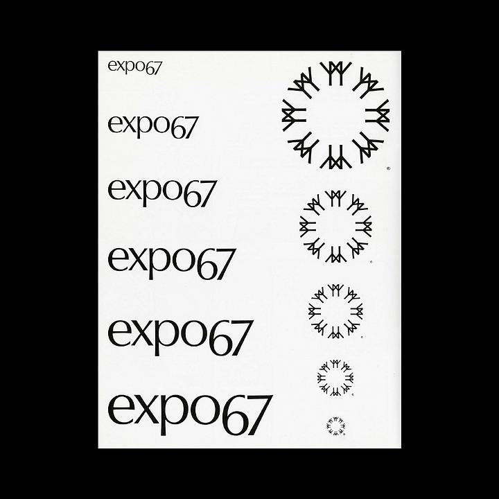
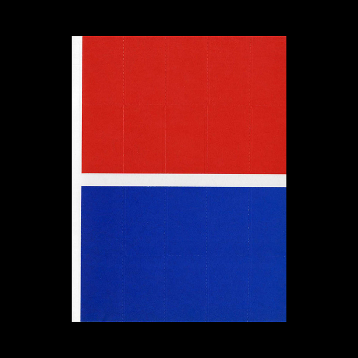
The official colours for the Exhibition, EXPO red and EXPO blue offered a simple solution to the bilingual requirements. Where both French and English were used, it was recommended that French headings be in blue and the English headings in Red, helping to delineate quickly between the two. This would also be supported by two different coloured symbols. A guideline was produced to oversee the basic and consistent application of symbol, logotype and colour.
Despite its short six month lifespan, Julien Hébert's symbol for EXPO67 lives on as a fine example of conceptual creativity and graphic robustness.
Did we miss an important detail? Did you work on or know anything more about this project? We’re listening. Share your insights in the comments section below.
Thank you for subscribing to Logo Histories. If you enjoy reading this you may also enjoy these resources from the same team:
New! Wittl – Job posting and applicant tracking tool.
LogoArchive Website – Searchable modernist logo archive & research tool.
LogoArchive Shop – Vintage design books & LogoArchive Zines.
BP&O – Contemporary design editorial.
Brand Archive – Research tool for brand designers.


