


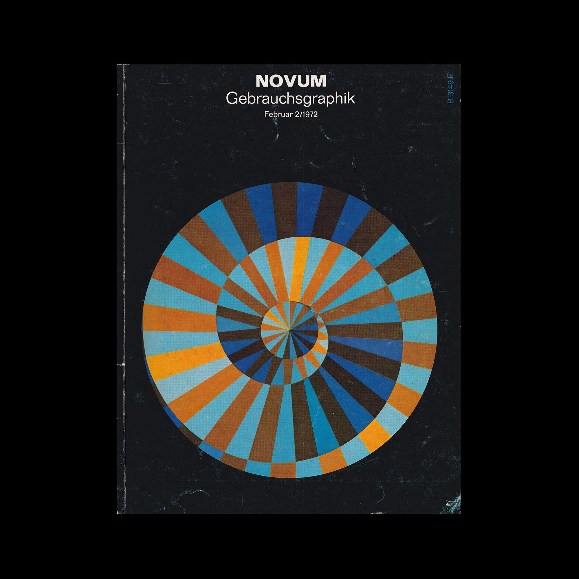
The following is an article published in Novum Gebrauchsgraphik, February 1972. It looks at Franco Grignani and his characteristic graphic style.

Throughout the many years during which Franco Grignani - graphic artist, designer and painter - has devoted himself to visual experiments, the solution of the scientific optical problem has always served as a pretext for imaginative creations in so far as the motive of his visual-perceptive modifications has always done double duty as the theme of his artistic inventions.


Our reproductions permit the identification of some characteristics of his graphic work - particularly the precision and the clarity of his pictorial messages. These two characteristics prevail no matter whether he uses photographic elements, has recourse to purely graphic constructions or applies the technique of ‘lettering’. Grignani invariably succeeds in creating a symbol which is a valid sign of our times, and many of the designs reproduced here evidence his predilection for maximum black-and-white contrasts. The result, at which Grignani arrives at with the aid of carefully planned and executed pictorial modifications (through torsion, contortion, distortion) is equally characteristic of the artist considering has ability for using geometrical as well as figural (photographic) components and fusing them into meaningful structures. Next to these activities directed towards very definite, practical ends, Grignani has always devoted himself to special problems of visual research. Here is his own comment:
Explore more like this in Famous Logo Designers and Studios →
Go behind the logos. Explore 200+ in-depth and meticulously researched logo histories revealing the designers, design decisions and ideas behind the world’s most iconic logos and important brand identities.
“Today, man no longer has a frontal view of his world. He rather sees it from the side (after the rule ‘right face’). This unfavourable situation is further aggravated by a number of additional factors such as the nervous tension of those driving motor vehicles at high speeds, the increasing intensity of traffic, the narrowing side-walks in the cities, the many restrictions imposed on pedestrians etc...”
All of those factors combine, on the subconscious level, to produce a growing distortion of the perspective, and the spatial effect of the scenery tends to be condensed by the deluge of simultaneous visual stimuli. The results of his research are reflected in Grignani's pictures, exhibition posters and industrial designs. In this way, the limits between free and applied art tend to be obliterated. The samples reproduced here prove that Grignani's artistic expression rises to unprecedented heights.
Want more in-depth articles? Check out LogoHistories’ other articles on logos by Franco Grignani →


Thank you for subscribing to Logo Histories. If you enjoy reading this short you may also enjoy these resources from the same team:
Brand Archive – Research tool for brand designers.
LogoArchive Website – Searchable modernist logo archive & research tool.
LogoArchive Shop – Vintage design books & LogoArchive Zines.
BP&O – Contemporary design editorial.