



Why Fuji Bank needed a new logo
In an attempt to restore its preeminence, having been usurped from the top position by Dai-Ichi Kangyo Bank (DKB), Fuji Bank agreed to merge with Osaka-based Sanwa Bank in the late 1970s. However, the merger failed to win approval from the Ministry of Finance. Following this, the bank sought another approach to reaffirm its position. Part of this was to develop a new logo and corporate image.
Key Takeaways
A failed merger
After its merger with Sanwa Bank failed to win approval, Fuji Bank turned to a new logo and corporate image to reaffirm its position.
Mt. Fuji in a square
Yūsaku Kamekura drew Mt. Fuji as a simple outline set within a square of equal line weight.
Blue and green for freshness
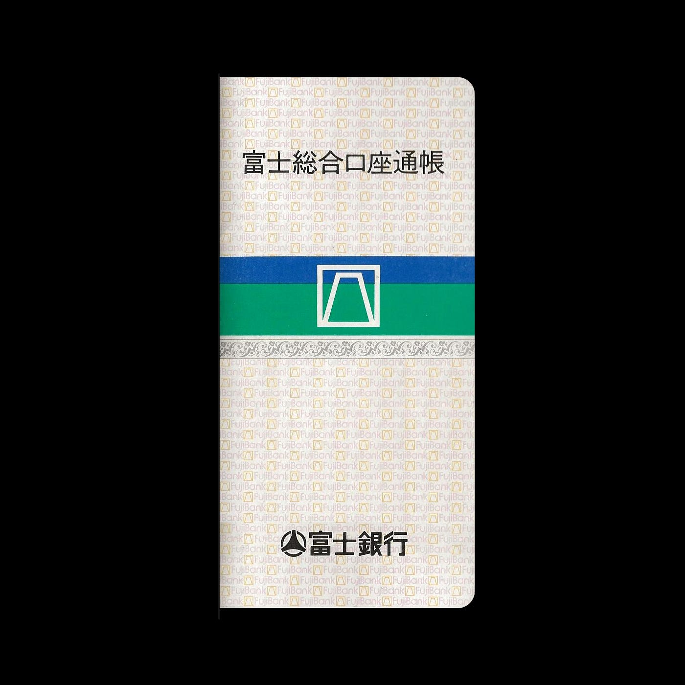
A background of one-third blue and two-thirds green gave the logo freshness and youthfulness across cards, passbooks and signage.
Explore more like this in Japanese Logos →
Go behind the logos. Explore 200+ in-depth and meticulously researched logo histories revealing the designers, design decisions and ideas behind the world’s most iconic logos and important brand identities.
Continue reading to discover how Yūsaku Kamekura shaped Mt. Fuji into the Fuji Bank logo →
Yūsaku Kamekura’s Mt. Fuji
Fuji Bank’s logo, created by renowned Japanese designer Yūsaku Kamekura, is based on the form of Mt. Fuji. This was a requirement laid down by Art Director Tatsu Matsumoto and the director of Fuji Bank.
Kamekura noted in his book “The Works of Yūsaku Kamekura” that, at the time, he was initially overwhelmed by the design challenge as Mt. Fuji was difficult to shape because, when drawn, it becomes profane. However, Kamekura accepted the commission and created a simple logo depicting Mt. Fuji as an outline which was set within a square of equal line weight.

Blue and green for freshness and youthfulness
A coloured background–one-third blue and two-thirds green–intended to give the logo a “freshness” and “youthfulness”. This dual coloured band would extend laterally across different contexts such as credit cards, passbook and signage to form part of Fuji Bank's new corporate identity. This colour pairing varied slightly across use-cases. Above is the logo presented as a PMS to hex conversion, the closest possible digital realisation.


How the Fuji Bank logo was received
As Yūsaku Kamekura later recounted, despite his initial trepidation about diminishing the spiritual power of Mt. Fuji, the logo and corporate image was well-received and the bank was pleased. Following the introduction of the logo and new design policy customer deposits increased.
Want more in-depth articles? Check out LogoHistories’ other articles on Yūsaku Kamekura logos →


