Shorts: Ibaraki Prefecture 茨城県旗
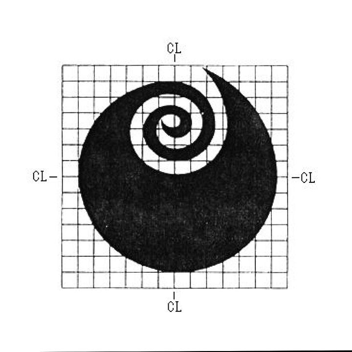
Kazumasa Nagai's 1991 symbol for the Japanese prefecture of Ibaraki
From the Editor: We have a lot of stories to tell, some of these are short but fascinating. Logo Histories Shorts is an additional free post that will bring these to our readers. To access our longer fully illustrated Logo Histories and support the project, upgrade to paid. A special thanks to those who have already done this. I hope you enjoy these additional insights.
Japan is divided into 47 prefectures which fall below the national government and form the country's first level of jurisdiction and administrative divisions. Each prefecture has its own symbol and, in the spirit of ‘mon’, the traditional crests of Japanese families and clans, they are often influenced by traditional lettering or the natural environment.
The earliest iteration of the Ibaraki prefecture symbol was designed in 1911. This was a stylized rose created from the characters イハラキ, the katakana version of “Ibaraki”. This was later updated and modernised in 1966 by the designer Takeshi Yamazaki.
In 1991, it was decided that the idea of using イハラキ had never been fully-grasped and supported by the citizens of the prefecture so Kazumasa Nagai was asked to design a new symbol. This new design would also commemorate the prefecture’s 120th year.
The logo devised by Kazumasa Nagai follows in the tradition of Japanese 'mon' by evoking the natural landscape of the surrounding area, a region that borders the Pacific Ocean northeast of Tokyo. The flowers of Ibaraki prefecture and, in particular its rose buds, became the key motif, while the swirl alluded to notions such as 'advancement, 'creativity', 'dynamics' and 'development'.


The design was not without controversy. Comparisons were made with the Naruto City prefecture logo. This featured a spiral, a symbol of the Naruto Whirlpools. When rotated 180 degrees the spirals of the rose bud and those of the whirlpool appeared similar. Regardless, the symbol continues to be used by the prefecture.
If you enjoyed reading Logo Histories Shorts also check out these projects:
Brand Archive (Beta) – Research tool for brand building designers
LogoArchive Website – Searchable modernist logo archive & research tool.
LogoArchive Shop – Vintage design books & LogoArchive Zines.
BP&O – Contemporary design editorial.
Extra Issue – Unlocking opinion and insights from the past.


It's a lovely logo to represent the roses and advancement in science. Tsukuba City, the "science city" has a big rose garden.
One small quibble. The katakana for the modern pronunciation is イバラキ with a diacritic on the second kana to change the sound from ha to ba.