IBM Stripes
The design process and stripes of Paul Rand's logo for IBM
This is the second part of a two-part series.
Click here to read the first part.
Design Process
Prior to Rand’s involvement the IBM logotype was typeset in Beton Bold Condensed. In this form the logotype was said to be neither unique or exclusive. It had poor legibility from a distance and was vulnerable to substitution by printers, a common practice at the time. This made it impractical. It was, however, felt that this first version made positive steps forward, presenting IBM in a direct, unaffected, non-stylish way and had cultivated a general acceptance of the initials IBM in the minds of the company’s customers.
Rand felt that the company was on the right track with a simple "IBM" mark. It was absent any symbolism that might restrict its usefulness or become dated as the company expanded and diversified. With this in mind, Rand focused on designing a distinctive "IBM" that had good visibility and couldn’t be substituted with commercially available typefaces.
The new logotype, as a result of these considerations, was seen as not too much of a departure from the logotype it replaced and eased in its introduction. Furthermore, in its simplicity, it could be used in a wide variety of contexts without undermining its recognition and authority. Uniqueness came in the shape of rationalised geometric letterforms, square counters within the "B" and the flat serifs of the "M".
With it being so simple, the logotype could receive any number of treatments and print finishes such as spot colours, embossing and foiling.
Rand’s logotype and the design policy developed with Eliot Noyes, created the capability for great variation whilst also delivering continuity. It offered the many designers working with the logotype an aspect of creative freedom.
IBM Stripes
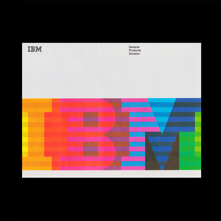
In Design Quarterly, A Paul Rand Miscellany, No. 123, Rand writes about stripes, and their role in nature and society, referencing flags and zebras. He describes them as dazzling, sometimes happy and hypnotic and attracting attention.
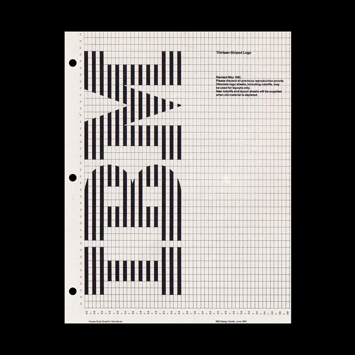
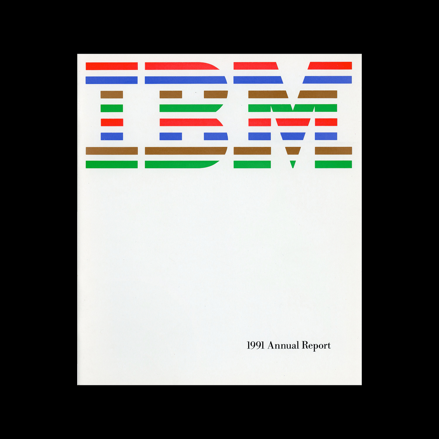
The stripes used in the IBM logotype function, as described by Rand, as an “attention grabbing device”. The stripes take the letters out of the realm of the ordinary and imbue them with a memorability. They suggest speed and efficiency. The stripes also tie disparate letterforms together, resolving the increasing width of the characters I, B and M (and the feeling of an open ended sequence), to create a single and unified form.


If you enjoyed reading Logo Histories also check out these projects:
LogoArchive Website – Searchable modernist logo archive & research tool.
LogoArchive Shop – Vintage design books & LogoArchive Zines.
BP&O – Contemporary design editorial.
Perspectives – Unlocking opinion and insights from the past.
Asset Converter – Save time by automating client asset creation.


