Japan Tobacco & Salt Logo, 1979
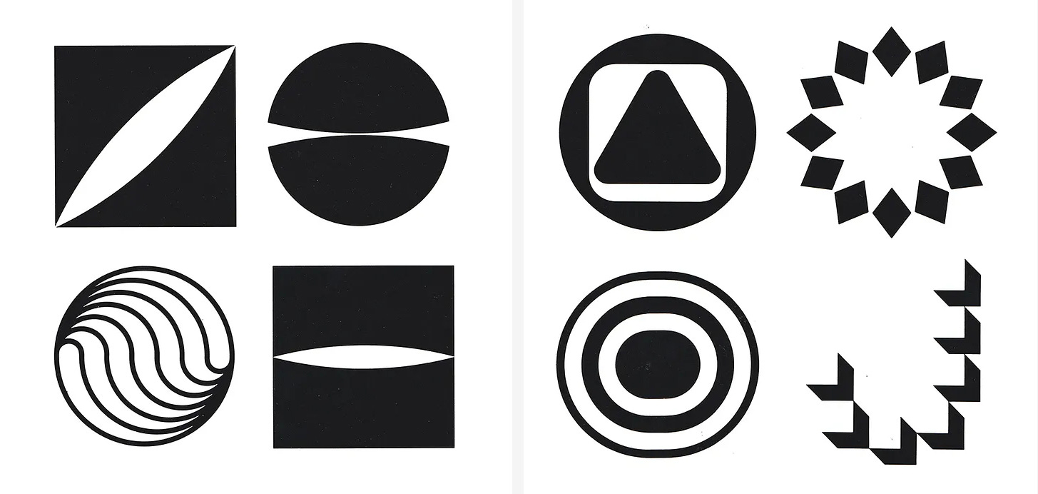
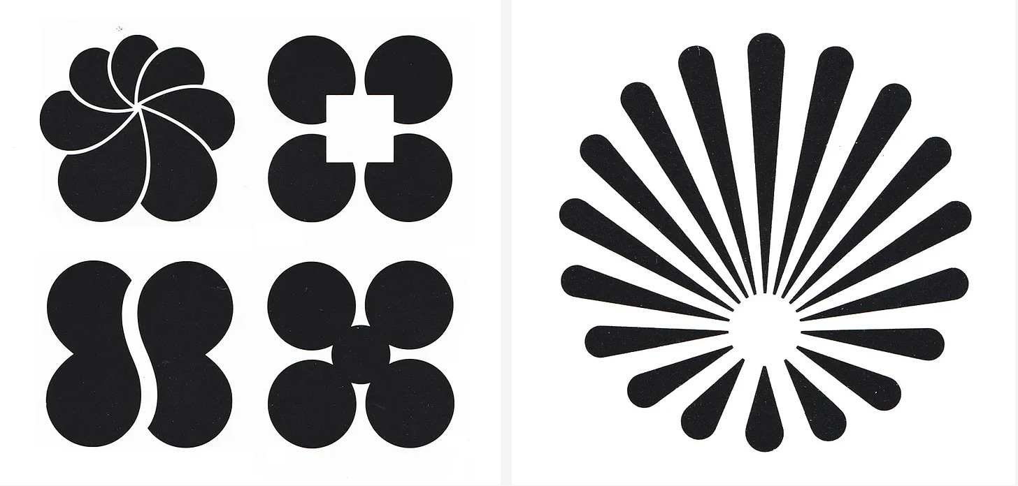
Takahisa Kamijo's 1979 logo for Japan Tobacco & Salt Public Corporation.
This post is supported by LogoArchive – The home of historical logos. Discover over 4000 of history’s greatest designs from the world’s finest designers. Always find the logo inspiration you need for your next project. Start here.
Japan Tobacco & Salt Public Corporation (日本専売公社, Nippon Senbai Kōsha) (JTSPC) began as a nationalised monopoly set up by the Japanese government in 1898 to secure tax revenue from tobacco and salt sales. JTSPC remained a state monopoly until 1985, after which it became the publicly-traded Japan Tobacco Inc. Ahead of this change, in 1979, JTSPC looked to formalise aspects of its visual identity, using the format of a closed competition to source a new logo, with eight designers competing anonymously.
Masaru Katzumie, having successfully directed large design programmes such as Expo '70, the Sapporo Winter Olympic Games and Expo ‘75, was appointed by JTSPC to oversee the competition, selecting the designers and jury members.
Katzumie consulted with Yusaku Kamekura, who was in agreement with him on the final list of designers who would be asked to submit propoals. These would be Shigeo Fukuda, Takenobu Igarashi, Kazumasa Nagai, Makoto Wada, Takahisa Kamijo, Masayoshi Nakajo and duo Gan Hosoya and Tadasu Fukano. Kamekura also wanted Ikko Tanaka to join the list, however, Katzumie felt that Tanaka would be better-placed alongside himself and Kamekura on the judging committee.
The request put forward by the JTSPC was to express the enterprise in a way that suggested it was in the business of helping to create a ‘comfortable life’. And that this be done in a way that wasn’t too concerned with tobacco and salt. Further, the chosen logo would need to work across flags, employee badges, door plates, letters of commendation, stationery, products and print advertisements.
The designers produced a number of different proposals each, submitting between four and eight, except Masayoshi Nakajo who, enthusiastically, produced a total of eleven.
Despite the difficulty of the theme, which he considered difficult to grasp and visualise, Kamekura felt that all the works contained ideas and forms that were distinctive from one another.
When it came to judging and voting, each entry was numbered and the designers anonymised. As the theme was abstract it was difficult for the judges to unify their thinking. However, gradually, adjusting their differences and finding a consensus, with an ‘emphasis being placed on the designs with beautiful form and a providing a strong impression’ they narrowed the field down to a shortlist of just ten. Finally, the one with the most points was selected.
Writing in Issue 78 of Graphic Design magazine, Kamijo Takahisa shared his thoughts and experience producing concepts for the competition.
“To grapple with such a theme as tobacco and salt, which have vague images, was like trying to grab smoke. On top of that, how could I understand and express the image of a public corporation which is also a semi-government company?”
“Unable to solve this difficult problem, I became anxious and impatient. It was like a maze which could be entered into from various entrances, but which actually had no entrance. It was like a looping highway which had no beginning and no end. I energetically came up with various ideas just like a sumo wrestler scattering salt before a bout, but I was unable to come up with a winning idea and the deadline arrived, so I submitted several ideas. The one I liked the best was eventually selected.”
The design submitted by Nakajo, which combined a tobacco leaf and salt crystal was considered by Kamekura as particularly outstanding. This work competed with Takahisa’s leaf design right up until the end. Opinions were then exchanged between the judges and the JTSPC, and it was decided that Takahisa’s design would be the one adopted.
After the judges were told that the selected design was the work of Takahisa they couldn't believe it. Saying that it was an established theory at the time that a designer’s individuality appears strongly in marks he creates but in this case, it wasn’t. It seemed that the competition and theme was confining for the designers, and that their individuality only really becomes apparent when they are given sufficient leeway.
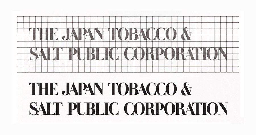
The logo was in use up until the formation of Japan Tobacco Inc. in 1985 as the organisation between a group and expanded its activities. The logo devised by Takahisa Kamijo was replaced by a logo and logotype created by Dentsu and designers Ray Yoshimura and Akira Ishikawa
Thank you for subscribing to Logo Histories. If you enjoy reading this you may also enjoy these resources from the same team:
Brand Archive – Research tool for brand designers.
LogoArchive Website – Searchable modernist logo archive & research tool.
LogoArchive Shop – Vintage design books & LogoArchive Zines.
BP&O – Contemporary design editorial.


