The age of mechanics
Bob Noorda, Roberto Sambonet & Pino Tovaglia's 1975 symbol for Lombardy Region.
This post is supported by LogoArchive – The home of historical logos. Discover over 4000 of history’s greatest designs from the world’s finest designers. Always find the logo inspiration you need for your next project here.
The following article, ‘Twelve Paragraphs for the Symbol of the Region’ was written by Franco Fortini and included in the book Bob Noorda Design published by Moleskin in 2015.
The Region is a Modern Idea
The Lombardy Region is a modern idea. Throughout its history, the region has always been an extremely important geographical, political and cultural reality; but this is not the Lombardy that now surrounds us, whose emblem we are discussing here. For a very simple reason that could easily pass unnoticed: in recent years, Lombardy has developed as part of a united Italy, and not as a separate entity.
The images and emblems adopted after the Unification of Italy were able to evoke diverse regional realities of the past. Whereas it is quite evident that in the seventh decade of this century the Lombardy region cannot be represented by images of the past.
Renouncing the Middle Ages
Yet it was not easy to forego historical emblems, from the age of the Commune to that of the Duchy and the Risorgimento.
The images associated with those centuries - Aribert and the Carroccio of Legnano (a four wheeled war altar), the Visconti and the Sforza, Leonardo and Gaffurio, Stradivari and Volta, On Crimes and Punishments, the History of the Infamous Column and Notizie storiche sulla Lombardia - are quite "unforgettable" - as they say. That is why, if they are not forgotten, they must at least be given secondary importance. Just as the great Lombard minds of the last century favoured innovation - whether successful or not - over conservation. A nostalgic devotion to the past had already enveloped those images.
The Roman and Gothic periods in Lombardy, with their Carrocci, crusades and Biscione, had already been a lasting source of ideas for novels and romances, from Berchet to Carducci; the Renaissance period, on which Leonardo left his mark, had been widely revived by the time of Umberto I and Giolitti.
Milan as the Present Age
After 1945, the region became a hub of industry, commerce and banking and, above all, expanded into and beyond Europe. This wide range of activities and goals has raised the Lombard people's awareness of the extraordinary variety of their historical roots and heritage, which goes far beyond the circle of Spanish walls and ring roads that surround Milan. Despite Gonzaga and Venetian domination, Mantua and Bergamo are still Lombard cities; the prehistoric pottery of Golasecca, the Etrusco-Gallic artefacts and those of the Roman Brescia, and the Longobard bastions of Castelseprio, all pertain to Lombardy.
As the third millennium approaches, Lombardy can look far beyond the beginning of our era. Or to put it more simply, reflecting on the regional emblem has led us to extend the historical context. It was necessary to seek and find something that originated in a more distant past, but one familiar to us, if the emblem was to be effective in the future.
Leonardo's ‘Knot’
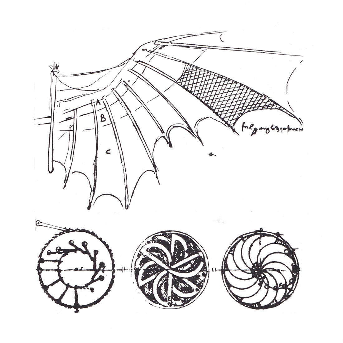
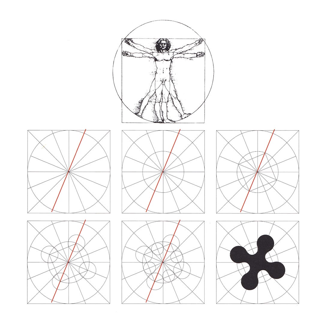
Here Leonardo's lesson came in useful. The master often worked with emblems - the wheel, the wave, the wing - and the importance of these visual obsessions as conceptual abstraction and notions of the mind is well-evident. Leonardo is still linked to the world of symbols and allegories through nis formation, as we see from reading his fables, but he also goes beyond them to establish patently intellectual relationships and dynamic contrasts in things - and the intelligence of things. We focused particularly on the Leonardesque concept of "knotting" and "unknotting", of "winding" and "unwinding".
In so many of his projects there is a tension between centre and centrifugal, between pivot and articulation. It was not Leonardo's graphics that we considered perfect but dated, but rather his ability to create self-contained signs with multiple meanings, like the knotting and unknotting sign.
More Sign Than Symbol
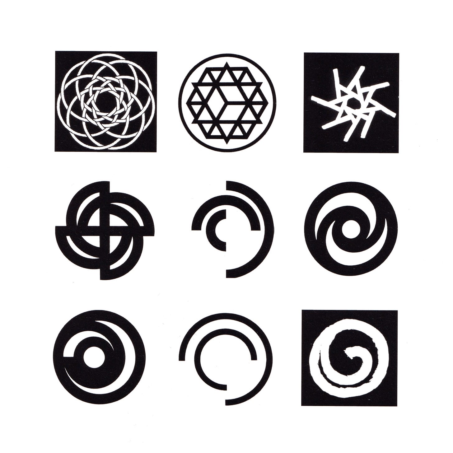
This was also why we believed that the emblem of the region should focus on the character of the sign, whereas that of the symbol should be diminished or at least played down. In short, we did not want something that "alluded" to Lombardy, that was a metaphor or allegory of the region.
Instead, we needed a simple, clear sign that, first and foremost, had a value in itself and was also associated with the idea of the Lombardy Region.
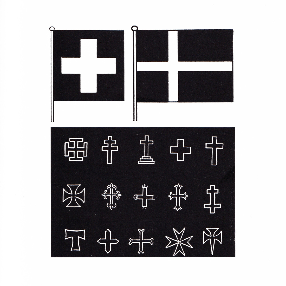
Like the "+" sign that commonly means "growth", or the abbreviation "etc." that is usually held to indicate an incomplete series of things. We sought to create a sign that embodied as far as possible the abstract quality of road signs and signalling flags. (Besides, the symbolical meanings of heraldry and national flags have diminished over time: a graphic element stands for the name of a given country, nothing more. It is not coincidental, therefore, that one of the strongest points of contemporary graphic design lies in its giving added meaning to the essential graphic form - the "logotype" - of a word). To conclude, we favoured a sign that (a) was essential and mainly abstract, as memorable as a seal, and easily reproduced; and (b) whose form was able to represent a range of values and trigger associations, especially those relating specifically to the Lombardy Region.
The Camunian Rose
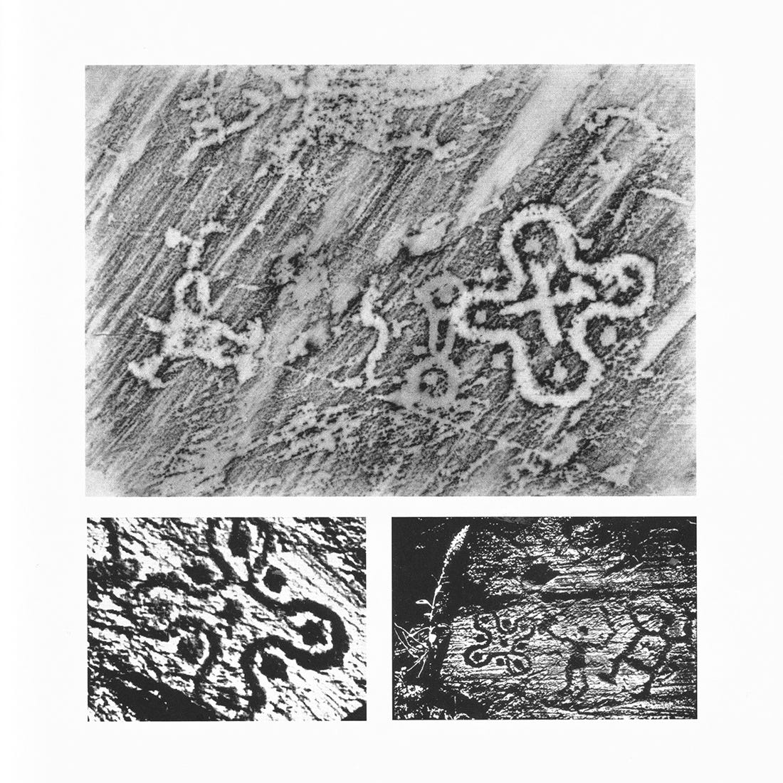
The Bronze Age populations who inhabited the Valle Camonica left thousands of engravings on rock walls and boulders.
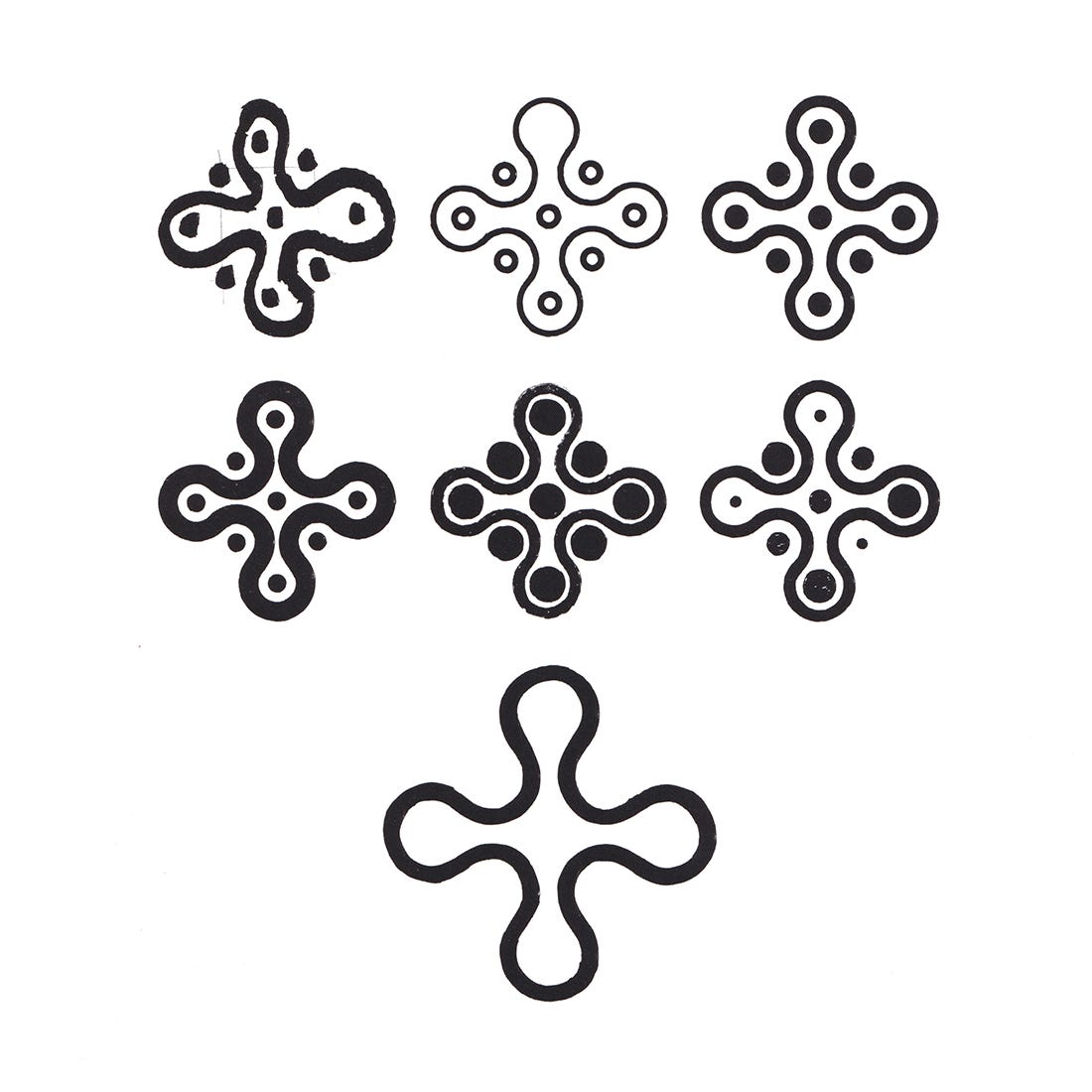
Among them is the intricate and characteristic sign known as the Camunian rose, left by a people of Celtic origin, the Camuni, after whom the valley was named Perhaps it was a sign used to show hunters in which direction the herds were moving; or the diagram of the musical instrument known as the sistrum. It is composed of nine cup signs, in sequences of three, placed within the curve of four lobes, petals or arms.
The Place of Engagement
This is the sign that was chosen as the starting point for the emblem of the Region.
The idea of representing the lively quality of the nine cups was quickly discarded: the varied effect was pleasing but soon would have worn thin. An emblem is destined to last and even if it is necessarily linked to the time in which it is created, it must go beyond that time. In redesigning the four spherical elements of the rose, we focused on a specific point of tension and balance, among the many rendered possible by the inherent movement of the volumes and curves. But in the relationship between the divergent elements and the centre, the latter was not to prevail. It was exactly like Leonardo's "knot": the place of giving and having, of offering and receiving, of the centre one arrives at and from which one departs, and of "engagement".
Angle and Movement
Verticality would have immobilized the sign. The emblem of the Lombardy Region, which we shall now call a quadrilobate cross, is inclined towards the north-east, as if the four arms were pointing to Voghera, Bormio, Ostiglia and Luino, all of which lie on the border. The angle prevents the emblem from being static, indeed, it creates a clockwise movement: it is wheel and turbine; flywheel and steering wheel. It also has an upward thrust and seems to take off - since we are so inclined to see a cross as a figure with a head.
Topicality
The sign incised in the stone of the Valle Camonica has an essential meaning. This stems from its antiquity, from its having been created by a people that, perhaps three thousand years ago, joined with others who had descended for water or come up from the Tuscia region and crossed the River Po, to form the ethnic group from which the Lombards are descended. Men of contemporary culture, as we said earlier, consider less remote those times that only fifty years ago were seen as belonging to an unspecified prehistoric period.
Other Readings
The emblem also represents the plan of a feudal castle, the shape of a rose window and the cross section of a Gothic pillar. But its geometric quality - Lombard school children could easily draw it with a ruler and compass - also links it to the age of mechanics, of technical drawing and design; in fact, it is also the section of an extrusion or a girder.
The Colour
The emblem is white on green. The significance of these two colours for the Lombard people is so evident that it needs no explanation. The atmospheric quality that characterizes regional painting, from Foppa to Morlotti, reflects the abundance of waters and pastures in the land. The georgic period of the Lombard plains, which lasted from Virgil to Parini and beyond, is attested by the indexes of dairy products, of animal fodder and the raising of livestock. It is understandable, therefore, that the sign should not only possess clarity but also play on inversion, the reversed image: the four arms become as green as the grass that is a good omen.
The Applications
The applications and the various sizing, materials and functions cannot be considered here. Flags and posters, seals and headings will be developed from a single, unmistakable graphic sign. Anyone in Italy who sees it must immediately think "Lombardy", associating with the symbol one of the adjectives commonly - but also rightly - used to describe the Region. Whoever sees it, in Italy or abroad, will immediately know to which order or level of contemporary culture it refers and why it was chosen.
Thank you for subscribing to Logo Histories. If you enjoy reading this you may also enjoy these resources from the same team:
Brand Archive – Research tool for brand designers.
LogoArchive Website – Searchable modernist logo archive & research tool.
LogoArchive Shop – Vintage design books & LogoArchive Zines.
BP&O – Contemporary design editorial.




Great site - however the justification for the development of this logo seems so over-the-top…if u have to offer that much explanation is it really successful? Also this particular mark and its relationship to Lombardy’s prehistory origins seems pretty obscure & not fully expressive of the region and its remarkable history. Time to redesign…