The spirit of the age
The story of Walter Ballmer's 1971 logotype for Olivetti.
This post is supported by LogoArchive – The home of historical logos. Discover over 4000 of history’s greatest designs from the world’s finest designers. Updated every single day. Always find the logo inspiration you need for your next logo or branding project. Start here.
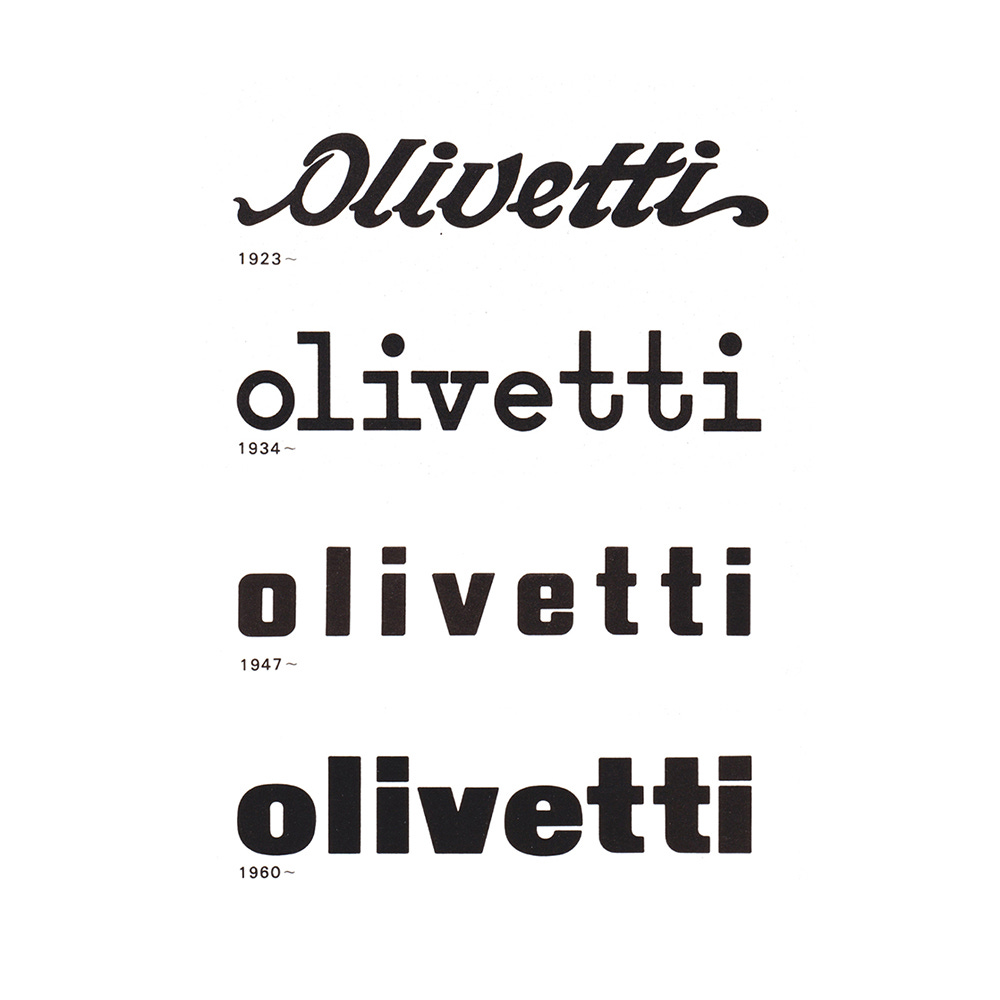
By the late 1960s the Olivetti logotype had undergone five distinct changes since its founding in 1908, with each lasting for around a decade. As Olivetti was originally a typewriter manufacturer, the design of the logotype was of ‘special concern’ with the belief that the typestyle not only reflect the spirit of a particular age but express the corporation’s contemporary concerns.
Want to see more of this brand? And thousands of assets from hundreds of other brands like Adidas, Pepsi and Coke? Join Brand Archive.
This began in 1923 with a logotype created by founder Camillo Olivetti. This was decorative, and very much in keeping with the art nouveau flourishes of the time. This was followed in 1934 by a typewriter inspired Universal Pica logotype by Xanti Schawinsky that better reflected the mechanical nature of the product. Schawinsky would later design a further logotype in 1947 that improved the immediacy and impact across advertising with bolder and more broadly spaced letters.
Continue reading to understand the context of the redesign. Learn about the design process and see examples of early concepts.


