A union of five continents
The story of Coubertin's 1913 logo for The Olympic Games.
This post is supported by LogoArchive – The home of historical logos. Discover over 4000 of history’s best designs from the world’s finest designers. Always find the logo inspiration you need for your next project here.
The idea for reviving the Olympic Games as an international competition came to French educator and historian 'Le baron de Coubertin' Charles Pierre Fredy de Coubertin in 1889, and he spent the next five years bringing together both athletes and sports enthusiasts to make this happen. These individuals became the International Olympic Committee (IOC) and, in the summer of 1896, the IOC opened the Games of the I Olympiad. At this point there was not a unifying symbol, but a wreath was a recurring motif in posters and advertising. Coubertin had also designed an open crown motif made up of olive branches, similar to the awards of the ancient Games. This was used on the official letterheads of the IOC.
In 1913, three years after failed attempts to create a unifying visual language, and following the 1912 Stockholm Games which was the first to include athletes from all five continents, Coubertin began work on a symbol for the Games.
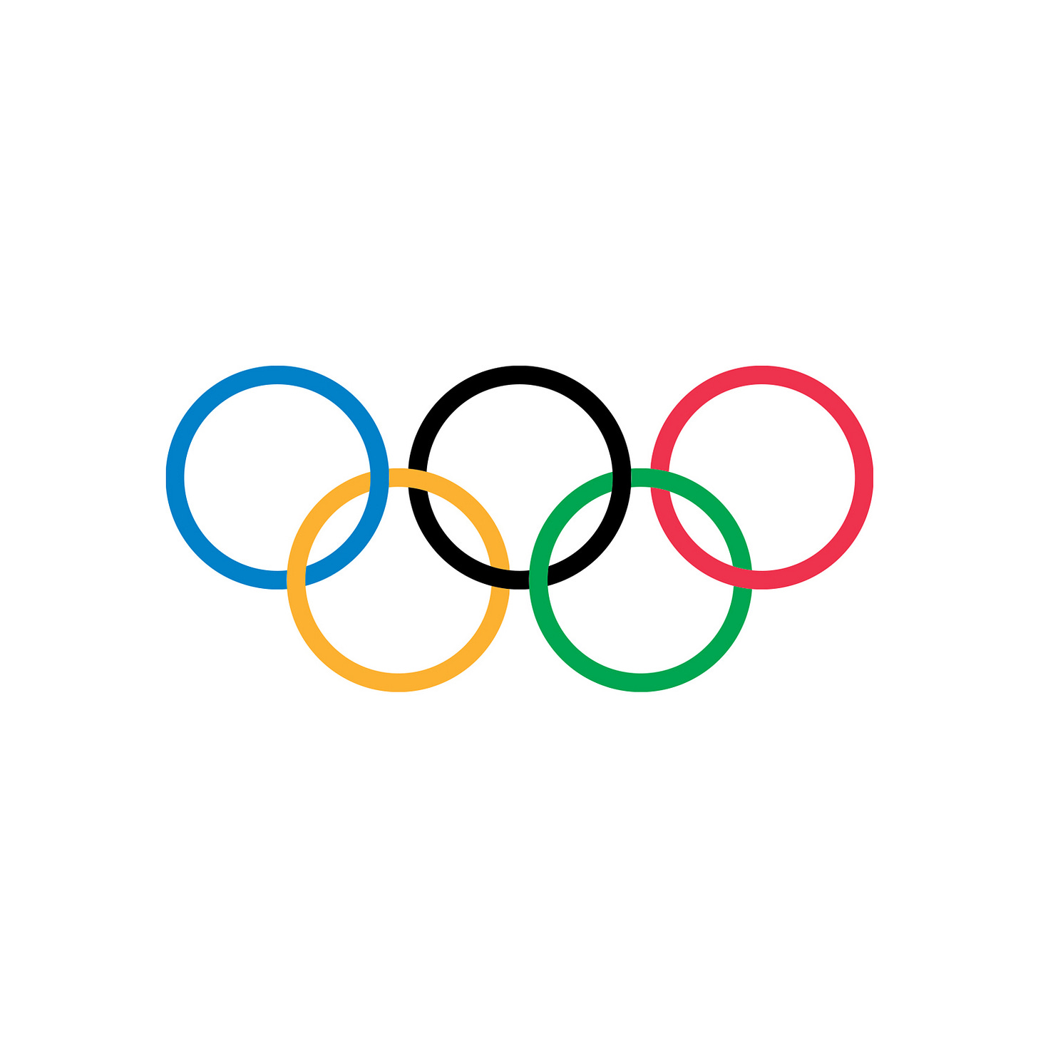
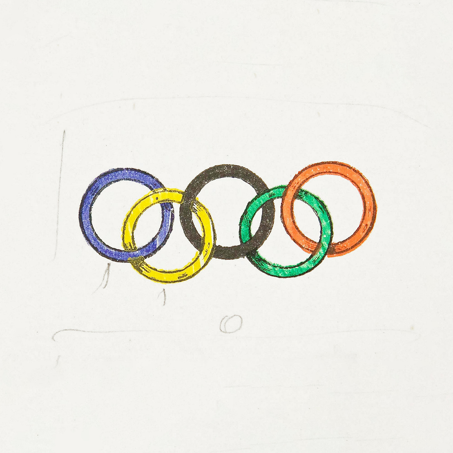
Coubertin’s design–now an iconic and powerful image, first used for the 1920 Games in Belgium–was of five rings of equal dimensions, representing the union of the five continents. The interlocking composition of the rings was a gesture of the universality and community of Olympism and the meeting of the athletes of the world. This symbol was likely inspired by the logo of the USFSA (Above: Union of French Athletic Sports Societies), which Coubertin co-founded in 1890. This features two interlocking red and blue rings. Historian Karl Lennantz proposed that Coubertin may have also been inspired by a Dunlop tires advert, illustrated with five bicycle tires, and featured in a magazine read by him.
The five interlinking rings was initially used by Coubertin on his own letterhead, then as the emblem of the IOC’s 20th anniversary celebration in 1914, and finally presented to and accepted by the Olympic Congress in Paris. 1916 was supposed to be the first time the Olympic Rings was to be used, however, the Games was cancelled due to the continuing conflict of WWI. Not known to many, the colour principle draws its inspirations from the flags of the world. With at least one of the five colours being part of the design of each country’s flag.
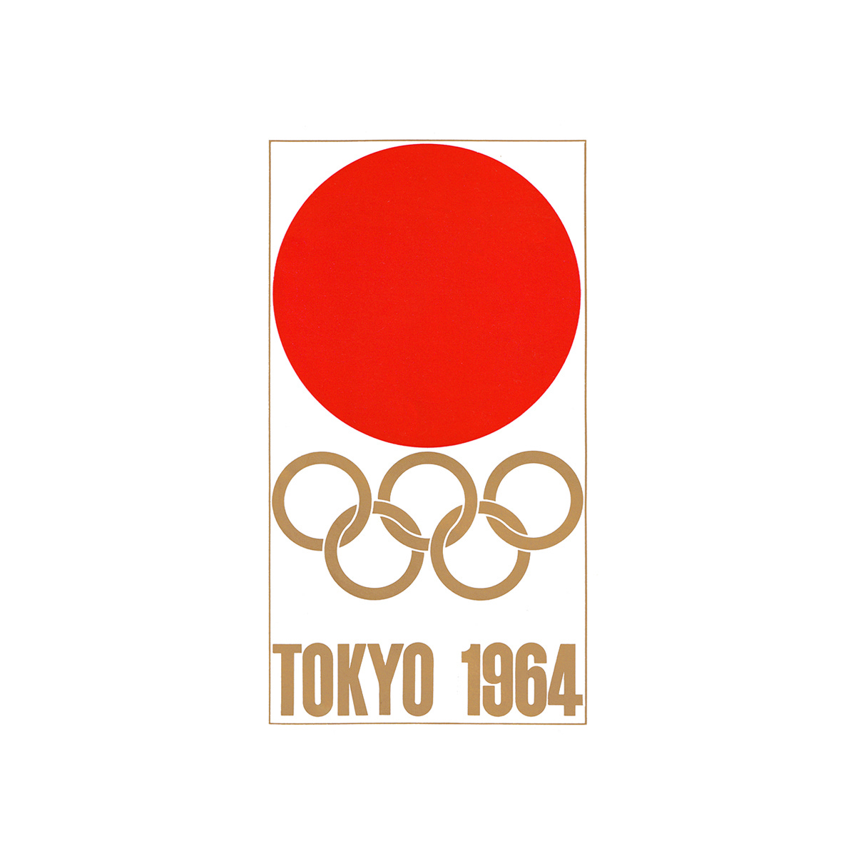
Over time, the rings have remained largely consistent, with only slight variations in the distance between top and bottom rings, the line thickness, and whether the interlocking detail is solid or cut out. The rings can and have be applied using the five colours, as a solid black, or as white or colour variations. These solid versions were used to great effect in conjunction with country-specific symbols such as Tokyo 1964. In this instance, designer Yusaku Kamekura forgot about the brief and the requirement to use the five colour rings.
Thank you for subscribing to Logo Histories. If you enjoy reading this you may also enjoy these resources from the same team:
Brand Archive – Research tool for brand designers.
LogoArchive Website – Searchable modernist logo archive & research tool.
LogoArchive Shop – Vintage design books & LogoArchive Zines.
BP&O – Contemporary design editorial.


cool