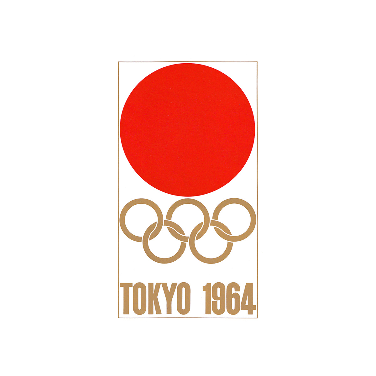
A symbol of passion and excitement
Yusaku Kamekura's logo for the Tokyo Summer Olympics of 1964
This post is supported by LogoArchive – The home of historical logos. Discover over 4500 of history’s greatest designs from the world’s finest designers. Always find the logo inspiration you need for your next project here.
The Games of the XVIII Olympiad, abbreviated to and branded as Tokyo 1964, was not only a state-sponsored event involving the whole nation but one of the first great opportunities for post-war Japan to showcase it rich cultural heritage to the world in a positive light and in an inclusive way. Designing a symbol that captured and conveyed this was critical in the promotion of the event. Work began on this four years earlier, in 1960, with an invitiation sent out by the Tokyo Olympics Organising Committee to critics, art directors, and designers inviting them to form ‘A Design Round Table Committee’. Their initial task would be to arrange a competition to generate options and the final design of an appropriate symbol.
This would take the form of ‘semi-open’ design competition (rather than an open competition that would include members of the public). Six nominees, put forward by the Design Committee, would submit ideas and compete. These designers were Kazumasa Nagai, Ikko Tanaka, Yusaku Kamekura, Takashi Kono, Koichiro Inagaki and Kohei Sugiura.
The guidance these designers were given was that the symbol should; function throughout the Olympic Games, in all of the many diversified contexts; feature the five Olympic colours; and use ‘unified’ lettering.


