



Target’s inconsistent bullseye
Within a few years of opening, Target had no consistent way of presenting its own logo. Different versions of its three-ring bullseye appeared at different times, and buyers and other staff, rather than one department, decided which marks and slogans to use. In 1968 the Chicago office of Unimark International simplified the bullseye, the first step in an identity programme that ran into the 1970s.
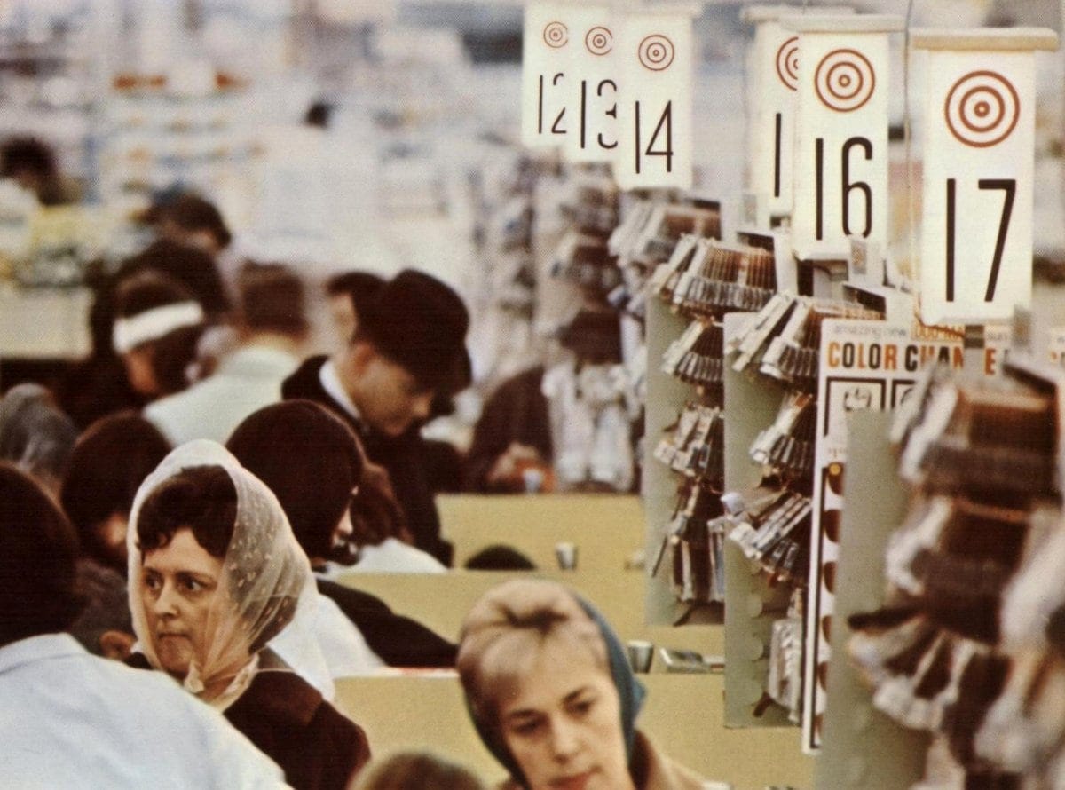

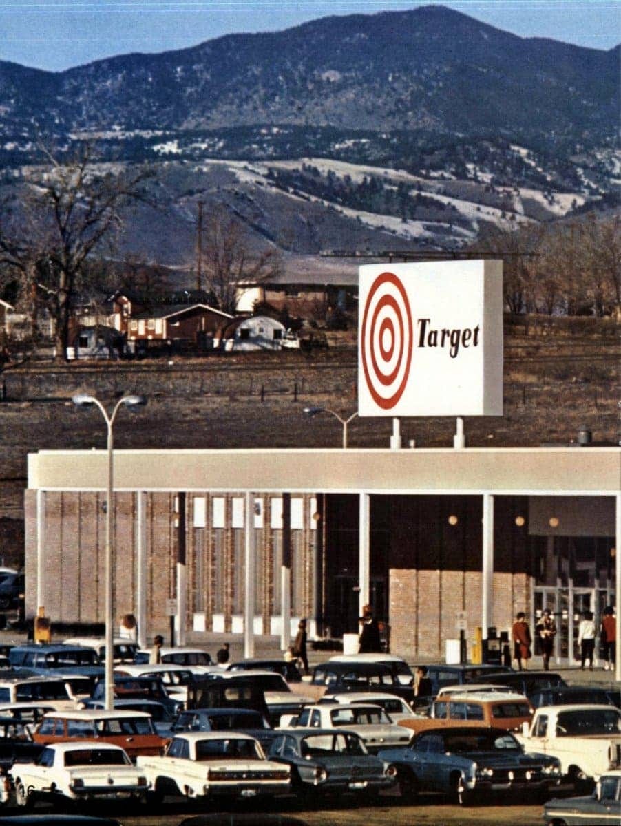
Target opened its first store on 1 May 1962 in Roseville, Minnesota, as a discount offshoot of the Minneapolis department store group Dayton’s. In the months before it opened, Stewart K. Widdess, Dayton’s director of publicity, chose the name from more than 200 options. Target has since explained the bullseye through a marksman’s aim: the store would hit the centre on goods, service, price, value and commitment to the community. The original logo had three red rings with “Target” set across the centre in black. Three more stores opened that year, in Crystal, St. Louis Park and Duluth, and in 1966 Target opened in Denver, its first stores outside Minnesota.
Key Takeaways
Three rings reduced to two
In 1968 Unimark International removed one of the bullseye’s red rings, making the mark easier to scale and to apply consistently, and simple enough to eventually identify Target without the name.
Helvetica and a full identity system
Unimark International replaced Target’s mix of typefaces with Helvetica and designed advertising grids, packaging, stationery and store signage to keep every application consistent and leverage economies of scale.
Red as the company colour
Unimark proposed painting store interiors red. The idea was dropped after a one-store trial, but red stayed Target’s main colour.
Go behind the logos. Explore 200+ in-depth and meticulously researched logo histories revealing the designers, design decisions and ideas behind the world’s most iconic logos and important brand identities.
→ free previews
→ join here
From three rings to two
In 1968 the Chicago office of Unimark International removed one of the three red rings, leaving a single heavy ring around a solid centre. With fewer elements, the bullseye scaled more reliably, was easier to use and could be applied consistently across stores, signage and print. Unimark had already worked on identities for Ford and American Airlines. Unimark also replaced Target’s mix of typefaces with Helvetica, so that advertising and signage used one typeface throughout.
Unimark designer Ted Peterson later said the aim was a symbol simple enough to identify Target on its own, without the word alongside it.
Applying the bullseye
In 1970 Norm McMillan joined Target as vice president for advertising and sales and found the bullseye still applied inconsistently. He hired Unimark’s Chicago office, where Ted Peterson and Ron Coates worked on the logo and its signage system, and set grids for advertising, packaging and stationery so the bullseye appeared the same way everywhere.
Peterson also proposed painting store interiors red. After a one-store trial Target kept its white walls, but red became the company’s dominant colour.
Today’s bullseye
Target refined the bullseye once more in the mid-1970s, settling on the form it still uses today.
Sources: Jan Conradi, Unimark International: The Design of Business and the Business of Design (Lars Müller Publishers, 2010); Target, Cheers to 60 Years!; Pleasant Family Shopping, May 1, 1962: The First Target Opens; Progressive Grocer, Target Celebrates 60 Years of Retail Innovation.
Want more in-depth articles? Check out LogoHistories’ other articles on Unimark International logos →


