A defensive approach of a valuable symbol
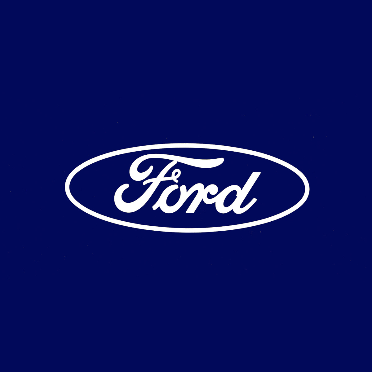
Unimark's 1965 logo and corporate identity for Ford Motor Company.
This post is supported by LogoArchive – The home of historical logos. Discover over 4500 of history’s best designs from the world’s finest designers. Always find the logo inspiration you need for your next project here.
Increasing volatility in the markets of the 1960s, and the general mood in American and elsewhere was enough of a provocation for the leadership at Ford Motor Company (Ford) to look at ways of improving their position.
Post-war expansion and globalisation had seen many American companies extend their operations overseas as a way to sustain growth and market value. Ahead of Ford’s plan to invest in further global reach (it was already exporting to Europe and South America), it sought to review its corporate identity and seek a fresh direction that would better support and position it for this new era. Part of this would include formalising aspects that had increasingly become incoherent among factories, showrooms, and divisions overtime.
The process would also seek to deliver cost savings through economies of scale as well as improving overall visibility and impact. This would extend to reviewing the Ford logo, a copperplate script, based on the signature of its founder Henry Ford.
Three studios were invited to submit proposals. These included Sandgren and Murtha, Paul Rand (IBM & Westinghouse) and Unimark International (AGIP & American Airlines). Each studio approached the project differently. Sandgren and Murtha, who had extensive corporate experience, and could leveraged knowledge from their time at Lippincott & Margulies, explored an ‘exclusive and upscale’ route.
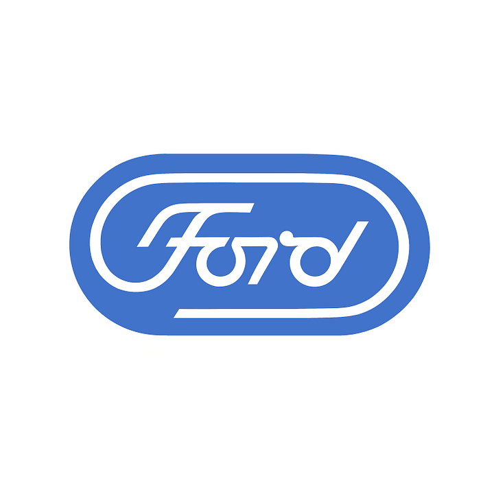
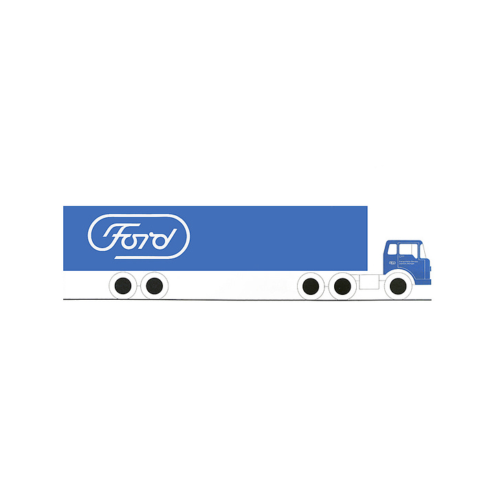
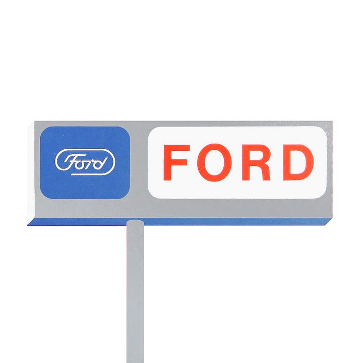
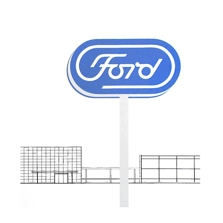
Rand, however, described Ford's logo as ‘hopelessly outdated’, ‘tied to the company's early twentieth century roots’ and ‘unsuitable for modern industry’. Driving the point further home in his proposal, said it was more ‘artistic embellishment than functional necessity’ and ‘not unique to any one time or period’.
Rand defined the key traits of Ford’s previous logo and developed a new one that translated these into ‘contemporary terms’; using evenly weighted letters instead of the Copperplate script; replacing a ‘common’ oval frame with a lozenge and creating a distinctive ‘F’ and ligatures. The effect, as described in the proposal document ‘conveys the impression of motion and moving lights’. It would also improve the logo’s usability, which was shown as an example on signs, trucks and when scaled down.
Despite Rand’s bold position, it would be Unimark that would secure the project with a proposal that did not focus on the logo. Rather than invent the new they refined the old, and suggested formalising and bringing into coherence all aspects of the brand, ultimately addressing key pain points and questions around expansion based on research they had gathered.
One key data point was the equity inherent to the script-and-oval. This was said to have been one of the most recognised symbols in the United States, second only to Coca-Cola. At the time, the script based on Henry Ford's signature was 70 years old. Unlike Rand, Unimark’s Massimo Vignelli favoured a ‘defensive approach of a valuable asset’. It was everything that surrounded it that was the issue. He proposed that Unimark ‘clean it up, not throw it away’. This resonated with Ford management and the studio was given the job.
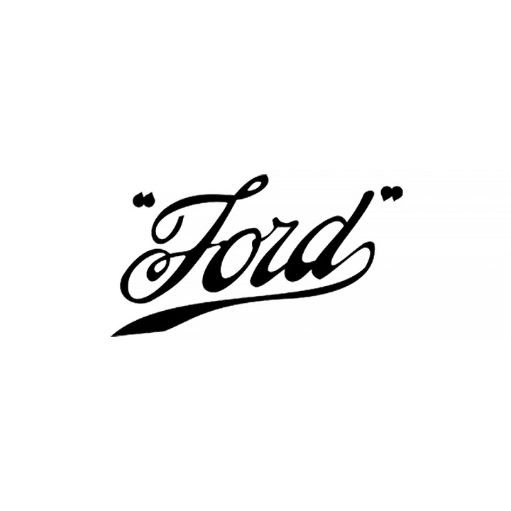

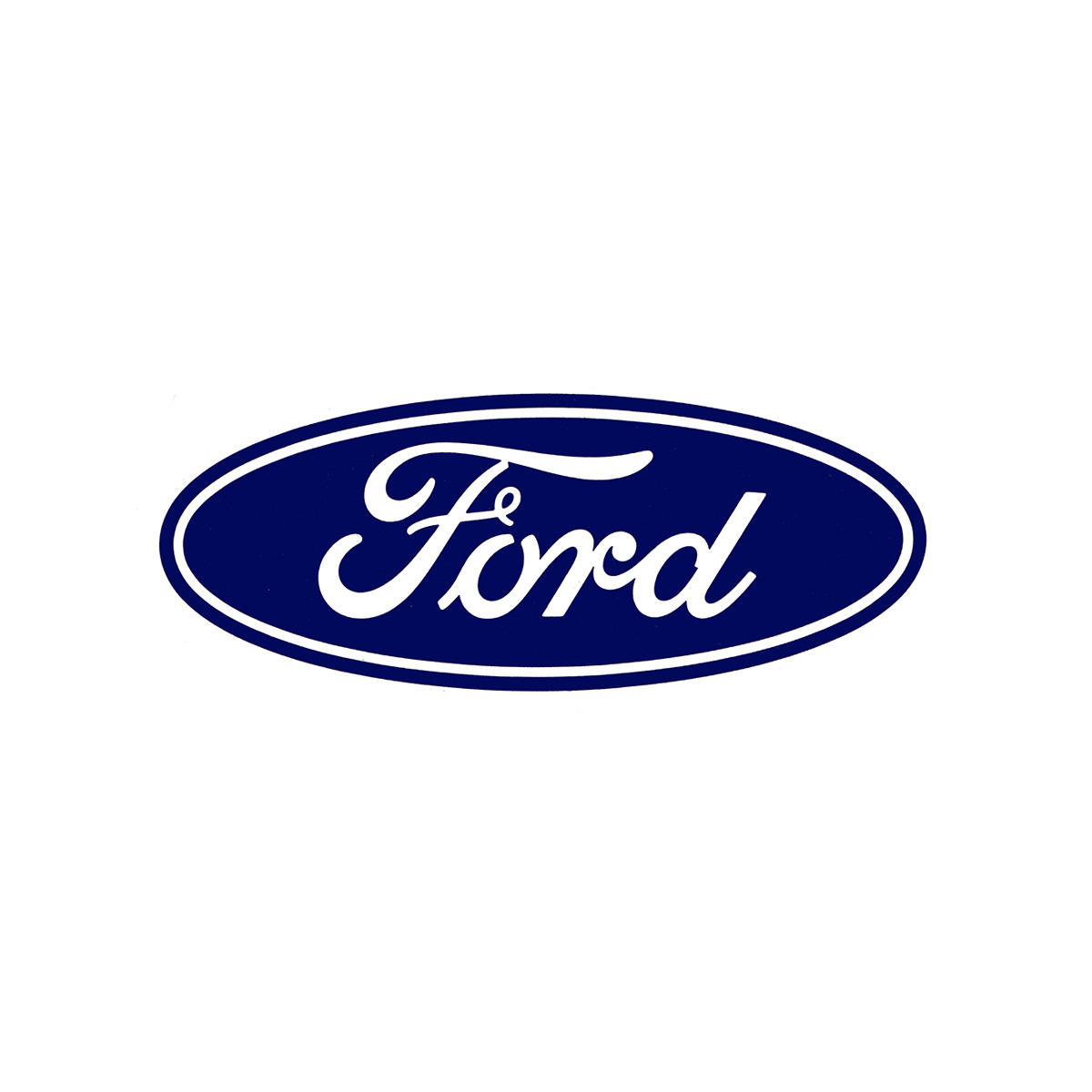
The script was reviewed and the letterforms refined, increasing legibility and improving its ability to be scaled up and down without the loss of significant and recognisable detail. The flow of letters and ligatures was also improved and the outlines reduced to one thicker line. All whilst maintaining the spirt and character of the original. Versions were also created for positive and negative applications (known as Positive Filled, Positive Line, and Negative Line. Alongside the refinement to the letters, these extended the usability of the logo across a multitude of applications.
Unimark, with one of its offices in Italy, was familiar with Ford's European presence and took an evidence-based approach to their proposal, showing slides of the application of the old design system far from the American headquarters. These highlighted that the Ford letters had been placed in a range of containers, often at the discretion of dealers.
The fundamental issue was consistency and the practicalities of fabricating signage for dealerships all over the world which were self-funded (which had led to corner cutting). By addressing the signage, they could also address the inconsistencies of the logo. The challenge was to devise a method to tie each dealership inexpensively to the new system, and make the revised logo part of this.
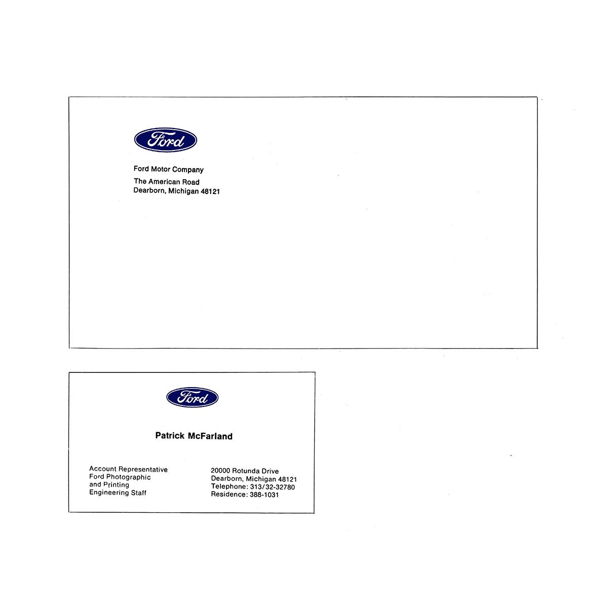
With this in mind, Unimark established a flexible grid. This would be the underlying structure of the new Ford visual identity. Harri Boller and Peter Teubner developed a Ford grid system that could be expanded, over one, two, and three columns and up to five and six where necessary. This wouldn’t just formalise aspects such as corporate stationery such as business cards and letterheads but to physical architecture and signage. This became an evident and common denominator. Further, the grid system would also afford economies in fabrication, in any part of the world. The grid would simply become modular fabricated parts that could fit together in different combinations, and customised for each dealership.
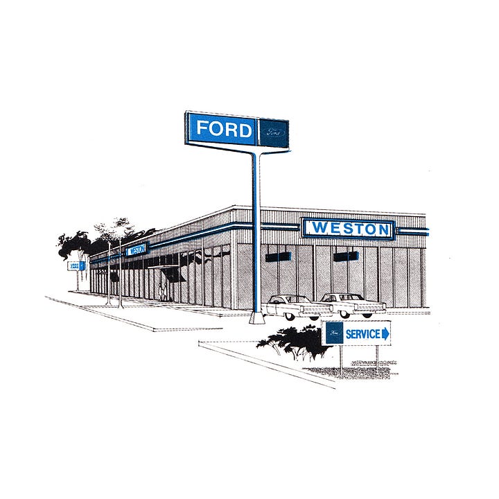
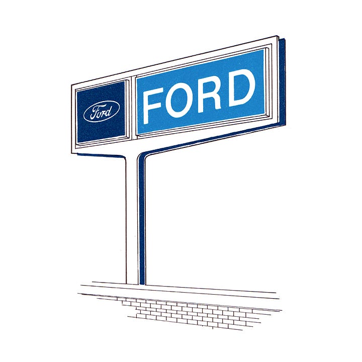
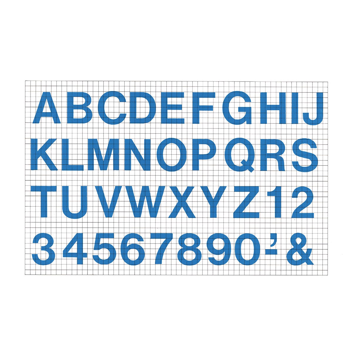
Furthering this modularity would be the approach to the choice of type, with Helvetica being widely available at the time around the world. Inks and paint, reduced down to just the essential colours and standardised with two blues (Corporate Blue and Ford blue) and two reds (Ford Truck Red and Mercury Red), as well as white. These were then used to help delineate between different on site signage. For interior office signage, these were standardised and gridded up to help with hand-painted applications.
These parts; logo, type and colour, went together regardless of the size and shape of the building in an affordable manner, and with little friction for dealerships all over the world. In this adaption, the revised logotype would also be adopted, and bring an end to its inconsistencies.
The designers at Unimark had established reputations individually, but prior to the Ford commission hadn’t proved their capabilities as a studio. The success at Ford would set Unimark up as an iconic studio, responsible for some of the most progressive identities throughout Europe and American. Although the grid system, colours and typefaces were eventually changed, the Ford logo, as was drawn at Unimark, remains intact and visible today.
Thank you for subscribing to Logo Histories. If you enjoy reading this you may also enjoy these resources from the same team:
New! Wittl – Job posting and applicant tracking tool.
LogoArchive Website – Searchable modernist logo archive & research tool.
LogoArchive Shop – Vintage design books & LogoArchive Zines.
BP&O – Contemporary design editorial.
Brand Archive – Research tool for brand designers.





Unimark in a nutshell: Set everything in Helvetica!!!