



A brief in three parts
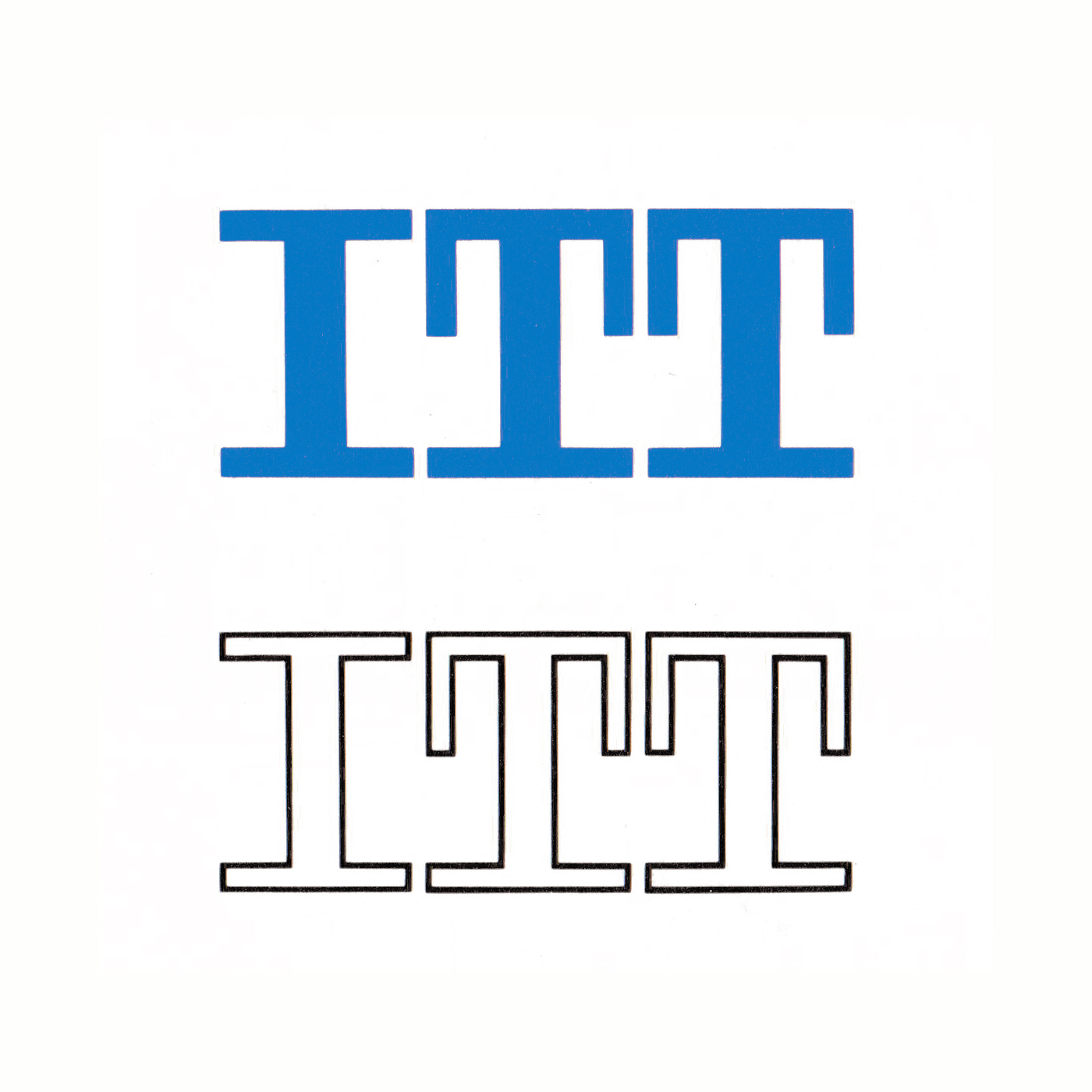
When International Telephone and Telegraph (ITT) planned a new corporate advertising programme, the New York office of Needham, Louis and Brorby asked designer Carl Regehr to create a logo for the company. The brief had three parts. The logo needed to allude to the scientific work ITT was doing, its international reach and a corporate philosophy centred on its plants, products and people. This would replace the ITT monogram designed in 1958 by Sandgren & Murtha.
Globes, vortices and networks
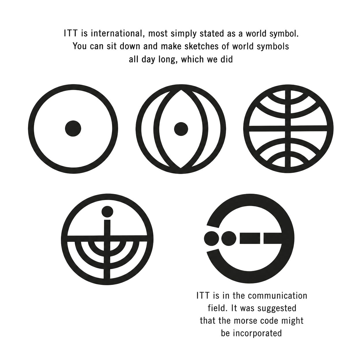
Regehr began by drawing each idea separately. Globes and circles offered a way to express the company’s reach. Vortex patterns, an echo chamber and a binary system suggested science. Networks and electrical symbols pointed towards communication. His sketches show the breadth of the search, but also the difficulty: a globe alone could say little about research, while a scientific diagram might be too specialised to represent the whole company.
Key Takeaways
A three-part brief
Needham, Louis and Brorby asked Carl Regehr for a logo that alluded to ITT’s scientific work, its international reach and its plants, products and people.
Sketching every idea
Regehr drew globes, vortex patterns, an echo chamber, binary systems and networks before narrowing the search.
Tone meets infinity
His final proposal joined the curve of a pure tone with the continuous line of infinity inside a circle, though ITT kept its monogram until 2016.
Go behind the logos. Explore 200+ in-depth and meticulously researched logo histories revealing the designers, design decisions and ideas behind the world’s most iconic logos and important brand identities.
Continue reading to discover how Carl Regehr combined a pure tone and the infinity sign into a symbol for ITT →
