


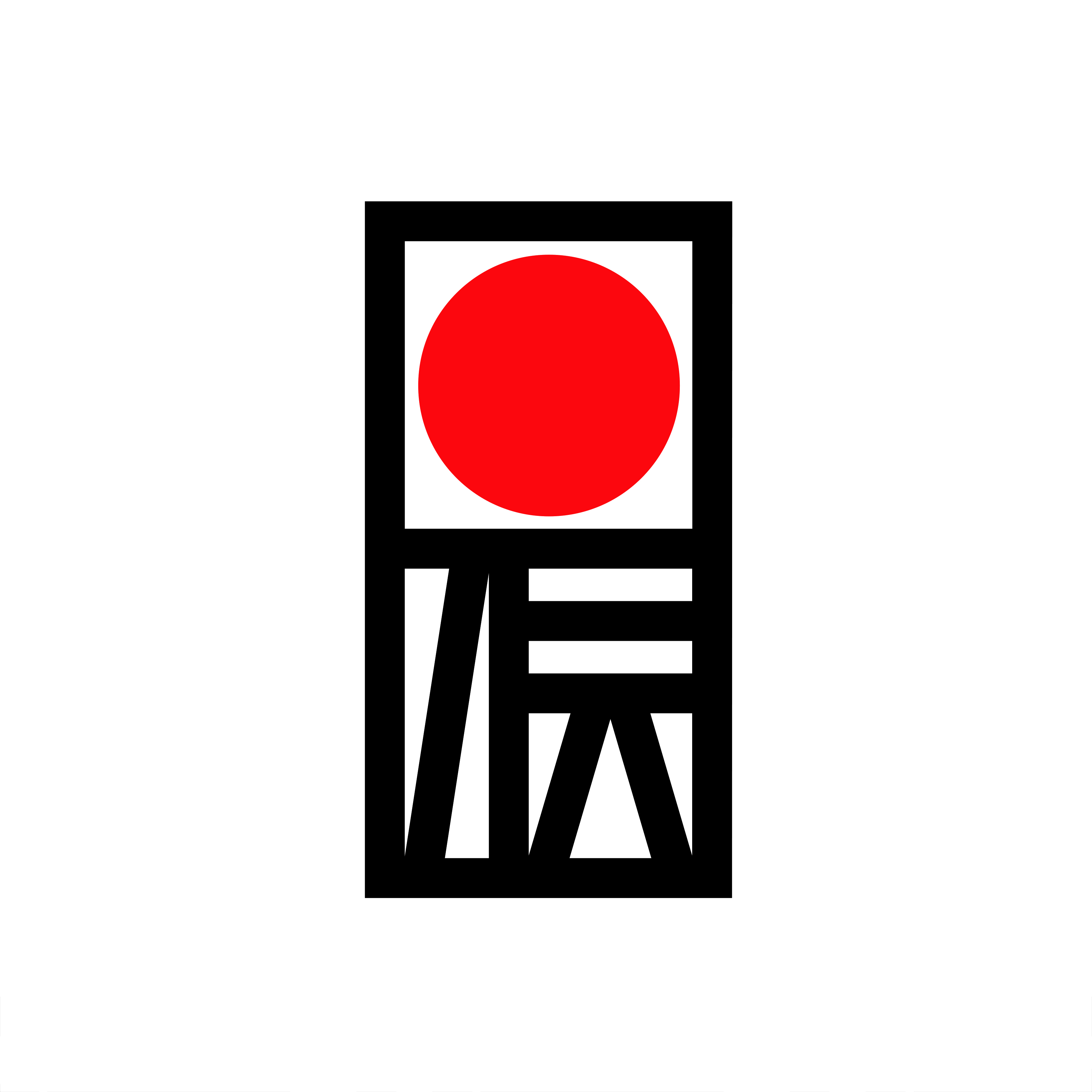
In 1974 the ‘Act on the Promotion of Traditional Craft Industries’ was set up in Japan. This intended to help preserve ancient techniques and promote domestic and international interest in authentic hand-made regional crafts.
The following year, the Traditional Craft Industry Promotion Association was formed. This was a dedicated body that would establish the requirements that needed to be met for items to be designated ‘Traditional Craft Products’. Categories included traditional skills, techniques, raw materials and production regions.
In order to support this initiative, the association ran a competition to design a logo. This would be used across promotional materials and to mark products that best showcased Japanese craftsmanship.
Renowned Japanese designers Kazumasa Nagai, Ikko Tanaka and Yūsaku Kamekura were asked to draw up proposals for a logo that could work nationally and internationally, and be stamped on a range of products, large and small.
As reflected on by Kamekura at the time, the job was made harder because ‘the two people who are said to be masters of logo design in Japan were now his competitors’. He felt that he wouldn’t be able to match the two.
Still, not entirely deterred, Kamekura reflected on how to embody the word ‘tradition’. He created a form that had a structure that was derived from the character 伝 (den, tradition) and used this alongside a red disc, representing the sun, linking to Japan's title as the "Land of the Rising Sun" (Nihon). In this way, he balanced both national and international motifs.
Go behind the logos. Explore 200+ more in-depth and meticulously researched logo histories that reveal the design decisions and ideas behind the world’s most iconic logos and important corporate identities.
→ free previews
→ join here
Kamekura created a number of variations to increase the symbol’s usability across promotional items and differing products. Kamekura was concerned about the tension between a symbolic and literal reading, and whether it would be a symbol if the readability of the word was over-emphasised.
The outcome, however, was in Kamekura’s favour, with the Association selecting his proposal. They continue to use this logo today, marking those products that have been inspected and best-reflect Japanese traditional crafts.
Want more in-depth articles? Check out LogoHistories’ other articles on Yusaku Kamekura.
Tokyo 1964

This post is supported by LogoArchive – The home of historical logos. Discover over 5000 of history’s greatest designs from the world’s finest designers. Always find the logo inspiration you need for your next project here.
Kamekura's Shell

This post is supported by LogoArchive – The home of historical logos. Discover over 4600 of history’s greatest designs from the world’s finest designers. Always find the logo inspiration you need for your next project. Start here.
Surbank, 1985

A shinkin is a local Japanese trust bank for individuals and families, as well as small to medium-sized companies conducting business in specific areas, and often run and financed cooperatively by its members. When the Japanese banking industry began to be opened up in the
Thank you for subscribing to Logo Histories. If you enjoy reading this short you may also enjoy these resources from the same team:
Brand Archive – Research tool for brand designers.
LogoArchive Website – Searchable modernist logo archive & research tool.
LogoArchive Shop – Vintage design books & LogoArchive Zines.
BP&O – Contemporary design editorial.