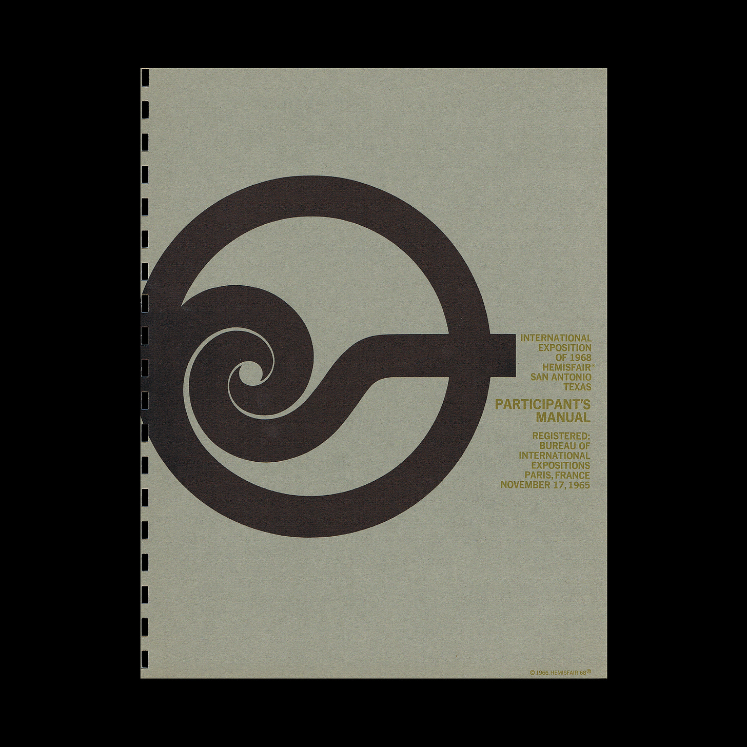
A Confluence of civilisations
Richard Wilson’s 1965 logo for HemisFair ‘68
This post is supported by LogoArchive – The home of historical logos. Discover over 4000 of history’s greatest designs from the world’s finest designers. Always find the logo inspiration you need for your next project. Start here.
“There is something in the nature of man that will not tolerate the unexplored. Always he finds his perimeter of ground too small, and restless stirrings prod his feet until he has gazed from every peak.”
This was the ethos – of discovery and exploration – that defined the 1968 San Antonio World’s Fair which ran from April 6th to October 6th. The event, known as HemisFair, marked a significant milestone for the Texan city as it coincided with both the 250th anniversary of its founding (1718) and the 1968 Mexico Olympic Games. The endeavour had initially planned to be a regional affair, originating from the dream of United States Representative Henry B. Gonzalez in 1962. Gradually, this idea expanded and grew (both creatively and financially) to become a visionary international exposition with endorsement of the United States Government and the State of Texas, and was officially registered by the Bureau of International Expositions.
The name ‘Hemisfair’ – coined by local businessman and civic leader, Jerome K. Harris – was a simple reflection of the fair’s goal: to expand San Antonio’s tourism industry and bring the ‘East Hemisphere’ to the ‘West Hemisphere’. Like every World’s Fair before it, HemisFair ‘68 was an invitation for nations across the world to attend and share culture, cuisine and cutting-edge innovation. And it was to be a meeting point of the Southwestern United States and Latin America. The host city was excited to inform, entertain, and educate millions of guests about the history and future of the Americas.
For an international and multilingual audience, it was essential for HemisFair’s image to be comprehensive and recognisable. At the beginning of development, there were a few program requirements for the key element: the symbol. As a request from the fair committee, the symbol, which would be designed by Richard Wilson, had to go on everything and be everywhere as an identifying mark. Secondly, the word “Exposition” was required to appear alongside the symbol in more formal contexts. As a unique design, it would also need to be flexible not just in the printing process, but also in its applications.
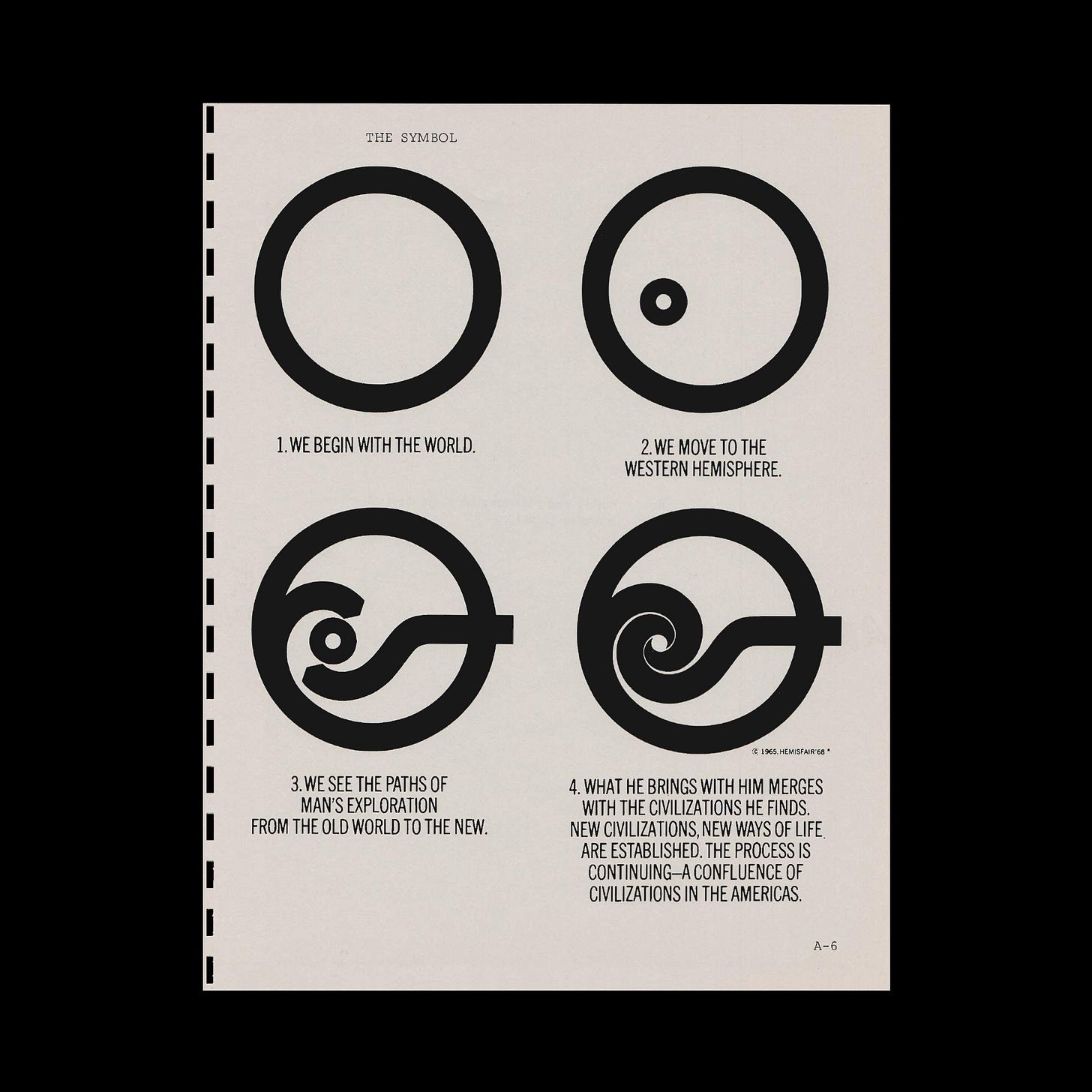
Embodying the spirit and theme of the fair, the official logo created in 1965 was a swirling symbol of confluence. In four evolving images, Wilson’s design expressed a narrative of four stages; four chapters of man’s journey across the globe and its intersection with other cultures.
As the Participant Manual describes:
1. We begin with the world
2. We move to the Western Hemisphere
3. We see the paths of man’s exploration from the old world to the new
4. What he brings with him merges with the civilisations he finds. New civilisations, new ways of life are established. The process is continuing–a confluence of civilisations in the Americas.
One line of the ‘confluence’ starts from the circle itself, the other is external. In these four steps the logo develops from a lone empty circle towards a convergence of cultures, and of nations, forming two interlocking spirals.
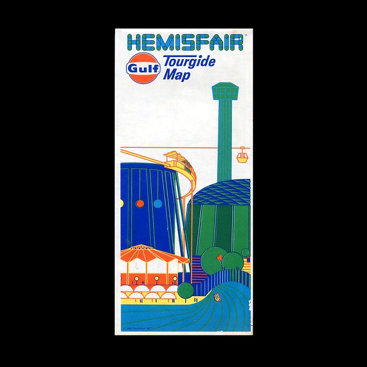
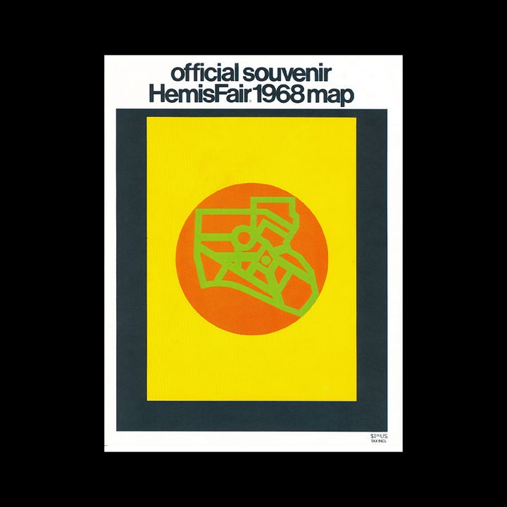
The convergence and diversity of cultures was also expressed throughout a vibrant and high contrast colour palette inline with the expectations of it being "history's most colorful World's Fair". Illustration also played a key roll in conveying the spirit of the fair. A thick black pen line made sure many of these were clear part of a larger story.

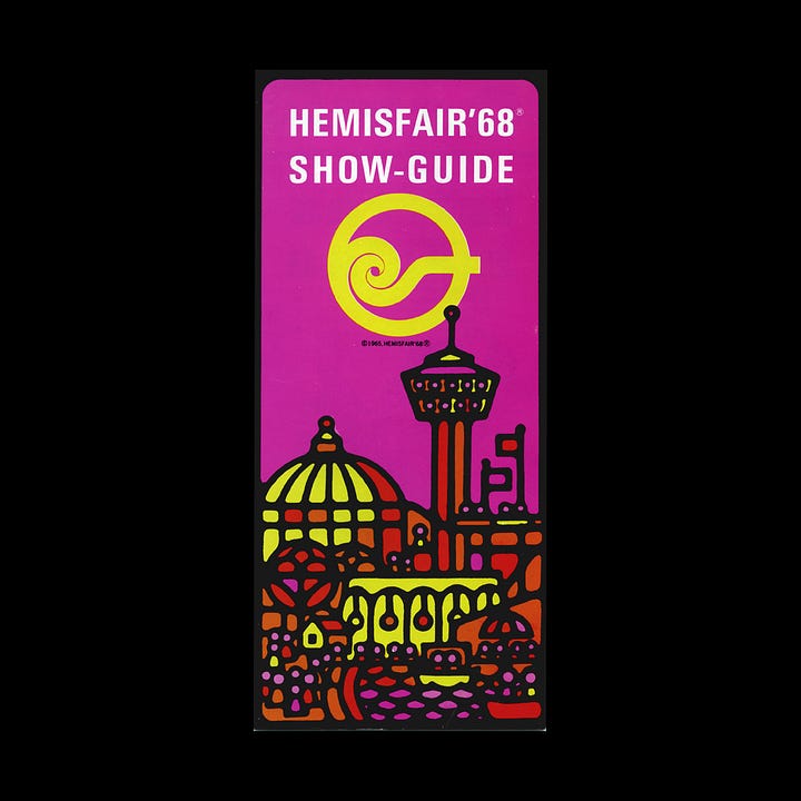
Underneath this optimistic spirit, however, there was a more divisive side to the Expo. In the spirit of Texas, the project was ‘big’ in all meanings of the word. For example, developing the fair on the 92.6 acres of land cost roughly $156 million. And the area was largely demolished to make way for the new developments that included a 750-foot observation tower (Tower of the Americas) and a brand new 21-story 500-room hotel.
Contractors demolished over 1,300 buildings and, consequently, destroyed a tight-knit community of working class latinos, African-Americans, Germans, and other Europeans.
In the neighbourhood once called Germantown, out of 300 historic homes, only 22 buildings that were seen as ‘historically significant’ were saved. It was planned that many of these new buildings would remain in order to benefit the city long after the guests had gone, however, there was a cruel irony in the displacement of 1,600+ civilians for the sake of urban renewal and an Expo that sought to celebrate the “confluence of civilizations.”
Thank you for subscribing to Logo Histories. If you enjoy reading this you may also enjoy these resources from the same team:
Brand Archive – Research tool for brand designers.
LogoArchive Website – Searchable modernist logo archive & research tool.
LogoArchive Shop – Vintage design books & LogoArchive Zines.
BP&O – Contemporary design editorial.


