
A snowflake for Sarajevo
Miroslav Antonić Roko's 1978 logo for the 1984 Winter Olympics


The 1984 Winter Olympics, officially known as the XIV Olympic Winter Games, or just Sarajevo '84, was held between the 8th and 19th of February 1984 in Sarajevo, Yugoslavia, now capital of Bosnia and Herzegovina. It was the first Winter Olympic Games to be held in a communist country, with the heavily-boycotted Moscow Summer Olympics paving the way in 1980.
Sarajevo delivered a compact proposal, winning out against Sapporo and Gothenburg. The former had already hosted a Winter Games and the latter’s distance between venues was seen as a disadvantage. As early as 1970, the authorities in Sarajevo planned to host the Winter Olympics, and this was part of a broader programme to develop the region into a sustainable winter sports centre.


The logo for the Sarajevo ’84 candidacy bid was designed by Miroslav Antonić Roko. Not uncommon for the time and place, Roko held down two jobs, working as both a graphic designer and lawyer.
Roko’s symbol design was used as part of the application submitted by the Yugoslav Olympic Committee to International Olympic Committee in 1977. This application was announced as the winner the following year, in May 1978. The first version of the logo can be seen in its original form on the cover of the application document ‘Candidate Host for XIV Olympic Winter Games’.

Unusually, although not a unique case, this candidacy logo was then used for the Games, with only small adaptions to the symbol, rings and typography being made by Branko Bačanović and Čedomir Kostović, who also developed the graphics manual. These adaptions moved the overall feel and composition away from the similar ‘totem’ structure of both Tokyo ’64 and Sapporo ’72, which also employed a thin frame, stacked elements and a condensed typeface. A small change was also made to the symbol itself.
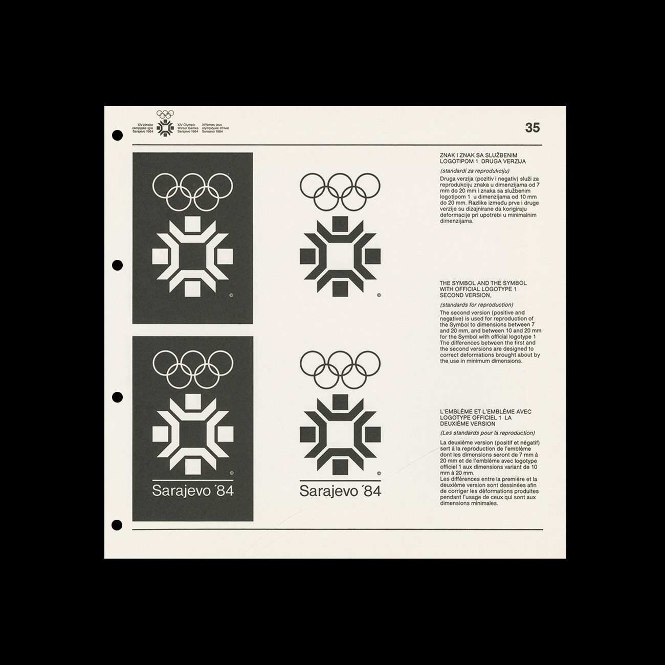
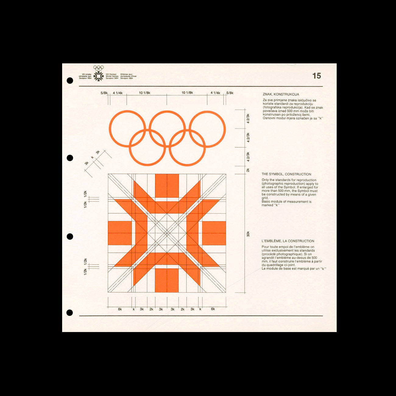
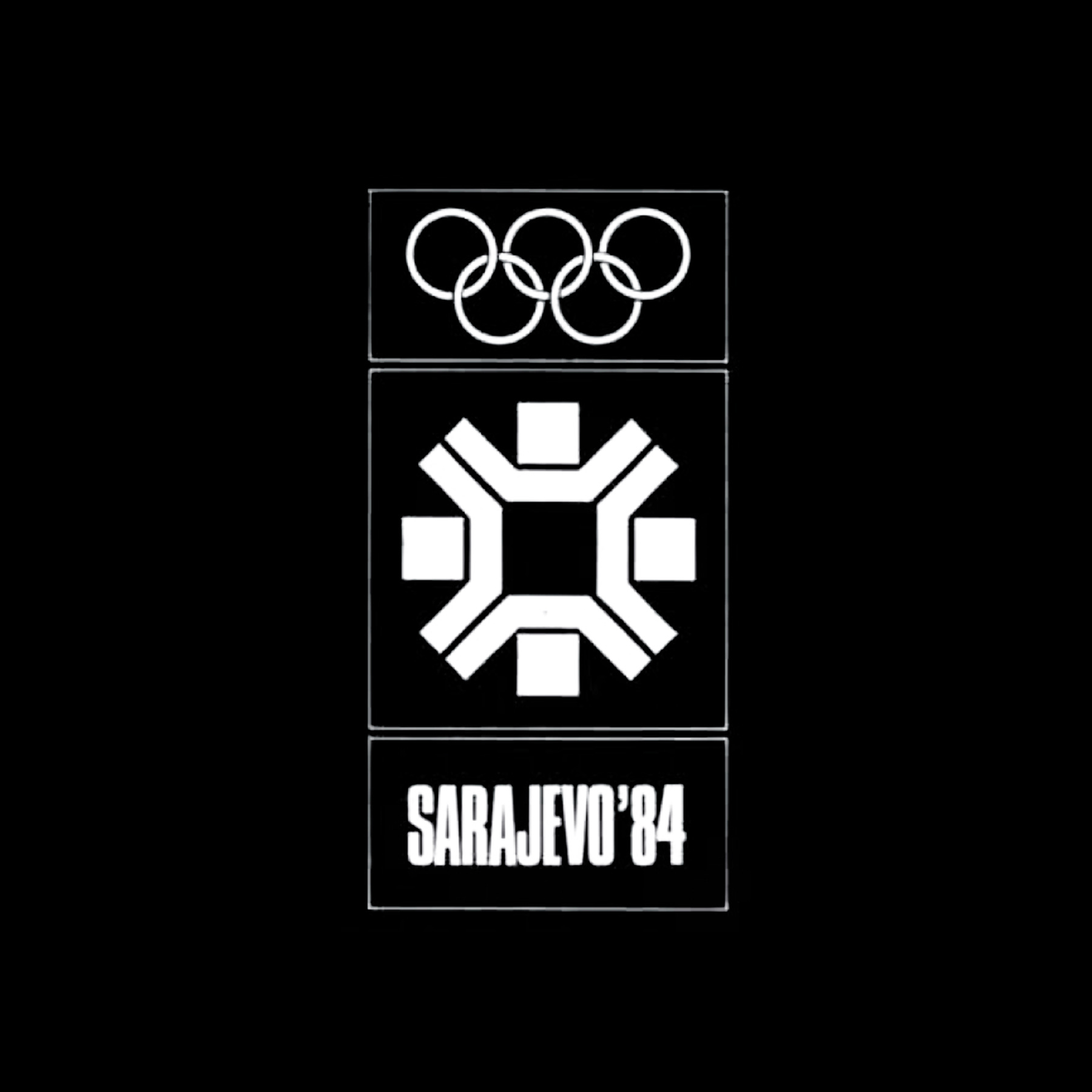
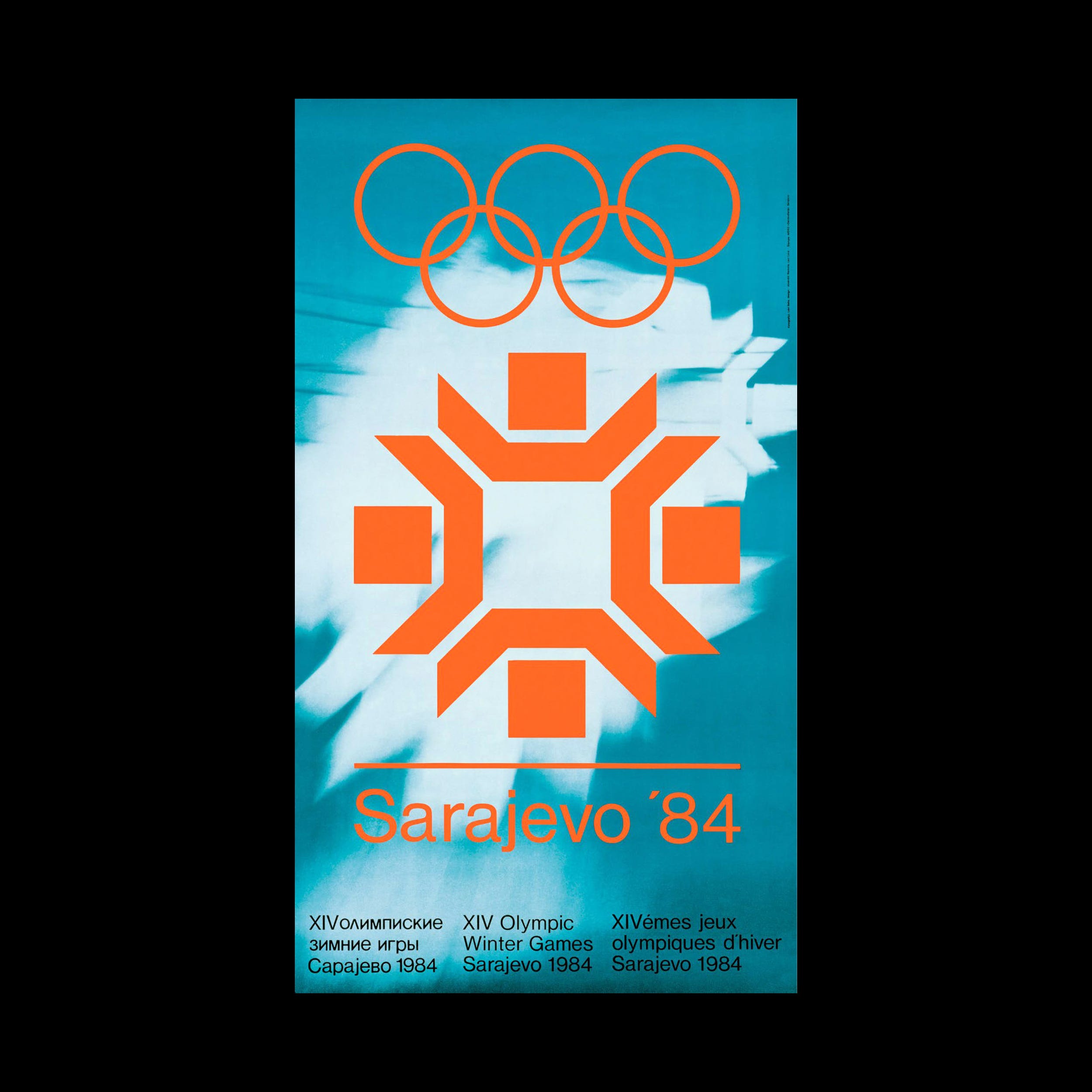
Roko’s symbol appears as a stylised snowflake and draws on traditional embroidery with a distinctive geometry produced in the region. The small adaption later made distinguishes the final symbol slightly from the bid logo, adding right angle cuts to the outward reaching lines to create points and emphasising the snowflake reference. The Olympic Rings are fixed above the symbol, rendered as a solid form, with Sarajevo ‘84 typeset in Helvetica Light sitting below. Unique to the Games up until this point, the composition was then presented as a single colour.
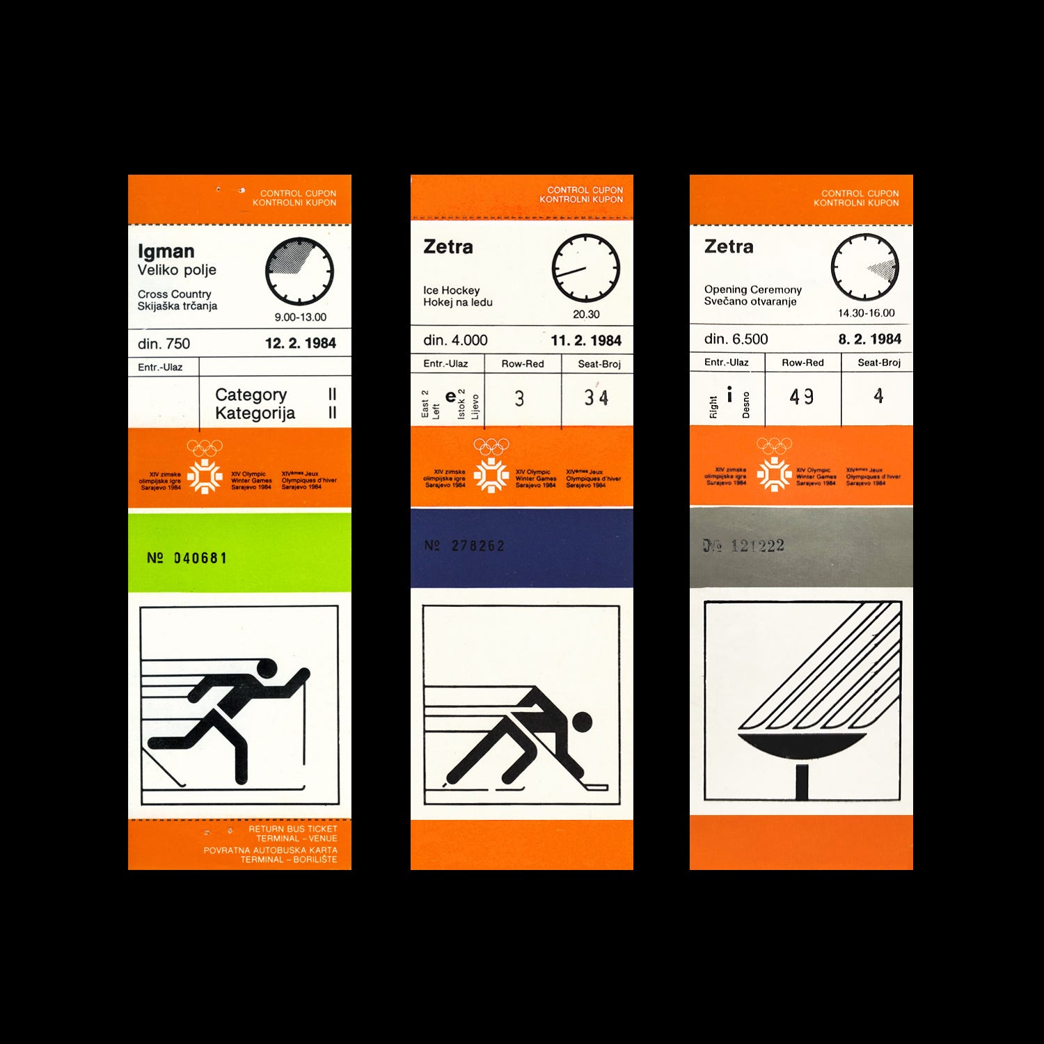
The symbol and Olympic Rings, as stipulated by the Graphics Manual, were to always be presented together, as a single solid colour or knocked out of a colour or image. ‘Sarajevo ‘84’ was added or excluded depending on the use-cases, appearing in its full form on the official poster or in a shorter form used on tickets.
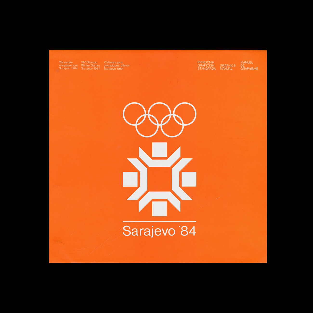
The predominant colour used was a bright orange. This system of colour was developed by Ismet Mujezinović, an artist who also created a series of event posters. Čedomir Kostović, Radmila Jovandić, Lora Levi and Srđan Kokoruš contributed official posters. These drew their inspiration from the snowflake and added dynamic elements.
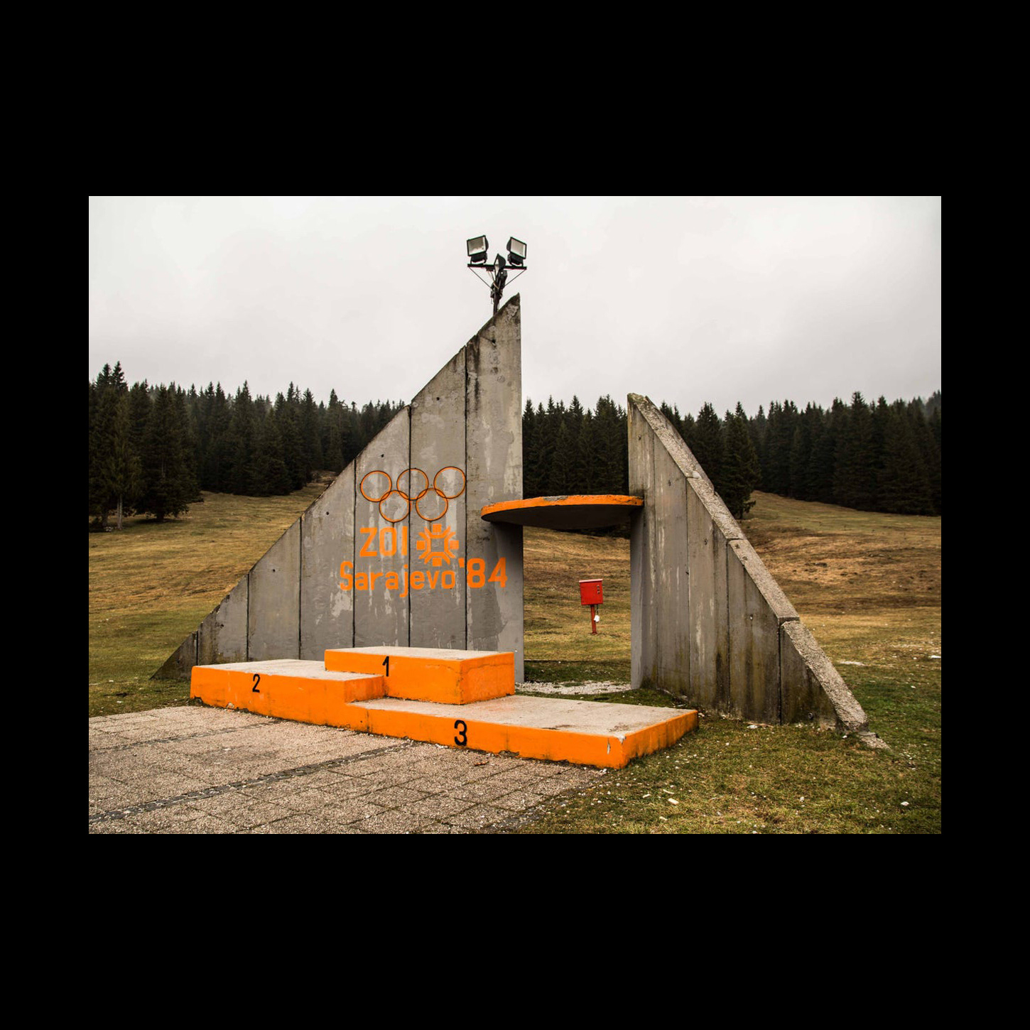
Sarajevo ’84 was considered a success, and this made it possible to modernise aspects of the surrounding area. However, in 1992, war broke out and heavily damaged the city and the Olympic facilities that were intended to develop winter sports tourism. Some sites have been renovated but others remain abandoned, with the logo, signage and architecture appearing as a ghostly reminder of an optimistic and welcoming moment prior to catastrophe.
Discover these brand assets and more at Brand Archive.
Thank you for subscribing to Logo Histories. If you enjoy reading this short you may also enjoy these resources from the same team:
Brand Archive – Research tool for brand designers.
LogoArchive Website – Searchable modernist logo archive & research tool.
LogoArchive Shop – Vintage design books & LogoArchive Zines.
BP&O – Contemporary design editorial.