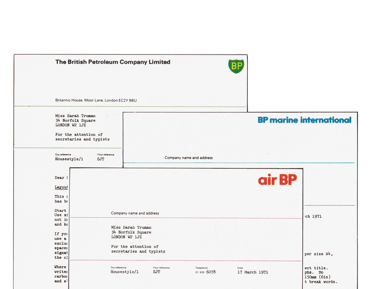
Shorts: BP Alphabet
Crosby/Fletcher/Forbes & Adrian Frutiger's corporate typeface for BP.
From the Editor: We have a lot of stories to tell, some of these are short but fascinating. Logo Histories’ Shorts is an additional free post that bring these to our readers. To access our longer fully illustrated Logo Histories and support the project, upgrade to paid. A special thanks to those who have already done this. I hope you enjoy these additional insights.
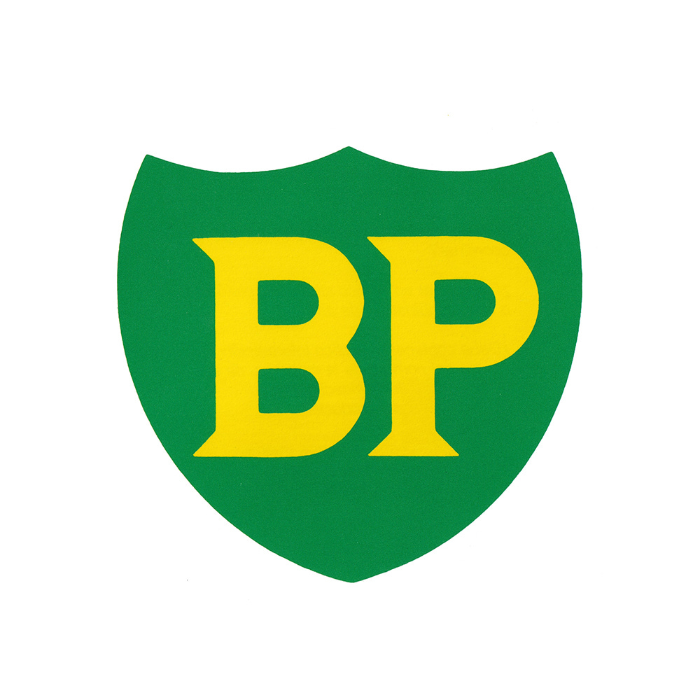
In 1920, BP employee A.R. Saunders won a competition to design the first British Petroleum (BP) logo. The shield logo devised in 1920 and carried forward didn’t address larger challenges the corporation faced as it expanded its products, services and international reach in the mid-century. In 1958, the Paris-based design firm C.E.I. led by Raymond Loewy, was commissioned by BP to examine their visual language. Research indicated that the logo had a high visual equity so, rather than redesign the logo, it was refined and a new contemporary house style was introduced.
The introduction of self-service petrol stations throughout Europe in the 1960s had proceeded faster than in the United Kingdom and, in particular, Sweden, Germany and Denmark. To reinforce BP’s market image as it grew, Crosby/Fletcher/Forbes were given the task in 1968 to develop UK’s self-service stations and packaging.
Crosby/Fletcher/Forbes, working with Kenneth Grange (later, they would form Pentagram) visited BP and other self-service stations across Northern Europe in order to systematically survey the infrastructure and requirements.
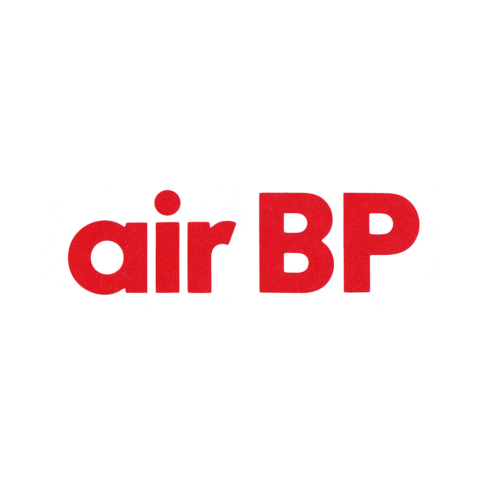
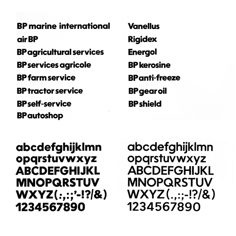
The BP logo, designed by A.R. Saunders and adapted by C.E.I, was to remain unchanged having established recognition in many countries and markets. However, with the need to develop a coherent visual character across all of BP’s growing services and products which were spread internationally and under different brand and divisional names (these included Air BP and BP Marine International) it was decided that a corporate typeface would sufficiently provide BP with a much needed coherence.
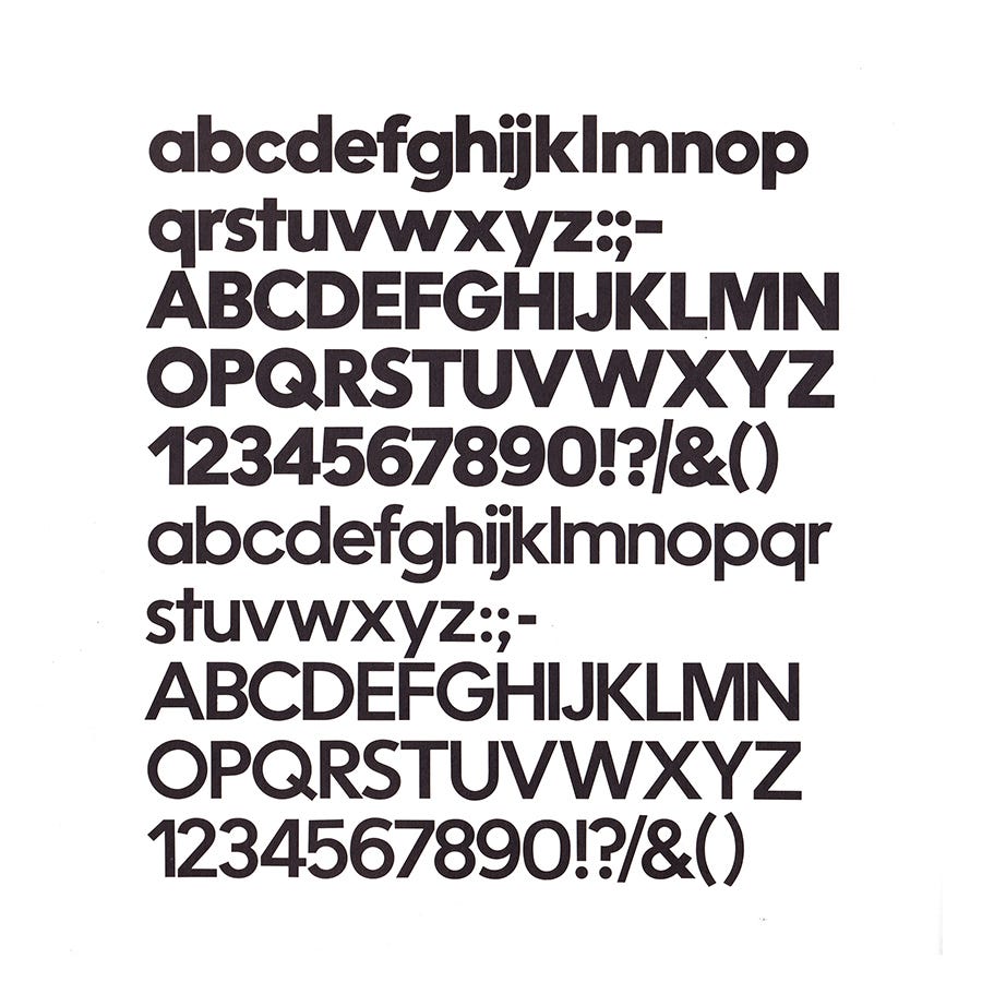
What would come to be known of as ‘BP Alphabet’ (AlphaBP Bold and AlphaBP Medium) was designed in collaboration with the legendary Swiss designer and typographer Adrian Frutiger. BP AlphaBold was created for the logotypes of various dividions, products and facilities. BP AlphaMedium was then drawn for use on signs used on service station forecourts. Frutiger’s Univers, was also used alongside Helvetica for instructional texts.
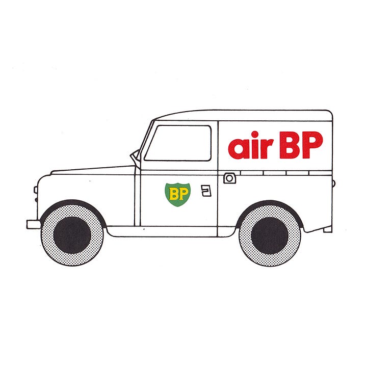
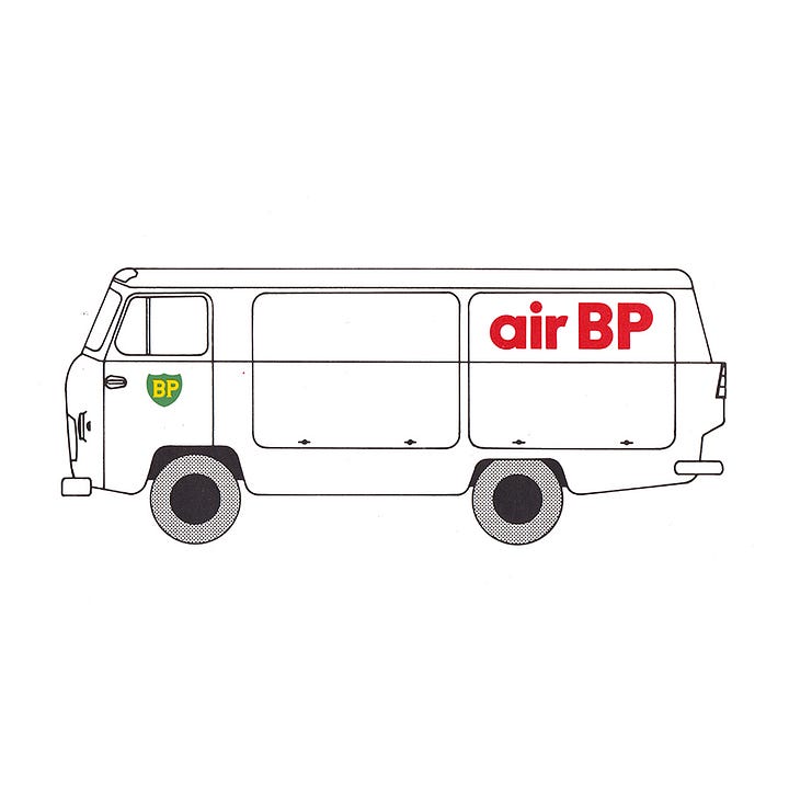
Much of BP’s communication across products relied on the ‘explicitness of the message printed on the can’ so typography played a key roll in doing this quickly and efficiently. Further, as an international entity, the typeface needed to accommodate translations into seven European languages, so a corporate typeface formed a cross-boarder continuity, and offered an economy at scale.
The introduction of BP Alphabet addressed key issues that related to a global corporate entity that included economies of scale, different languages and consistency, and was an early example of a custom corporate typeface (also read: Gerstner’s Shell). While the logo remained the same, only later being revised slightly by Siegel+Gale in 1989, this brought into coherence a large variety of signage, vehicle liveries and corporate communications.
In 1998 BP merged with Amoco to form BP Amoco, and worked with design studio Landor to develop a new identity. The ‘Helios’ logo was developed to signal this change, and desire to “move beyond petroleum”. This is still in use today.
Next Week on Logo Histories
Last week on Logo Histories, I shared the story of the Karl Gerstner’s unused logo proposal for Shell. Next week, I’ll tell the story of the competition to find a logo for Japan Tobacco and Salt Public Corporation, which includes all of the proposals submitted, including works by Shigeo Fukuda and Kazumasa Nagai. Subscribe today and receive this story straight into your inbox next week. Subscribers to our paid newsletter also receive 10% discount from LogoArchive Shop.
If you enjoyed reading Logo Histories Shorts also check out these projects:
Brand Archive (Beta) – Research tool for brand building designers
LogoArchive Website – Searchable modernist logo archive & research tool.
LogoArchive Shop – Vintage design books & LogoArchive Zines.
BP&O – Contemporary design editorial.
Extra Issue – Unlocking opinion and insights from the past.


