Citibank Logo, 1975
Anspach Grossman Portugal’s 1975 logo and corporate identity for Citibank.
This post is supported by LogoArchive – The home of historical logos. Discover over 4000 of history’s greatest designs from the world’s finest designers. Always find the logo inspiration you need for your next project here.
Citibank was founded in 1812 as the City Bank of New York and later came to be known as the First National City Bank of New York. The creation of Citicorp, a holding company, in 1968 began a trend amongst the larger banks as they expanded into new areas of business.
Citibank's need for a corporate identity (CI) program in the mid-1970s arose from the increasing complexity and diversity of its business and confusion around its name. Although many of its international customers referred to the bank as Citibank in New York City its retail branches were known as First National City Bank.
Under the guidance of Citibank's Ed Dooley, Advertising and Marketing, and Jack Odette, Communication Design, the New York design firm Anspach Grossman Portugal was invited to develop the new corporate identity for the bank. This intended to eliminate the discontinuity between the bank in New York and its operations abroad. With the introduction of the CI all the bank’s operations, which included retail, international and merchant banking, would be consolidated globally under a single name.
Leading the Anspach Grossman Portugal team would be Eugene Grossman with Dan Friedman responsible for generating many of the logo ideas and the final design.
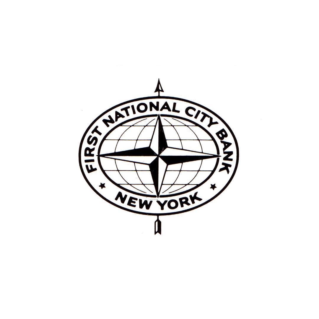
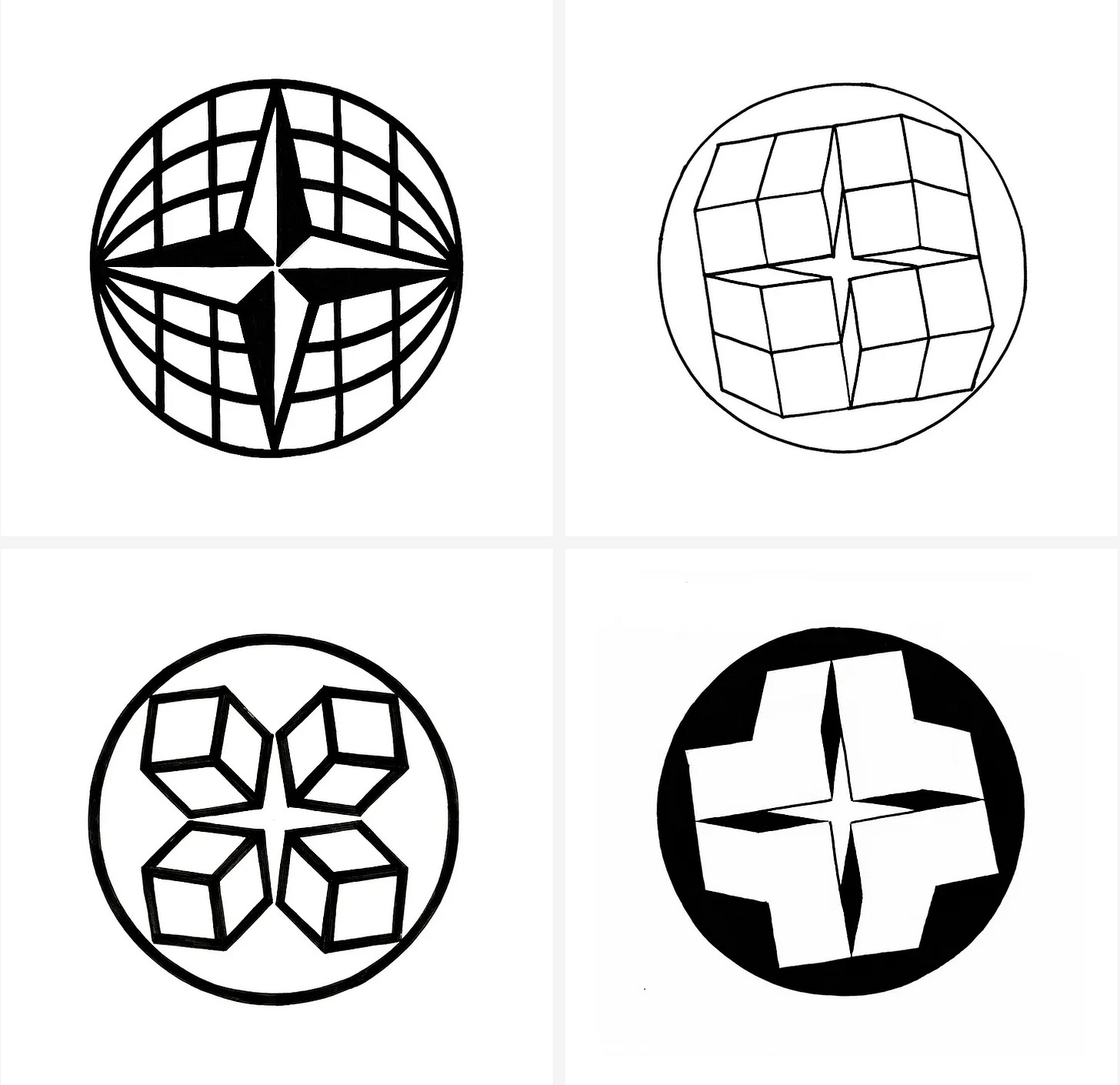
Building on the heritage and recognition of what was known as one of the most well-recognised graphic symbols in the banking world, the globe and compass rose, Dan Friedman explored new interpretations. Ideas included introducing dimensional effects, a sense of rotation and different versions of the compass rose.
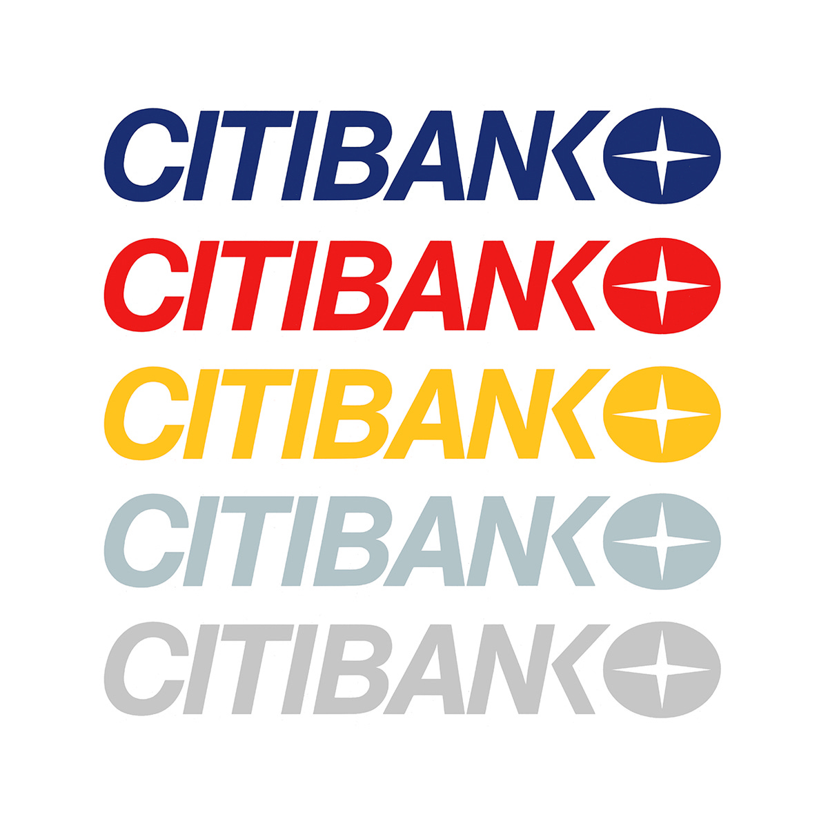
Despite the complexity of some of the early concepts, the final abstract design reduced the former logo down to just two essential parts. The lines of the globe would become a solid oval shape and a simplified compass rose was then knocked out of it. This improved the ‘communicative impact’ and immediacy of the earlier logo, projected a more ‘direct and contemporary appearance’ and would improve the function of the logo (solid and outlined) making it far easier to be fabricated across all of the bank’s international operations.


The logo was supported by a logotype set in Helvetica Italic, with a truncated ’NK’ combination adding distinction and making the logotype more compact in application. Helvetica Regular, Black and Regular Italic was used as the corporate typeface and was supported by Baskerville, Times Roman, Bondoni and Garamond in the bank’s advertising and corporate literature, giving it a flexible voice.
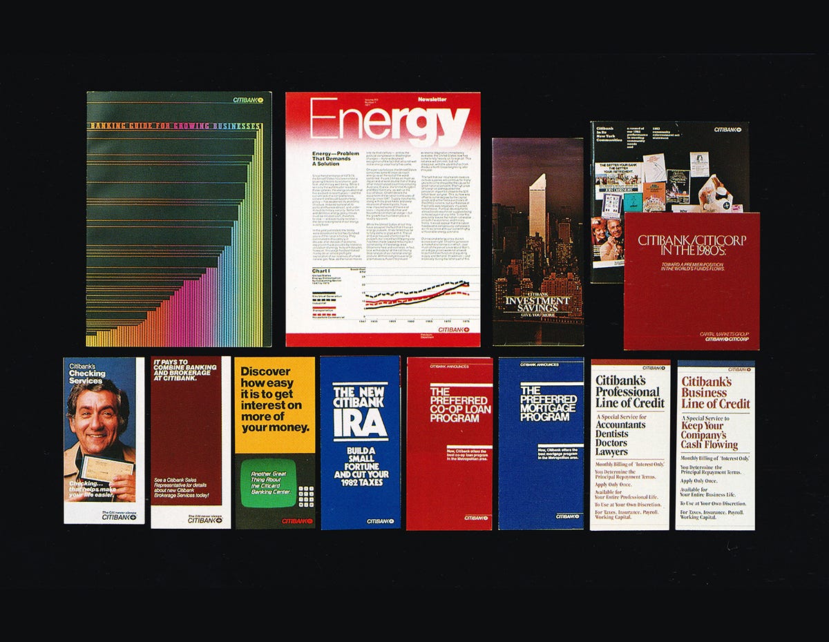
The approach to colour also afforded the bank a more distinctive and varied image. Unlike most bank and corporate identification programmes at the time, Citibank was given six colours. Three bright colours were selected for retail banking with the more neutral colours of grey, silver and black being used predominately for corporate banking. Within this system, there was an aspect of interchangeability, with these being remixed and combined to meet various identification and marketing needs.
As the bank had branches in 108 countries, Citibank management preferred not to form an international communications management group which was often used to monitor the application of CI programs internationally. Rather, it was decided that a standards manual, so complete and though, would be the ultimate international authority in governing the roll out.
The manual covered the usual printed materials such as stationery, branded items such as pens, match books, cufflinks, ties and ash trays. But it went much further, also incorporating elaborate engineering details for exterior sign construction. This was added to maintain the design integrity of the system in countries where English wasn’t a first language. The logo’s simple and formal geometry meant that it could easily be fabricated from technical drawings.
The international dimension also extended to the conversion of the design program into the metric system, and with the inclusion of physical paper samples, specified for use in the United States, so that an equivalent grade of stock could be selected locally.
The desire for the manual to become a total controlling force for the Citibank program ultimately proved unrealistic. Many who those were involved in its implementation found this to be too far-reaching and technical in its content, leading to the opposite effect, a discontinuity in some instances.
In 1981, the Communication Design Department extended the program to include a revitalised Citicorp program. Changes in the regulatory environment had allowed Citicorp to expand its business and it proved beneficial to use combined identifiers to reinforce each other.
In 1998 Citicorp and Travelers Group merged to create Citigroup, the largest financial company in the world. A new ‘Citi’ logo was devised by Pentagram Partner Paula Scher. Drawn in a moment on a napkin this took the red umbrella from Travelers Group, simplified it and used the ’t’ of Citi to form the handle. This logo became as iconic as the compass and is still in use today.
Discover more Citibank brand assets and assets from hundreds of other historical and contemporary brands at Brand Archive.
Thank you for subscribing to Logo Histories. If you enjoy reading this you may also enjoy these resources from the same team:
New! Wittl – Job posting and applicant tracking tool.
LogoArchive Website – Searchable modernist logo archive & research tool.
LogoArchive Shop – Vintage design books & LogoArchive Zines.
BP&O – Contemporary design editorial.
Brand Archive – Research tool for brand designers..







Citibank created a pretty impressive logo in their star/circle design. I'm pretty happy with how it managed to turn out under them.