
Dynamic, ascending and secure
Anton Stankowski's 1972 logo for Deutsche Bank.


In response to shifts in the market and increasing internationalisation in the banking services of the 1970s, German bank Deutsche Bank decided a new corporate image was required. This would help the bank stand out from national and international competition and establish it as a trustworthy entity.
In 1972, Deutsche Bank commissioned eight small design studios, paying them 3000 Deutsche marks each to create proposals for a new logo, with a winner being selected by an independent panel of designers and editors. This was the third time that the bank had attempted this. The panel reached a successful conclusion, selecting ‘line in a square’ by Anton Stankowski as the winning design.

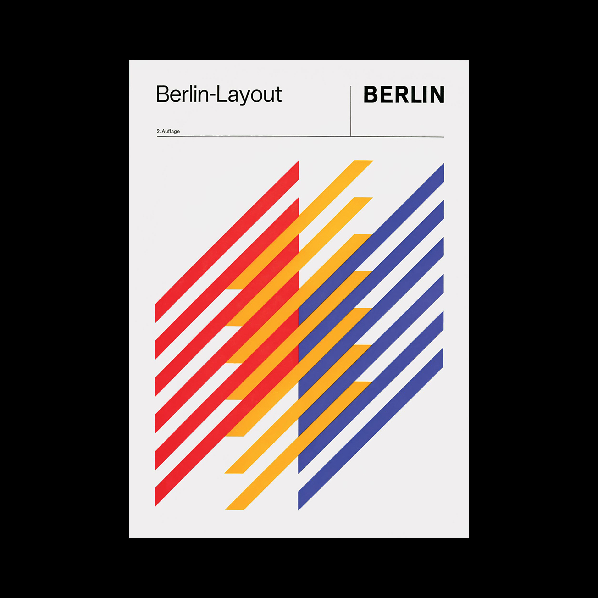
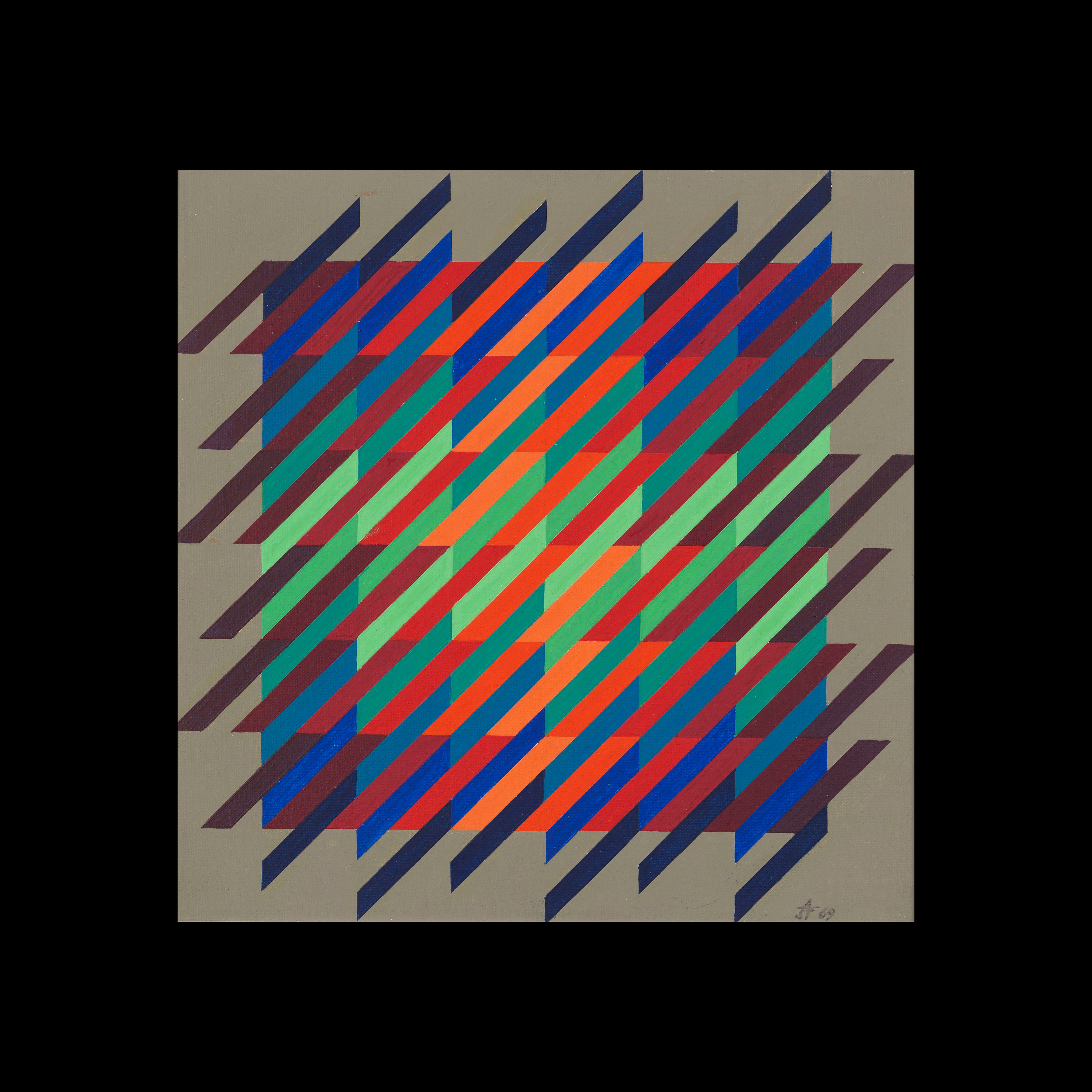
Stankowski was a well-known designer at the time having created the Berlin-Layout, the visual identity for the capital city, in the 1960s. Stankowski felt that there was little separation between art and design, with the two informing each other greatly in his practice. He aimed to depict intangible processes and notions through abstract fractal forms. As a painter, the oblique line was a prominent motif in his work.
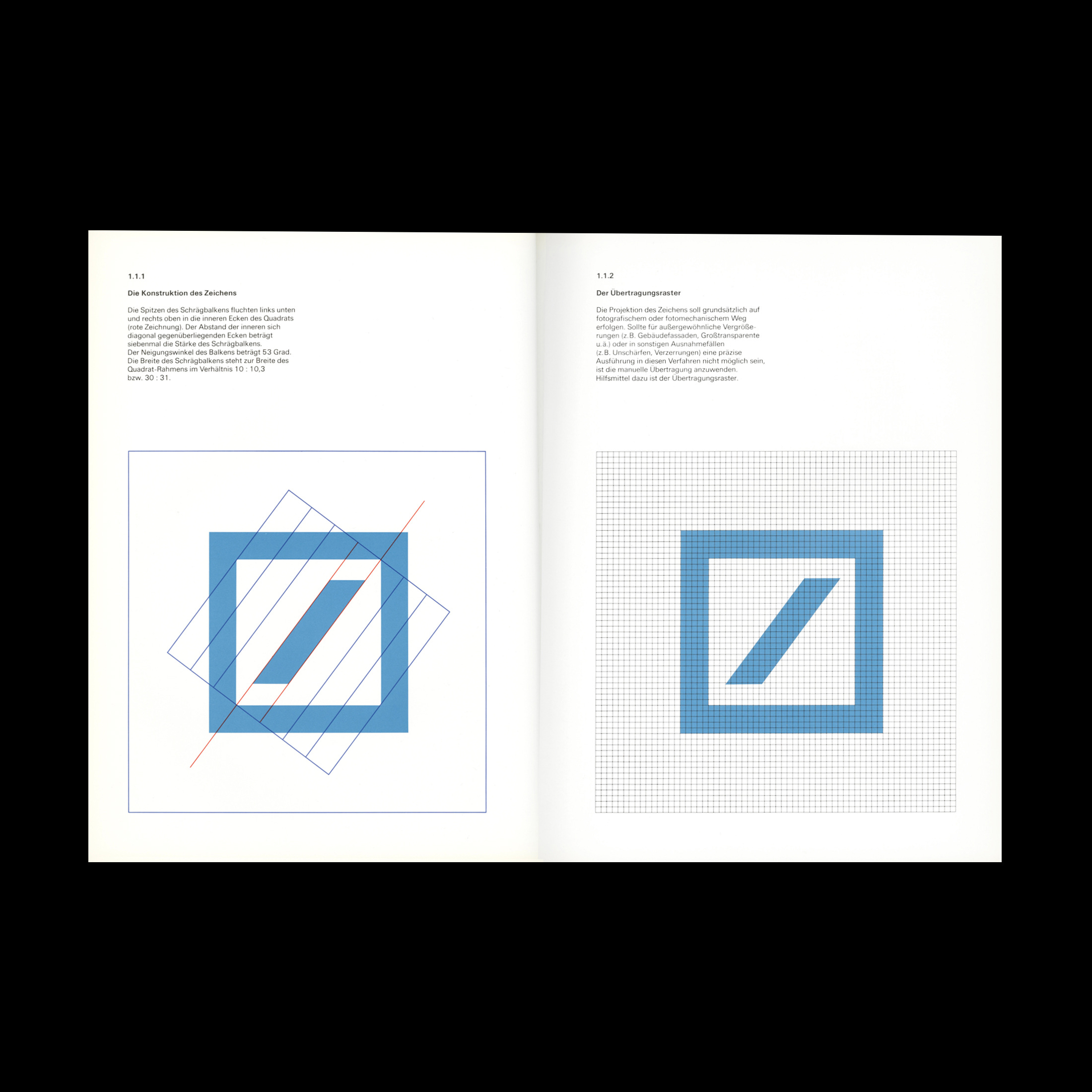
The new logo was unveiled at the annual press conference in April 1974. The design was a dramatic shift from previous letterform logos and consisted simply of an oblique beam, slanting at 53 degrees, contained in a square of bold lineweight. The tips of the oblique line are aligned with the inner corners of the square on the top right and bottom left. The width of the slanting beam is slightly thinner than the square frame with a ratio of 10:10.3.
The logo was developed into a corporate identity with the assistance of Karl Duschek, Stankowski’s partner at Stankowski + Duschek. This included the introduction of a vibrant colour palette, patterns and a wordmark typeset in Univers.
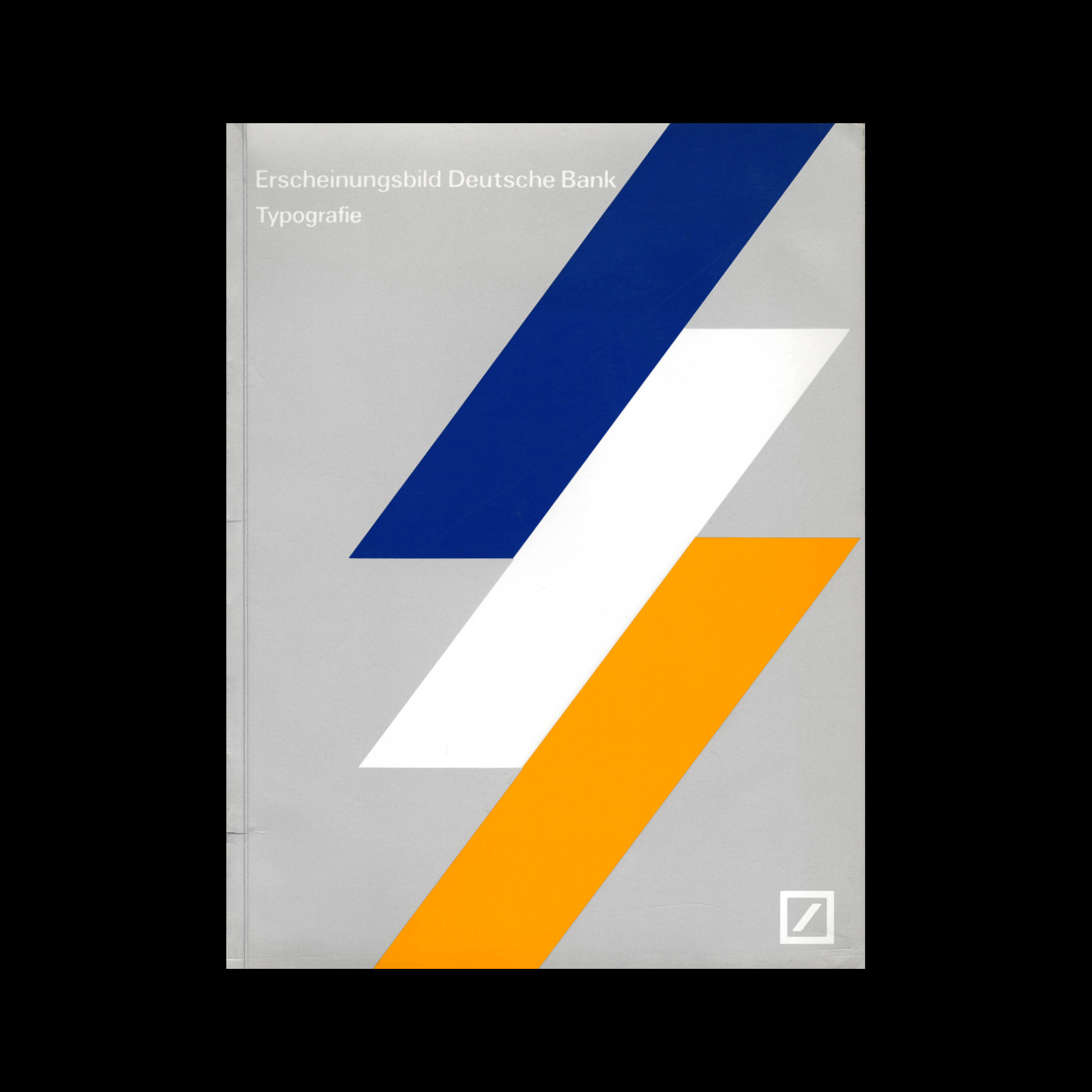
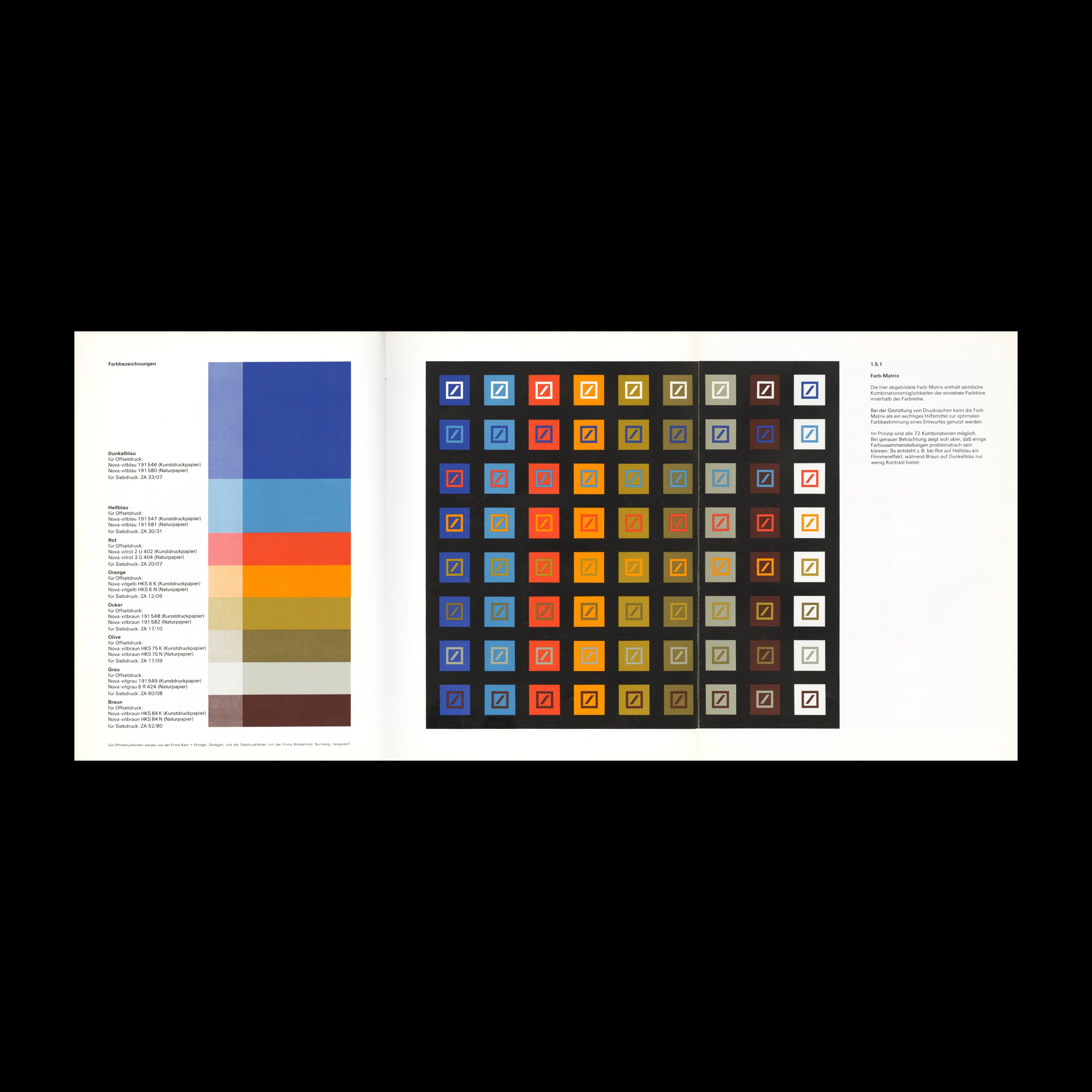
Blue was selected as the prominent colour due to its popularity, and is described within the brand guidelines as being understood as being a neutral, trustworthy colour to an international audience. Two shades of blue were included in the palette as it was believed, at the time, that women preferred a greenish blue, whereas men preferred ultramarine. For printed matter, a colour matrix was created to allow designers working with the brand to select pleasing colour pairings out of a possible 72 combinations.
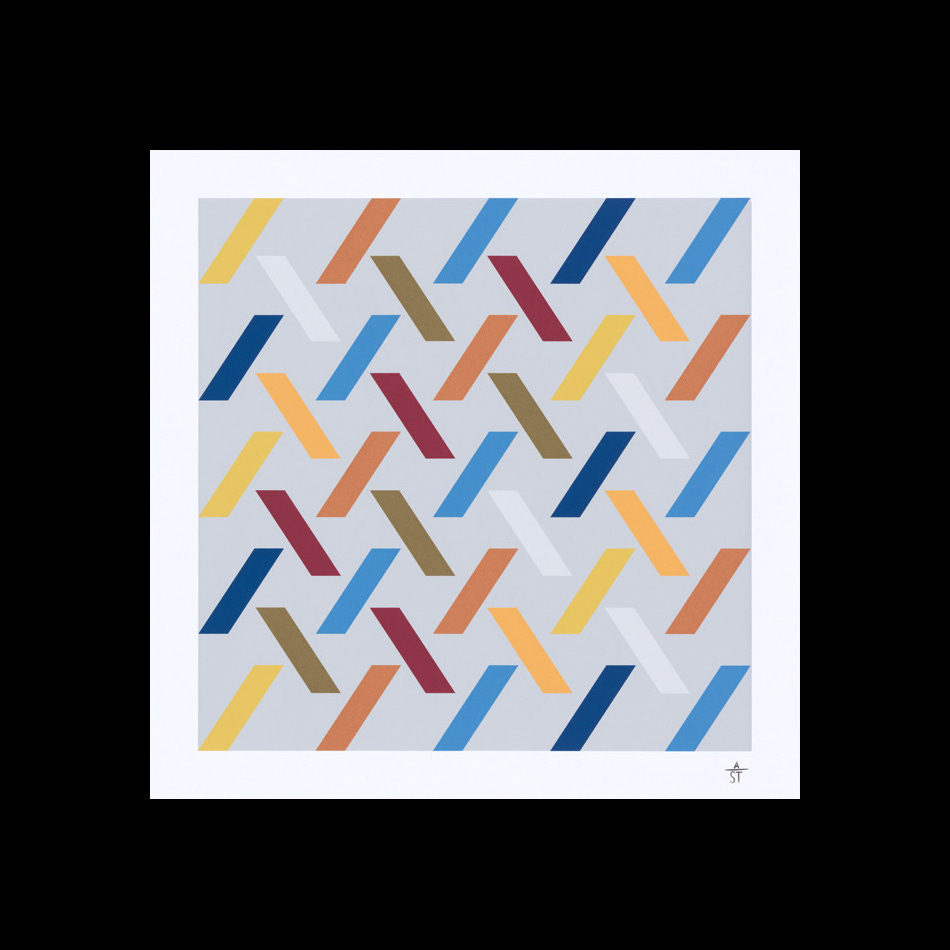
Thanks to the simple form, the logo proves versatile across a range of media. Similarly, the slant, the identifying characteristic of the logo, can be used in more creative compositions which Deutsche Bank continued to commission as a series of artworks.
Stankowski himself had described the logo as “Dynamic, ascending and secure. A security within a certain space, in which percentages fluctuate.” This was in reference to the dynamic and constant-changing nature of the market. The logo represents the stable and optimistic values that a customer would want from a banking service. The logo’s abstract quality also allows the viewer, like a piece of abstract art, to construct their own meaning.
The logo was considered a success by Deutsche Bank as it met several of the criteria: timeless, neutral, memorable, resizable and visually striking. It is still used today and is considered as one of Germany’s most iconic logo designs.
Thank you for subscribing to Logo Histories. If you enjoy reading this you may also enjoy these resources from the same team:
Brand Archive – Research tool for brand designers.
LogoArchive Website – Searchable modernist logo archive & research tool.
LogoArchive Shop – Vintage design books & LogoArchive Zines.
BP&O – Contemporary design editorial.
 | A guest post by
|