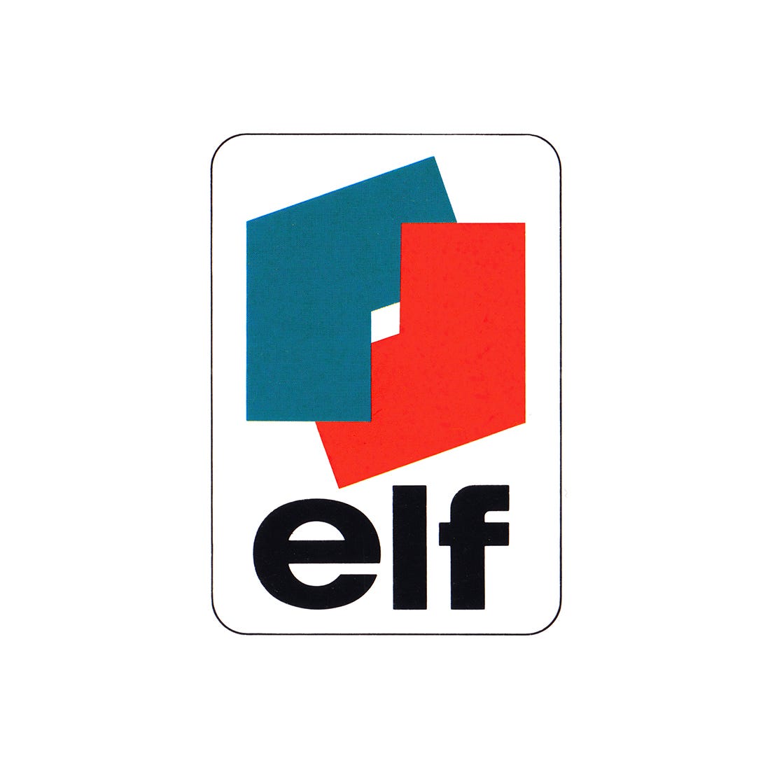
A ‘trépan’ and a red dot
Jean-Marie Chourgnoz, Henry Chaney, Erich Brenzinger and Jean-Roger Rioux's 1967 corporate identity for Elf.
This post is supported by LogoArchive – The home of historical logos. Discover over 4000 of history’s greatest designs from the world’s finest designers. Updated every single day. Always find the logo inspiration you need for your next logo or branding project. Start here.
By the early 1960s the ERAP Group appeared in France under several names. Among them were Caltex, CFPP, Lacq, La Mure and Avia. These covered refineries and chemistry, the production of oil and gas, and an international distribution network that extended across six countries. The formation of UGD (General Union of Distribution) in the mid 1960s was an initiative to essentially ‘re-group’ these. The combined efforts of each would then be focused, operating under a common logo and new name, vastly increasing the visibility of the total enterprise.
Continue reading to understand the process and concept behind the name and logo. Get an insight into why a further graphic element needed to be introduced and see this applied to vehicles, gas containers and packaging.


