Flexible and future-proof
Flexible logos in corporate identity design.
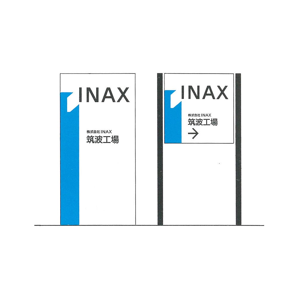
‘Insights’ is a new series from Logo Histories, and draws together learnings from across the archive. In this article, we take a look at the concept of flexible logos.
By the early 1960s, corporations had found themselves in difficult positions as post-war mergers and acquisitions had created a complex tapestry of product and services. Realising that their now vast scale of operations could be leveraged to achieve greater consumer visibility, they embarked on the development of new corporate identity programmes. Blue Circle’s pioneering visual identity designed by HDA International in 1967, used a simple graphic motif and colour palette to bring into coherence products that had existed across previously disparate subsidiaries. The ‘blue circle’ benefitted from straightforward applications such as signage, large format packaging and liveries. But what of more complex and diversified industries?
Aviation, with its international marketing activities and vast number of applications; from simple thermal printed luggage tags to the long liveries of aircraft, unusual ground equipment and diverse signage requirements, created a more complex task. Others found that their diversified product lines had multiplied their packaging formats and print requirements. A fixed logo couldn’t always deliver an immediate visual impression or make it easy for those working with it.
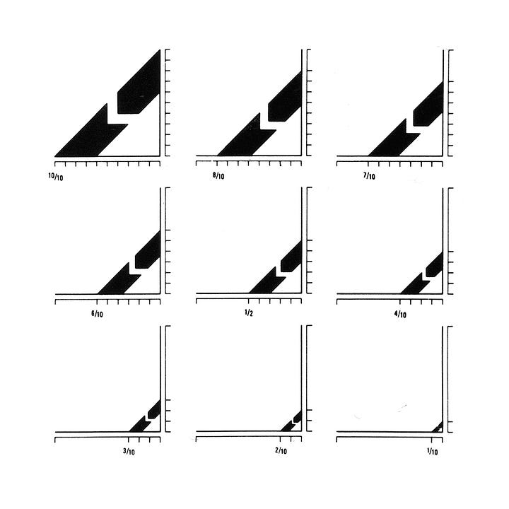

Lucas Industries, which had, through mergers and acquisitions, ended up with a vast quantity of products and packaging formats. Pentagram’s diagonal band design, which could terminate either flat or vertically, allowed them to create a strong visual impression and consistency, no matter the proportions of packaging.
Other companies, such as Claude Neon, used the flexible logo to break from monotony. Gottschalk+Ash devised a system that appeared familiar and consistent but was always changing (with over sixty variations), just like the signage service they offered.
Learning from Tokyo ‘64, the team responsible for the design of the Sapporo Winter Olympics iterated on an original design by Yusaku Kamekura, and made it a flexible modular system, rather than being fixed vertically. This addressed the issue of height restricted contexts forcing the logo to be reduced down in size and diminish its potential recognition.

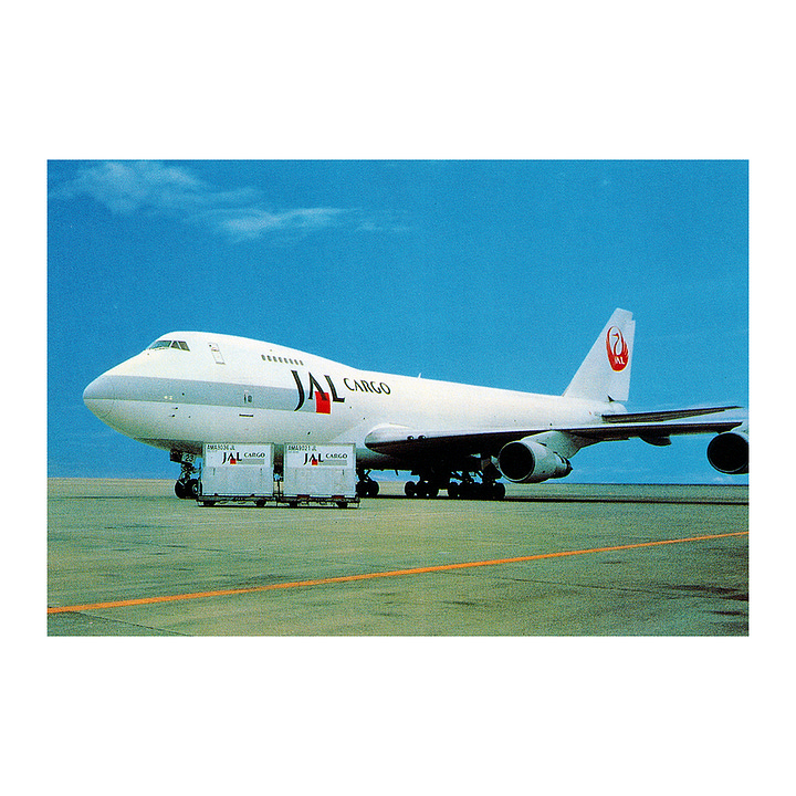
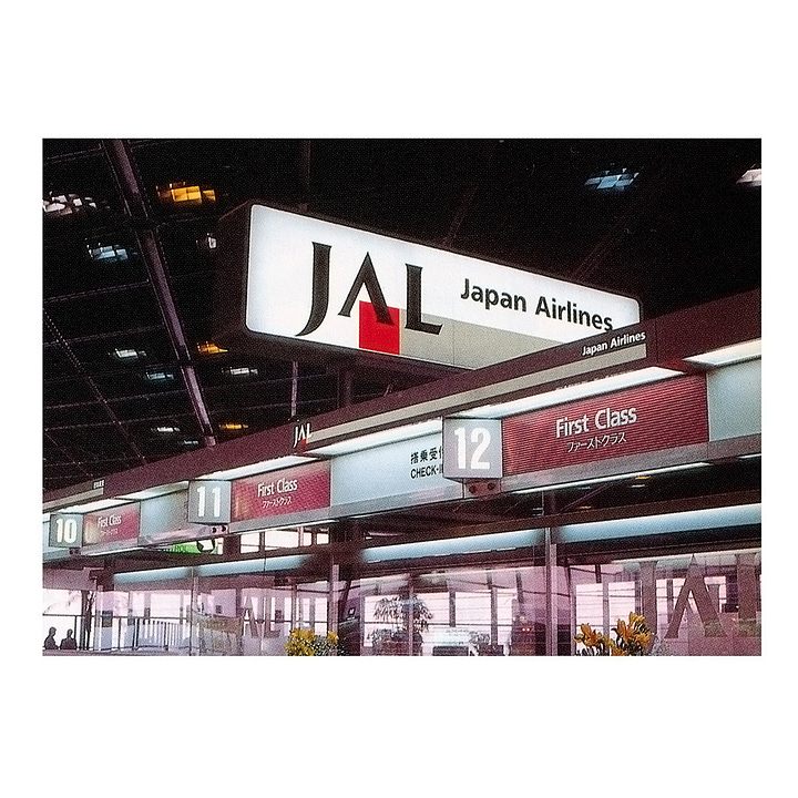

Japan Airlines ‘business-like grey band’ could run the length of check in desks, no matter how many there were, or along the length of a plane or luggage tag, or shortened to fit smaller contexts. This not only afforded JAL a flexibility that could accommodate a vast array or use-cases, but it also supported the overall concept of speed and dynamism.
These flexible logos were products of practical requirements. They may not always surprise and delight today, but they delivered on key considerations such as usability and the reinforcement of brand through the consistency of their application across all available surfaces, not matter how unusual these were. Further, not only were flexible logos appropriate for the unique use-cases of each brand at the time, they also afforded the brands that used them a flexibility going into the future, as they continued to grow and add more services or products.
There are many examples of flexible logos throughout history. Some of the early examples date back to the 1950s. What are your favourites? What examples best showcase this principle? Please share these in the comments below.
If you enjoyed reading Logo Histories also check out these projects:
Brand Archive (Beta) – Research tool for brand designers.
LogoArchive Website – Searchable modernist logo archive & research tool.
LogoArchive Shop – Vintage design books & LogoArchive Zines.
BP&O – Contemporary design editorial.


