
Going places
Will Van Sambeek's 1969 logo for Holland America Line.

Concorde made its maiden test flight in 1969, taking commercial air travel super-sonic. The technical developments in air travel had sunk the traditional role of passenger boats. For those that had time and money, cruises became a luxury experience, leaving the rest as cargo and container ships servicing international trade. Corporations with fleets diversified and expanded into both to safeguard their interests under quickly evolving market conditions.
The golden era of transatlantic passenger ships had ended, and in 1969, faced with this and substantial consumer changes in taste, Holland America Line commissioned Dutch designer Will Van Sambeek to develop a new logo and corporate image to better position them for the future.


The intention of the design programme undertaken by Sambeek and his team was three-fold; to visually integrate various divisions of the company into a single corporate entity with a strong identity; to create a new corporate face for the company that could be easily identified by shippers, consignors and passengers; and to ‘assure tourists of a modern and luxurious cruise line experience’.
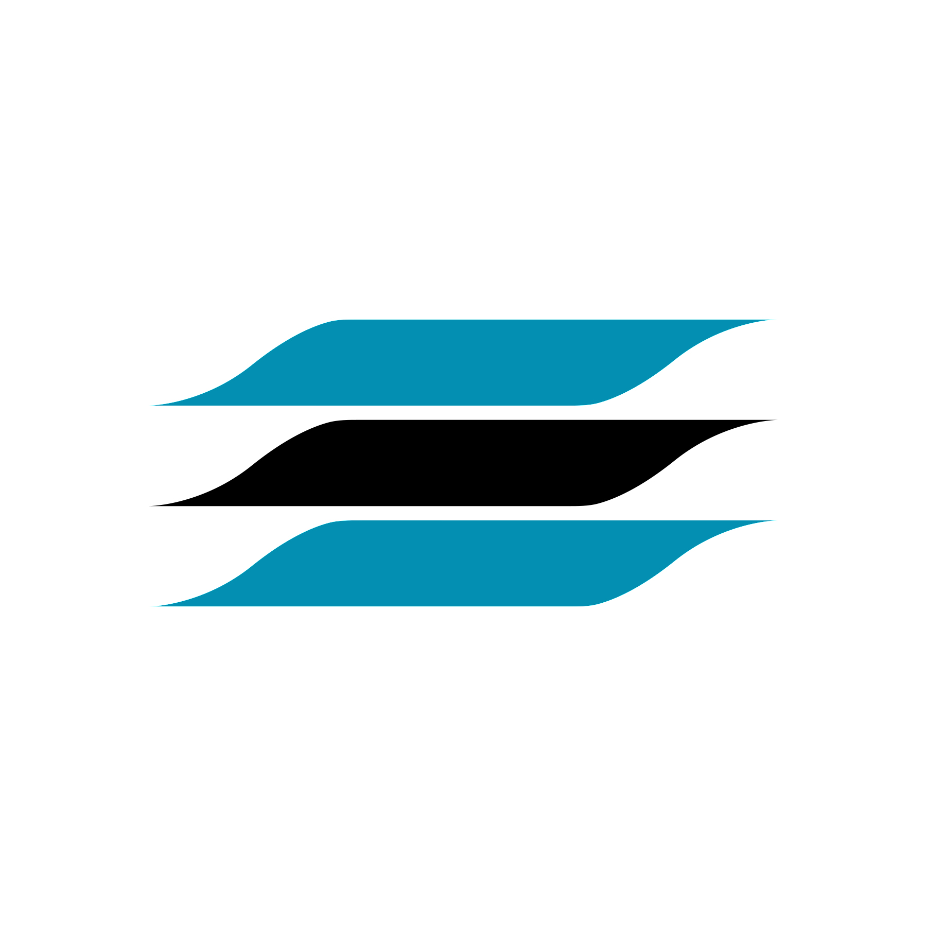
As part of the development of the new corporate image was the design of a logo. ‘Many sketches were made and discarded before the final one was accepted, with attention given to the usefulness of the new logo and its capacity to be applied at any size and by any means of production.

The final design is made up of several elements which are connected to the activities of Holland America Line and its brand image. The three horizontal lines, which curve into opposing points either end intended to give the impression of water and movement, of an ‘experience’, of ‘going places’ and of being modern and ‘streamline’.
The overall effect of the logo, rather than being specific, was to eliminate the need to represent various divisions of the company with different symbols, and make it easier to use and identify with whilst also being free from specific connotations understood by only a few.

Supporting the logo was Univers Extra Bold and Medium. This was used throughout as the primary typefaces. Univers was described at the time as being ‘the new pace setter in the printing world’, selected because it was ‘clear and easy to read’ and that it ‘never looks bunched or heavy, even in very small print.’ Finally, ‘unlike many type faces’ it was said that this one has ‘gone modern at no expense to legibility.’


Sambeek's design of the in-house stationery and literature, which included letterheads, envelopes and annual reports, was done in a fashion that was ‘neat and simple’ with passengers and sales promotion materials aimed at building a luxurious and pleasant image. Blue-green was selected for the corporate colour for its obvious association with the sea, and was used in combination with a black, amplifying the flag-like qualities of the logo.


In 1989, the Holland America Line was purchased by Carnival Corp. which saw it entirely owned by an American company. Although the brand remained, its corporate image was redesigned to reflect this change and the modernist logo designed by Will Van Sambeek was replaced.
Thank you for subscribing to Logo Histories. If you enjoy reading this short you may also enjoy these resources from the same team:
Brand Archive – Research tool for brand designers.
LogoArchive Website – Searchable modernist logo archive & research tool.
LogoArchive Shop – Vintage design books & LogoArchive Zines.
BP&O – Contemporary design editorial.
Brand Basics – Automated Brand Guidelines maker.