A monumental, French-curved M
The story of the Irving Harper'S 1946 logo for Herman Miller.
This post is supported by LogoArchive – The home of historical logos. Discover over 4000 of history’s best designs from the world’s finest designers. Always find the logo inspiration you need for your next project here.
Busy working on his first furniture collection as Creative Director at Herman Miller in and also responsible for the marketing of this collection, George Nelson handed the design of the new Herman Miller logo to Paul Rand.
When Rand backed out of the project, it was given to Irving Harper, Design Director at George Nelson & Co. and who was responsible for much of the furniture-maker’s classic advertising.
As Nelson’s collection was not ready and with no available photography, the trademark needed to work hard to catch the eye. Further, it should be simple enough to also work heat-stamped on to wood furniture and be reproduced in just two colours for advertising.
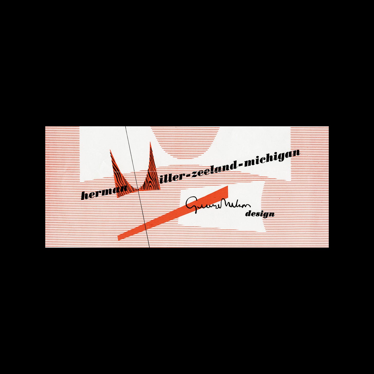
With these constraints in mind, Harper fashioned a striking form, a ‘monumental, French-curved M’, printed bold red with a black and white wood-grain texture on top.
This wood-grain texture would only be used when the reproduction size permitted, however, after a short period of time this wood grain was dropped and the logo was then applied as either a solid colour or as an outline.
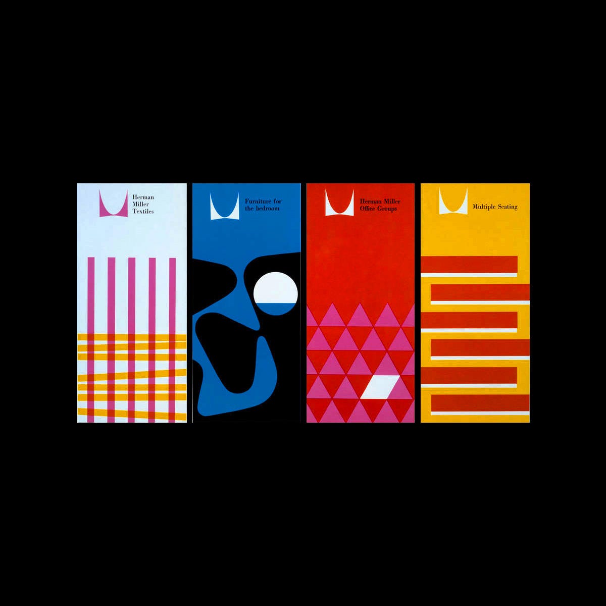
Today, and on quick inspection, the trademark appears largely unchanged, however, looking closer, small alterations can be seen to have happened between 1946–1998. These include a shallow smoother bottom bow (an adjustment made in 1960 by George Nelson Office) and a wider top bow and the flattening of the points which made it more scaleable.
More noticeably is the change in type and the relationship between type and mark. In 1968 John Massey introduced Helvetica aligned to the right of the logo, replacing the serif, and then in 1998 Brian Edlefson & Steve Frykholm changed Helvetica to Meta and placed the logo within a bright red circle.
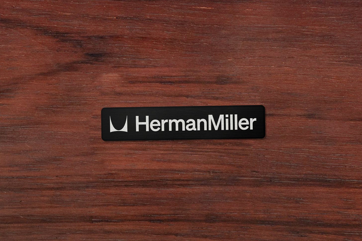
In 2024, following Herman Miller’s 100-year anniversary, design studio Order worked to refine, further and formalise aspects of the brand, to establish a more complete design system, "one that could accommodate growing contexts, from a mobile phone screen to a physical spaces and in all regions of the world. The logo remains unchanged, however, in reference to Helvetica, the studio selected Söhne from Klim Type Foundry capturing the same spirit but afford the brand more digital-first focus.
Want to see more of this 2024 rebrand by Order? Check out the case study on Brand Archive here.
Thank you for subscribing to Logo Histories. If you enjoy reading this you may also enjoy these resources from the same team:
Brand Archive – Research tool for brand designers.
LogoArchive Website – Searchable modernist logo archive & research tool.
LogoArchive Shop – Vintage design books & LogoArchive Zines.
BP&O – Contemporary design editorial.


