Fire beside the sea
The story of Jurriaan Schrofer's 1963 logo for Koninklijke Hoogovens.
This post is supported by LogoArchive – The home of historical logos. Discover over 4000 of history’s best designs from the world’s finest designers. Always find the logo inspiration you need for your next project here.
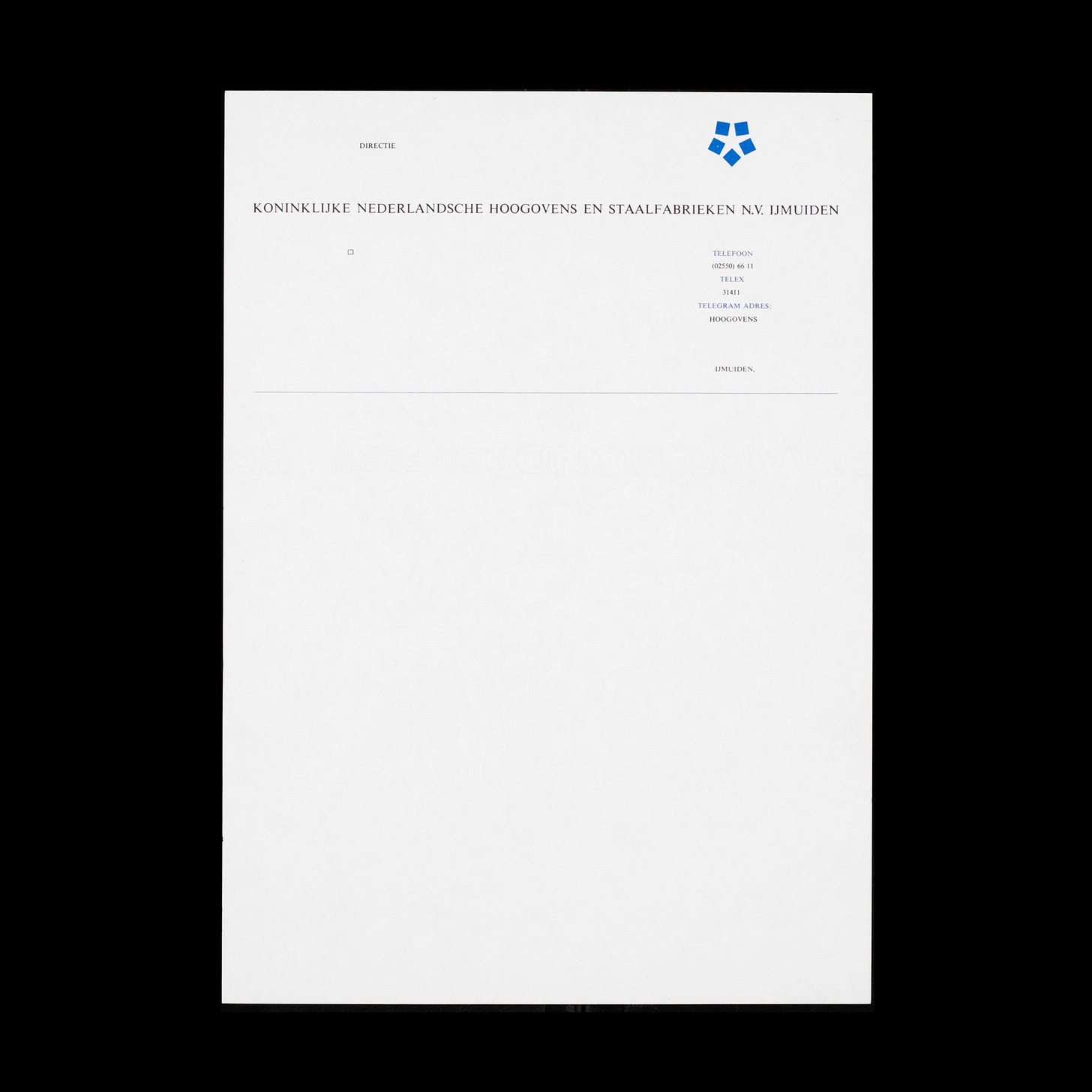
Koninklijke Nederlandse Hoogovens en Staalfabrieken (also known as Koninklijke Hoogovens, or informally as Hoogovens) was a steel-making company located in IJmuiden, a small port city in the province of North Holland.
Dutch designer Jurriaan Schrofer began working with Hoogovens in the 1950’s advising on its printed communications. In 1963 he was invited to design a new logo for the company.
This requirement for a new logo arose from the “publicity people of Hoogovens” who had identified a missed opportunity to better symbolise the company in print, and the desire of Hoogovens’ management to create a jubilee award for their loyal staff. This award, which would be cast from gold, needed a strong motif. Prior, the company had had a symbol that placed the letters KNHS at the centre of an oval.
Five years prior, in 1958, Jurriaan Schrofer had designed a photobook for Hoogovens on the occasion of the retirement of its president-director Arnold Hugo Ingen Housz. This book was poetically titled 'Fire beside the sea’ (vuur aan zee) and beautifully captured the hot metal work done by the company through the lens of five now well-known photographers.
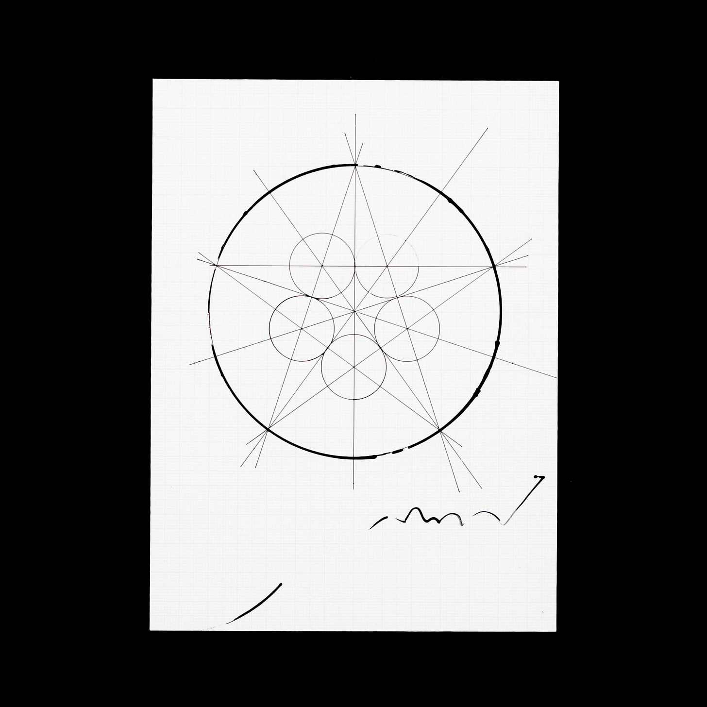
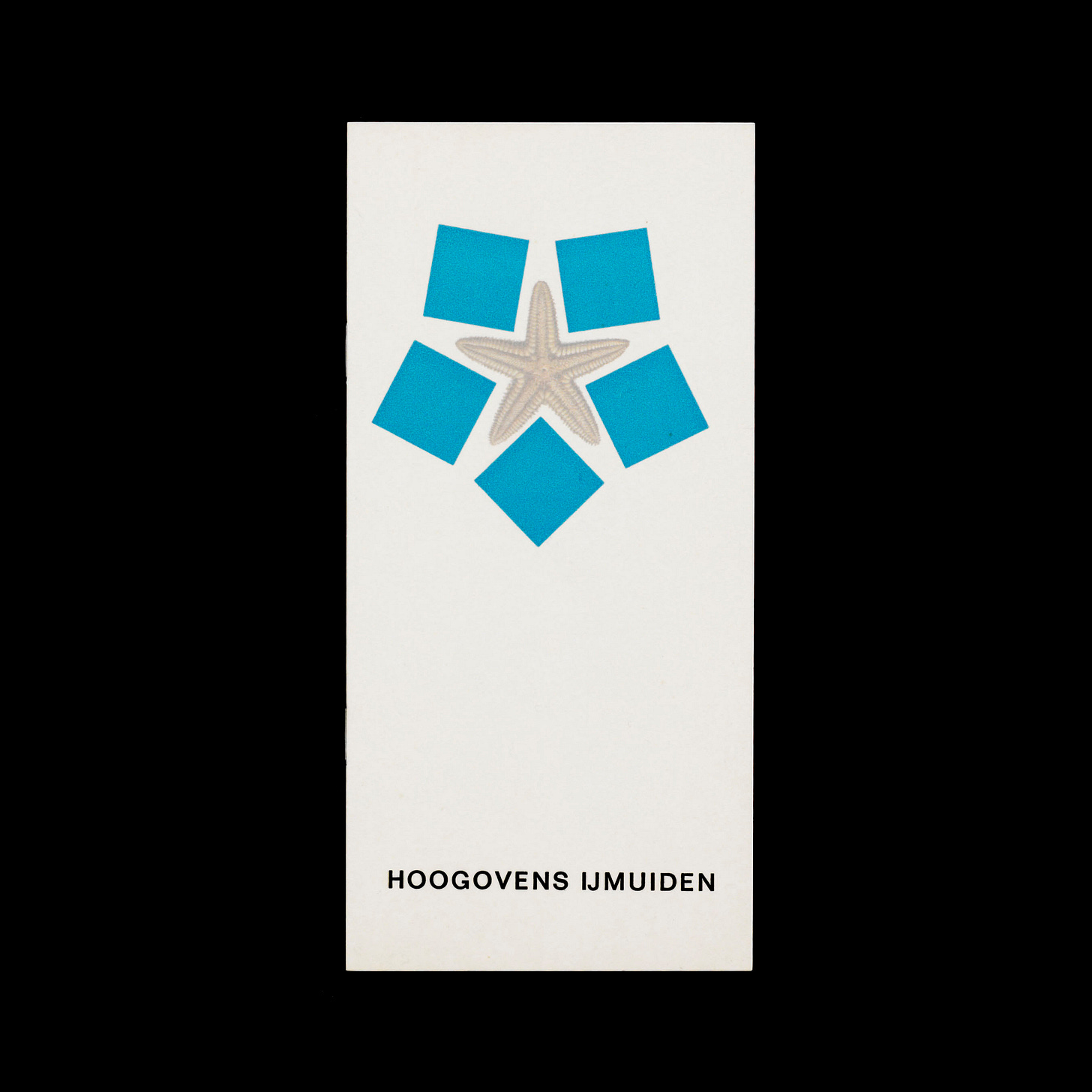
From this idea of 'Fire beside the sea’ Schrofer developed a logo inspired by the seaside location of the company, coming up with a stylised starfish as a basic form in which to arrange five squares.
The five squares represented the composite character of the Hoogovens steel manufacturing complex of five blast furnaces, and the five continents the company exported to at the time. In the arrangement of these squares they give space to the shape of a starfish, a symbolic representation of where the company was situated; the point at which land and sea meet. The negative space also became the sea between the continents.
The balance of positive and negative space, the formal arrangement of squares and reference to land and sea gave the star motif a distinctive character. This would distinguished itself from the many other stars used by countries and corporations. In a note written by Schrofer, he references the US Army, Soviet and Esperanto stars.
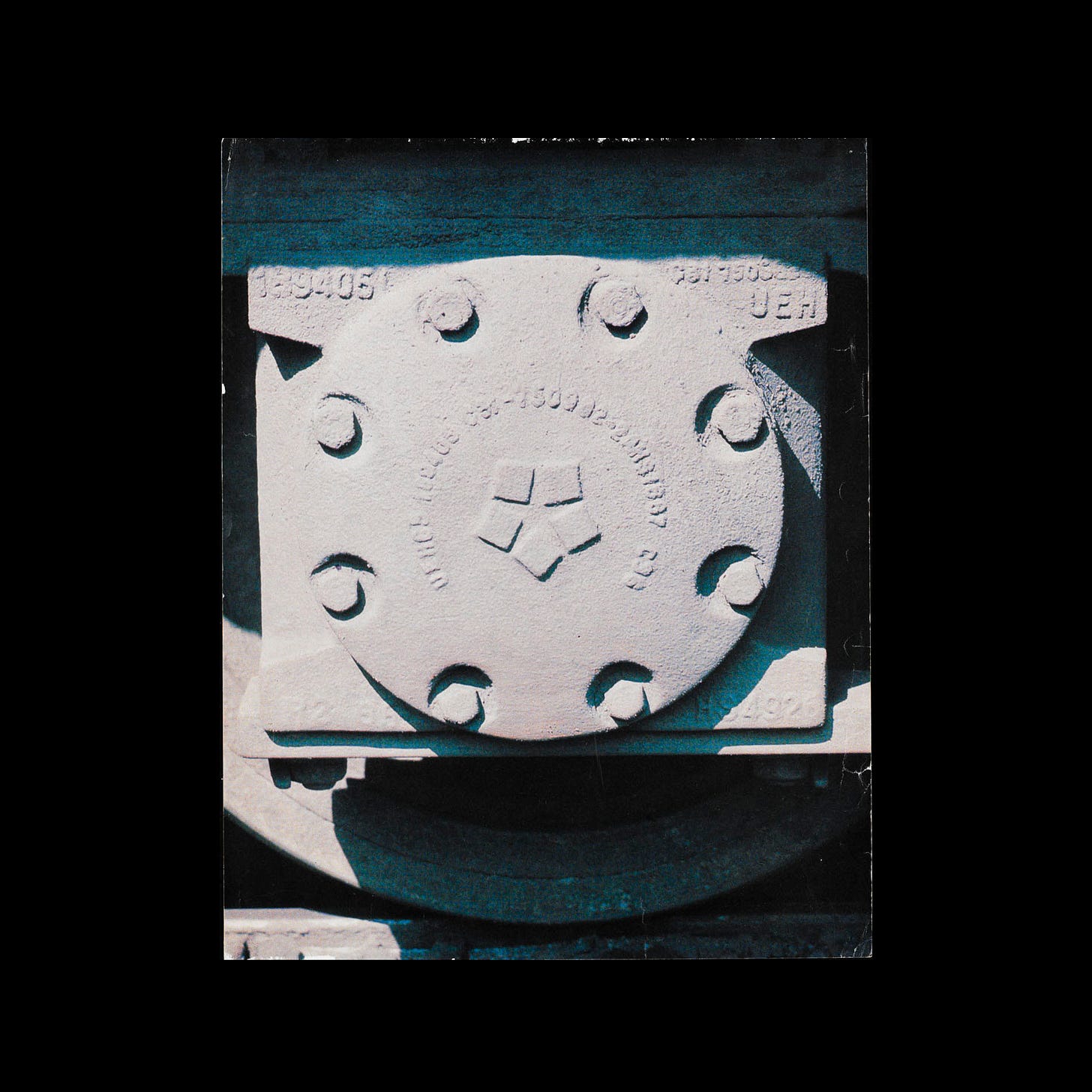
The new logo was first used in advertising campaigns in 1963 and featured at the event 'Taptoe Velsen 1963' held on 17th May. The new logo was also said to have performed well as flag which was first raised on 7th November the same year.
Marinus Kutterink was commissioned to design the golden jubilee pin/award using the Hoogovens logo created by Jurriaan Schrofer. The first person to receive the anniversary pin was the youngest 25-year-old jubilee, Mr J. Schavemaker, and the oldest of the 40-year jubilees, Mr H.T. Duyn.
A take over in October 1999 saw the Hoogovens’ star replaced with the oval red C of British steelmaker Corus. This was then usurped by the blue T of Indian company Tata Steel in 2006.
Thank you for subscribing to Logo Histories. If you enjoy reading this you may also enjoy these resources from the same team:
Brand Archive – Research tool for brand designers.
LogoArchive Website – Searchable modernist logo archive & research tool.
LogoArchive Shop – Vintage design books & LogoArchive Zines.
BP&O – Contemporary design editorial.


This was one of those a-ha moments. Seen this logo plenty of times, but never knew about the starfish!