


The following is an article published in Graphic Design 39, 1970. In it, Ota Yukio writes about two house styles in the Netherlands, KLM and DSM.

KLM Royal Dutch Airlines
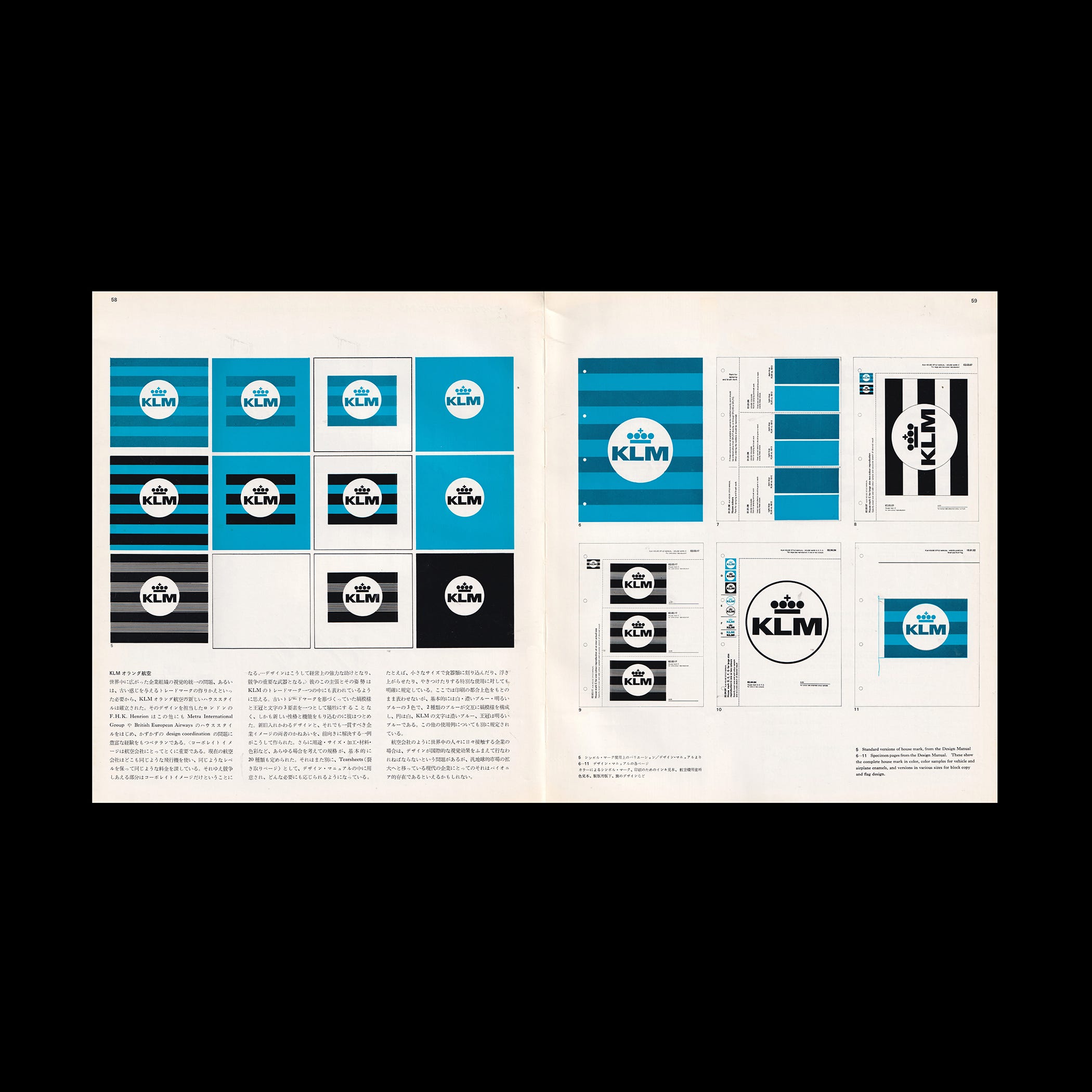
Because of the world-wide nature of the organization and the need for a visual identity coupled with a necessity to replace the old house mark with its old associations, the KLM Royal Dutch Airlines recently established a new house style. The designer F.H.K. Henrion of London has also done the house styles for the Metra International Group and the British European Airways. He is an experienced veteran in the problems of design coordination.
"Corporate image is particularly important for airlines. They use the same aircraft, offer the same high standards of maintenance, and charge the same fares. The area of competition is concentrated in corporate image. Design thus becomes an important instrument of competition."
Explore more like this in Logo Design History by Country →
Go behind the logos. Explore 200+ in-depth and meticulously researched logo histories revealing the designers, design decisions and ideas behind the world’s most iconic logos and important brand identities.
I feel that these ideas of his are to be found in the KLM house mark he designed. He worked at avoiding a sacrifice of the previous house mark which included the striped pattern, the crown, and the letters, while attempting to infuse a new characteristic and function. Thus we are given a progressive example of exchanging an old design for a new while maintaining the overall company image. The requirements of all situations were taken into consideration, such as, usage, size, specifications, materials, color, etc., and a basic 20 kinds were settled upon. These were on tearsheets prepared in a design manual ready for application to any necessity. For example, the small size design would be either engraved, embossed or enameled on the eating utensils and there were explicit regulations for these special uses.
Because of printing considerations we will not show the design in the original colors. Basically there are three colors: white, dark blue, and bright blue. The two blues formed the stripe pattern and the circle is of white. The KLM letters are in dark blue while the crown is in bright blue. There are separate regulations for other uses.
Because aircraft are seen by people throughout the world the companies must adopt a design which will have an international visual impact. This problem could be called a pioneering one in that all companies are showing trends to develop international markets in this present age.
DSM (Dutch Sate Mining)
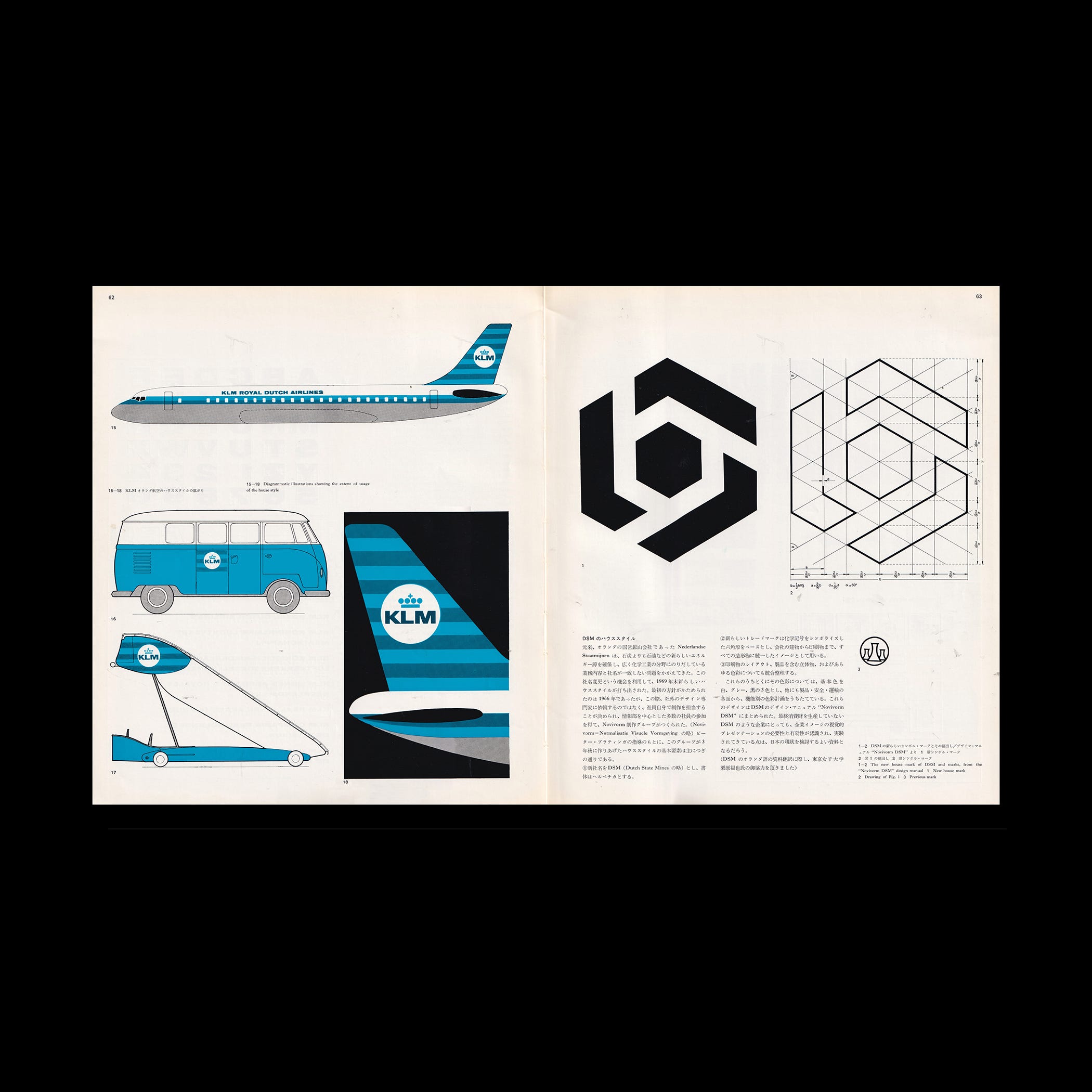
Nederlandse Staatmijnen is the state operated mining company and, in the search for new sources of energy, the company now produces more kerosene than coal. They are also doing research into chemicals and consequently, the name no longer fits the business. The change to a new name in 1969 gave the company an opportunity to come out with a new house style. The first ideas were developed in 1966 and at that time it was decided that for establishing the house style not an outside designer but the employees themselves should be asked to take responsibility. A number of employees formed the ‘Novivorm Working Group’ with the company information section at the core. (Novivorm stands for Normalisatie Visuele Vorm-geving). The basic features of the house style which this group, headed by Pieter Brattinga, developed 3 years later are as follows:
The new company name would be DSM (Dutch State Mines) and its type face would be Helvetica.
The new house mark would symbolize a chemical sign based on a six corner shape. This would appear on all company property.
All colors used, all printing layout, and all product tones were to be unified and systematized.
As for the colors mentioned in no. 3 above, the three basic colors of white, gray and black were chosen. A color code plan based upon function was laid out for use in all business endeavors.
All of these designs were published in the DSM design manual "Novivorm DSM". Although DSM does not manufacture finished consumer products, the need for and effect of a visual presentation of the company image was recognized and developed. In view of the present situation in Japan this example should be the basis for further study here. (In translating the DSM material in Dutch we received the assistance of Mr. Kurihara fukuya of Tokyo Women's College).
Want more in-depth articles? Check out LogoHistories’ other articles on Dutch logos →


Thank you for subscribing to Logo Histories. If you enjoy reading this short you may also enjoy these resources from the same team:
Brand Archive – Research tool for brand designers.
LogoArchive Website – Searchable modernist logo archive & research tool.
LogoArchive Shop – Vintage design books & LogoArchive Zines.
BP&O – Contemporary design editorial.