This post is supported by LogoArchive – The home of historical logos. Discover over 4000 of history’s greatest designs from the world’s finest designers. Always find the logo inspiration you need for your next project. Start here.
The 1960s would find many railways on the back foot as car ownership and low cost air travel became the norm. Airlines (KLM, Eastern Airlines, Austrian Airlines & Swissair), spurred on by commercial potential of the jet age, had fully embraced modernisation. Not only did airline visual identities reflect an exciting future (rather than the ‘glorious past’ railways had chosen to focus on) this period of modernisation had also extended to booking systems, managerial structures and customer services. This made airlines appear as exciting as they were efficient in service and competitive on price.
In Denmark high expectations surrounded national infrastructure, having benefited from faster trains, bigger ferries and modern bridges. While there was movement forward, much of the visual identity and communications remained stuck in the past.
Following in the footsteps of pioneering modernisation programs of Great Britain (British Rail) and Europe (Nederlandse Spoorwegen), the Danish State Railways (DSB) embarked on its own modernisation program in 1970. This would improve trains and station facilities, and introduce a new DSB design policy that would address an outdated image.
The intention of DSB’s new design policy was two-fold; to be a statement of the ‘spirit of the railway’, presenting it as modern and efficiently run; and align and inspire its 20,000 employees. The development of this design policy would also run in parallel to improvements being made throughout the passenger experience and working conditions of the staff. In this way, the design and introduction of a new visual identity would not only unify and improve communications but function as a signal of the change that extended across all aspects of the state-run railway.
The design program would begin with the development of a basic design system. This would include a new logo (replacing the steam-age image of a winged and crowned wheel), as well as a corporate typeface and colour palette.
To establish these basic elements, and begin to move the program forward, a competition was held and eight Danish graphic designers were invited to submit proposals.
Winning the competition was the renowned designer Niels Hartmann, with Jens Neilsen, the design director at DSB, coordinating a design group that would then be responsible for the development of the basic elements into a comprehensive design program from graphics to architecture.
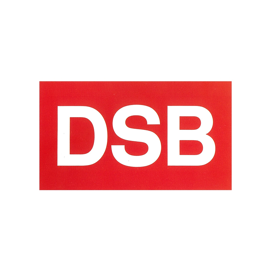
The DSB trademark was not a symbol but a logotype of three initials. These letterforms were based on Rail Alphabet designed by Jock Kinneir and Margaret Calvert for British Rail. This then formed the basis of ‘DSB Alphabet’. ‘DSB’ was a compact and easy to use abbreviation and, in its simplified form and utilitarian letter shapes clearly expressed modernity and efficiency, particularly when viewed as a successor to what came before. This approach to the logo also addressed key issues around consistency, legibility and immediacy throughout a complex system of signage, informational materials and train liveries.
The use of colours throughout DSB were formalised, using red and white as the corporate palette and helping to reinforce the recognition of the DSB logotype. A set of primary hues were introduced across printed matter, paint and signposting to help clearly delineate between services and messaging.
As well as establishing the basic principles of the DSB visual identity, Hartmann also developed pictograms that maintained a visual consistency. And, as part of the design group, in which he took a leading role following his winning proposal, he helped produce a revised signage system, staff uniforms, coach interiors and modular station architecture in cooperation with the DSB. He also developed the design manual, and further companion volumes on advertising, signs and buildings.
Like many large scale corporate identity and state transport programs, outside specialists were called on to contribute key elements. The team at Lange & Damsgaard (Per Arnoldi, Henning Damgaard and Rasmus Nellemann) were responsible for the schematically drawn route maps. These were a pioneering attempt to resolve a complex system that connected a unique topography of islands and peninsula. These were awarded with several Danish Design Council prizes.
Other specialists included artists. Although the design policy of DSB was mainly concerned with practical problems, there was also a concerted effort to develop the reputation of DSB in the minds of travellers. In 1974, shortly after the design policy was implemented, artists were invited to interpret the ideas and aspects of the railway as a series of posters. These were not seen as purely a sales activities but used to illustrate the way peopled experienced train travel. These posters where then used throughout the train system.
The logo was in use up until 1997 when a new logo was introduced, taking a modernist approach to the wing and crown motif that had proceeded the work done for the 1970 rebrand. In 2014, the sans-serif initials were reinstated using a custom typeface developed for the digital age.
Thank you for subscribing to Logo Histories. If you enjoy reading this you may also enjoy these resources from the same team:
Brand Archive – Research tool for brand designers.
LogoArchive Website – Searchable modernist logo archive & research tool.
LogoArchive Shop – Vintage design books & LogoArchive Zines.
BP&O – Contemporary design editorial.