A carnival of colour
Deborah Sussman's design policy for the Games of the XXIII Olympiad
This post is supported by LogoArchive – The home of historical logos. Discover over 4000 of history’s best designs, from the world’s finest designers. Always find the logo inspiration you need for your next project here.
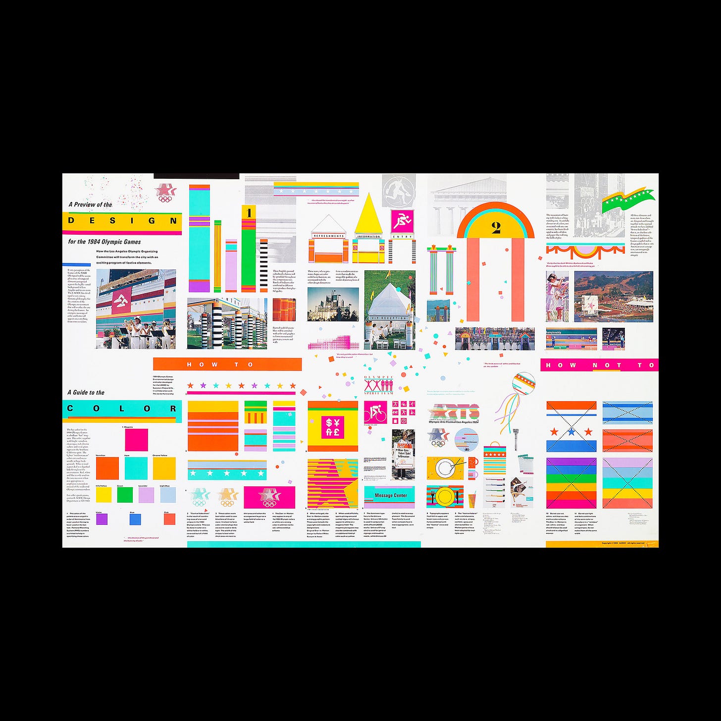
The Games of the XXIII Olympiad, also known as Los Angeles 1984 or just LA ‘84, took place between July 28 and August 12. This was the second time the Olympic Games had been held in the city. Just as the emblem of Los Angeles 1932 reflected its time so did LA 84. However, it wasn’t the emblem that gave the Los Angeles Games its distinct character, but a new wave energy and festivity of bright neon colour which was introduced by designer Deborah Sussman and the team at Sussman/Prejza.
Prior to Deborah Sussman's involvement, the design of the 1984 Olympics consisted of a red, white and blue ‘stars in motion’ symbol, designed by Robert Miles Runyan and approved in 1980, four years ahead of the Games. This would be used as a promotional emblem ahead of the Games and as the identity system was being designed.
The triple star symbol intended to convey the spirit of the competition, employing 13 horizontal lines to evoke the Star-Spangled Banner, speed and and a sense of action. The red, white and blue positioned the symbol within the proud culture of the United States of America.
However, when it came to developing a unifying design policy for the Games, the symbol’s combination of stars, stripes and the colours of red, white and blue was considered somewhat ‘inappropriate’ with a ‘nationalistic’ rather than an inclusive and intentional sentiment.
John Follis Associates was the first to suggest throwing out the traditional red white and blue in favour of using pastel versions of the colours that featured in the Olympic Rings. It was, however, Sussman/Prejza that drove the design policy into the ‘carnival of colour’ that it became, introducing, quite unique to Games at that point, a palette of eleven-colours.
The Sussman/Prejza team reworked the pastel colours suggested by John Follis Associates, and introduced additional vivid colours as a reflection of a Californian spirit. This also draw on aspects of 1980s New Wave, the Latin-America population of LA and the Mediterranean environment of the original Greek Games.
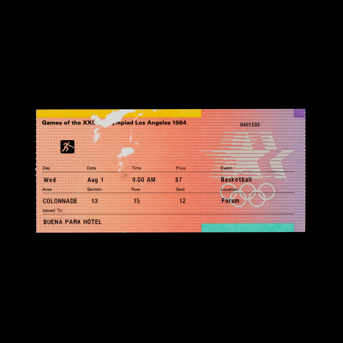
The symbol designed by Robert Miles Runyan was introduced into the design system. Rather than employ the original three colour version and transfer the nationalistic sentiment, it was used as a solid colour and applied as either a striking graphic element and focal point with contrasting colours or as a small independent element. What was once a somewhat individualistic symbol became an invitation to the international community to come party.
This is one part of a two part story. Click here to read more about the ideas, context and considerations that led to the design of the LA ‘84 ‘Stars in motion’ symbol created by Robert Miles Runyan in 1980.
Discover more LA ‘84 brand assets and assets from hundreds other historical and contemporary brands at Brand Archive.
Thank you for subscribing to Logo Histories. If you enjoy reading this you may also enjoy these resources from the same team:
Brand Archive – Research tool for brand designers.
LogoArchive Website – Searchable modernist logo archive & research tool.
LogoArchive Shop – Vintage design books & LogoArchive Zines.
BP&O – Contemporary design editorial.


