Stars in motion
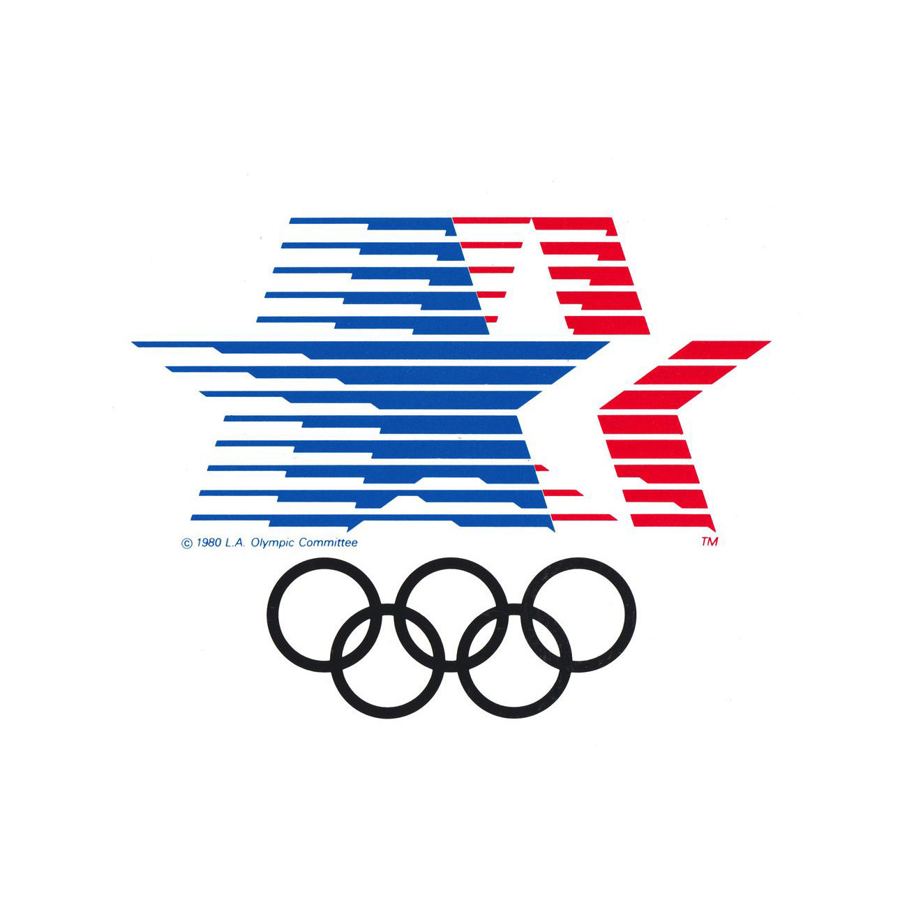
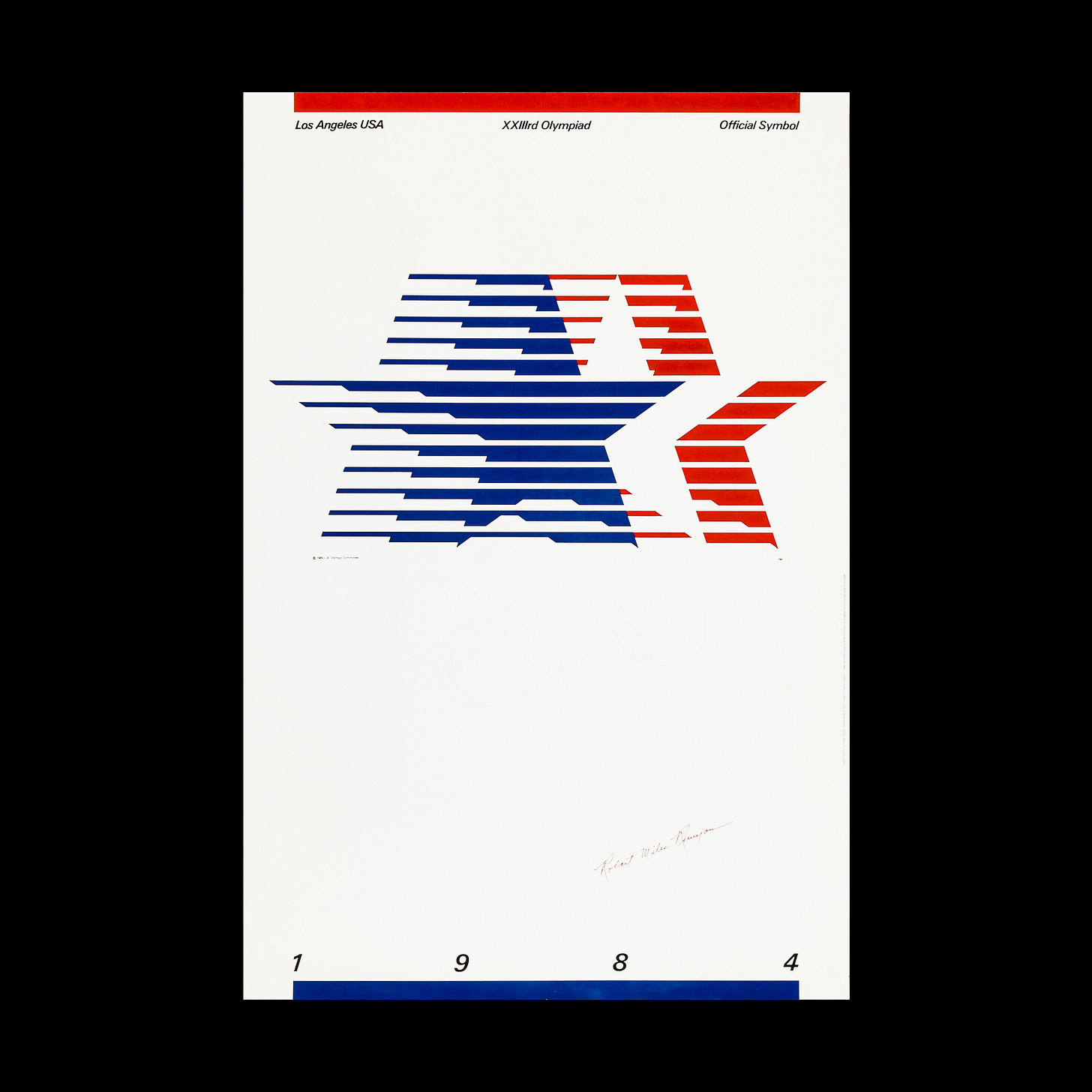
Robert Miles Runyan & Associates' logo for Los Angeles 1984 Olympic Games
This post is supported by LogoArchive – The home of historical logos. Discover over 3000 of history’s best designs, from the world’s finest designers. Bookmark and collate logo inspiration for your next project here.
The 1984 Summer Olympics, also known as Los Angeles 1984 or more officially, the Games of the XXIII Olympiad, was held between July 28 to August 12. This was the second time the city had hosted the Games, with the first being in 1932.
The design for the Games, and perhaps its defining and most widely-remembered quality, was the bright and impressive use of colour and the visual festivity created by Deborah Sussman. However, the logo, which played a supporting rather than focal role within this identity, was designed back in 1979 by Robert Miles Runyan Associates and approved in 1980, four years ahead of the Games.
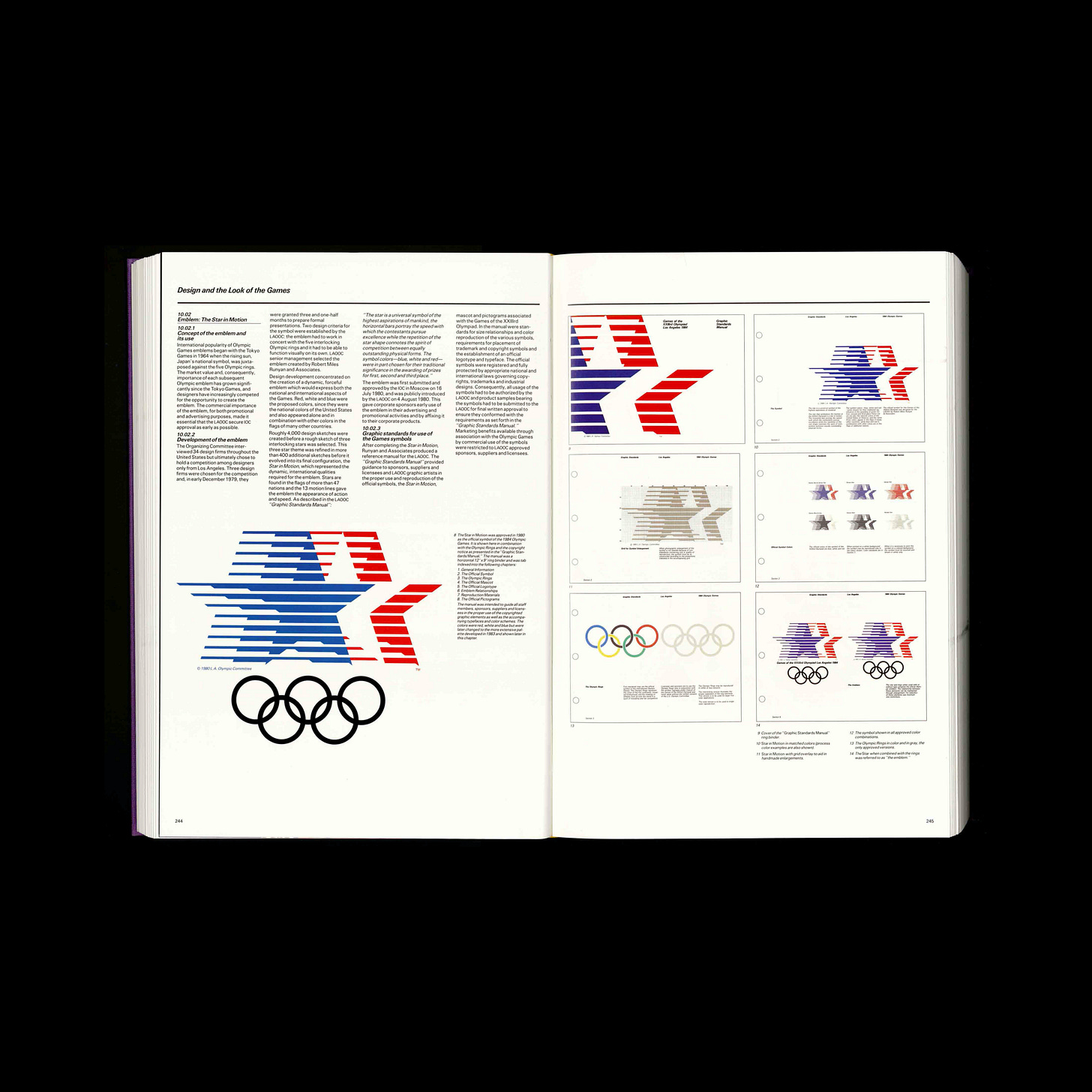
As a first step, the Organising Committee had asked 34 design companies from the United States to submit proposals for the emblem of the Games. However, in the end, it was decided to hold an exclusive and more local competition among Los Angeles-based designers. The committee selected three design studios, one of which was Robert Miles Runyan & Associates.
The Organising Committee of the Games set of conditions that the emblem should meet. It had to work with the Olympic rings, it had to function independently from other graphic elements and be dynamic and international.
From December 1979, the candidates had three and a half months to develop their proposals. The winning emblem was described as ‘stars in motion’ and designed by Robert Miles Runyan and illustrated by Jim Berte. This depicted three overlapping stars, linked in a dynamic gesture of increasing line thicknesses. This intricate but explosive American gesture had been one of over 4000 initial sketches produced by the studio, and then refined through an iterative process that produced another 400 sketches.
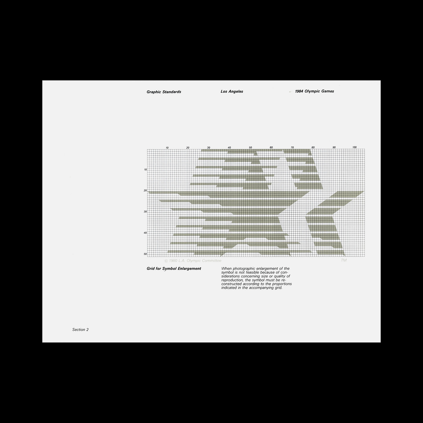
The final design weaved together a number of ideas. The three stars represented first, second and third place and the 13 horizontal lines, based on the Star-Spangled Banner, conveyed the speed and action of the Games. The red, white and blue, another gesture of "three", positioned the symbol within the proud culture of the United States of America.
When it came to developing a unifying design policy for the Games, the emblem's combination of Stars and Stripes, in conjunction with colour, was considered somewhat inappropriate for an international event, leaning far too much towards a nationalistic rather than inclusive sentiment.
On 4 August 1980, the Olympic Organising Committee presented this emblem to the public. The emblem began to be used by sponsors in the lead up to the Games, and a team of designers, led by Deborah Sussman, began to construct the LA ‘84 design policy.
This is one part of a two part story. Click here to read about how Deborah Sussman developed the festivity of colour that characterised the 1984 Summer Olympic Games.
Discover more LA 1984 brand assets and assets from hundreds other historical and contemporary brands at Brand Archive.
Thank you for subscribing to Logo Histories. If you enjoy reading this you may also enjoy these resources from the same team:
Brand Archive – Research tool for brand designers.
LogoArchive Website – Searchable modernist logo archive & research tool.
LogoArchive Shop – Vintage design books & LogoArchive Zines.
BP&O – Contemporary design editorial.


