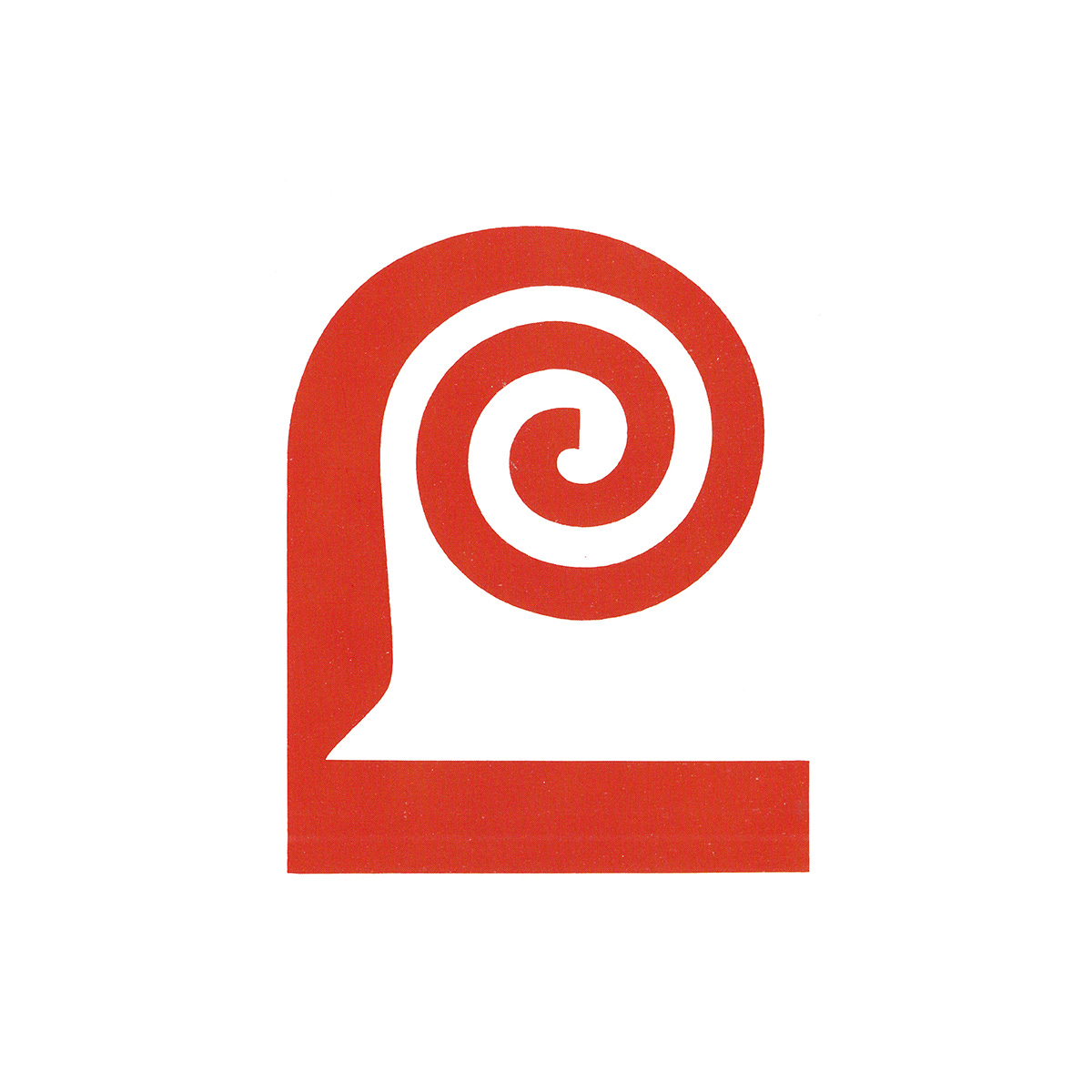
A gourmet flourish
Saul Bass & Saul Bass & Associates' 1959 logo for Lawry's.
This post is supported by LogoArchive – The home of historical logos. Discover over 4000 of history’s greatest designs from the world’s finest designers. Updated every single day. Always find the logo inspiration you need for your next logo or branding project. Start here.
American corporation Lawry's Foods began in 1938 as Lawry's The Prime Rib Restaurant. By the late 1950's, despite being a small, family-owned business, Lawry’s had found success with its roast beef, prepared using a proprietary aromatic blend of salt, herbs and spices. It later sold this seasoning pre-packaged to restaurant customers and began to compete with the giants of the food industry as it made its way on to the supermarket shelves.
As the product business gained market traction the need to establish a strong, contemporary logo to better identify Lawry’s basic salt product amongst bigger brands (with more lines) became apparent. A set of criteria was set out for its design. The new logo would need to; work as a banner under which Lawry’s could launch further products into national and international markets; work well primarily across packaging; link all Lawry's products to make their presence in supermarkets more important to consumers and store buyers; and serve as a ‘wedge’ to gain further distribution.
New York-based Saul Bass & Associates were initially invited to work on the structural design of a new Lawry’ dressings bottle in 1958. However, they became an ‘influential factor’ in the decision to also develop a new logo, and went on to develop a comprehensive corporate identity program.
Continue reading to understand the idea behind the new logo, see the variations that added flexibility and see these applied to packaging.


