


The following is an article published in Idea 135, 1976. In it, Tadasu Fulano writes about the logotypes of Yasaburo Kuwayama, a pioneer in new typeface development.

D51 was a steam engine locomotive loved not only by SL enthusiasts but also by anyone who took interest in locomotives. It was never a fast runner, but it was so powerful. It was able to pull dozens of capacity-loaded cars. It headed for its destinations braving steep slopes. For me, the image of Yasaburo Kuwavama coincides with that of the D51.
I have always been impressed with his sensible actions. He created a new typeface ‘Typos’ after 10 years-including some years when he studied at Musashino College of Fine Arts-of strenuous efforts as the leader of Group Typo. By this achievement, he opened up a new era for Japanese typography in which Ming and gothic typefaces had been dominant. He also contributed to the establishment of the social status of typeface designers who had been regarded as social outcasts since the Meiji era.
Explore more like this in Famous Logo Designers and Studios →
Go behind the logos. Explore 200+ in-depth and meticulously researched logo histories revealing the designers, design decisions and ideas behind the world’s most iconic logos and important brand identities.
Ever since, he has made many significant achievements, while devoting himself to typographical design. To mention only a few examples of his achievements, he proposed the foundation of the Japan Lettering & Typography Annual (now the Japan Typography Annual), advocated for typeface copyright, and marketed many designers' original typefaces as "negatypes." What he plans and implements is always ahead of the times, socially significant, and timely. What he plans seems unrealizable at first. Once he takes action, however, many people come to agree with him and help him realize it.
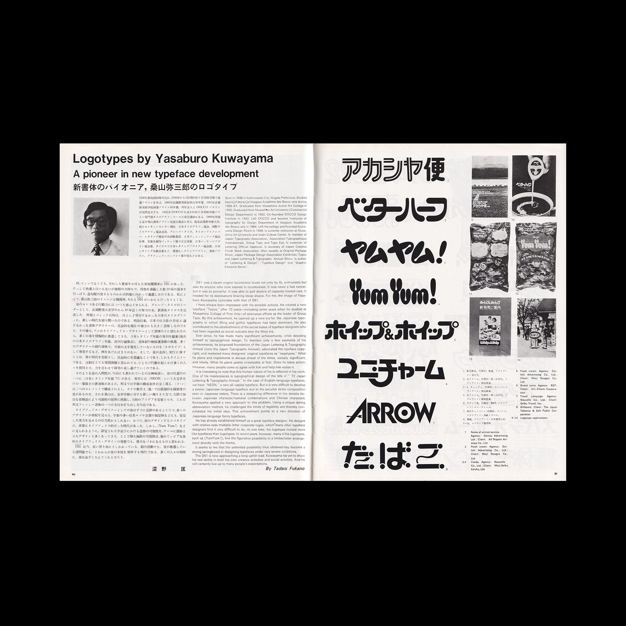
It is interesting to note that the human nature of his is reflected in his work. One of his masterpieces is typographical design of the title of "72 Japan Lettering & Typography Annual." In the case of English-language typefaces, we have "NEON," a new all-capital typeface. But it is very difficult to develop a similar Japanese-language typeface due to the peculiar stroke composition seen in Japanese letters. There is a despairing difference in line density between Japanese character/numeral combinations and Chinese characters. Kuwayama applied a new approach to this problem. Using a unique daring abbreviation method, he challenged the limits of legibility and thereby consolidated his initial idea. This achievement points to a new direction of Japanese-language fancy typefaces.
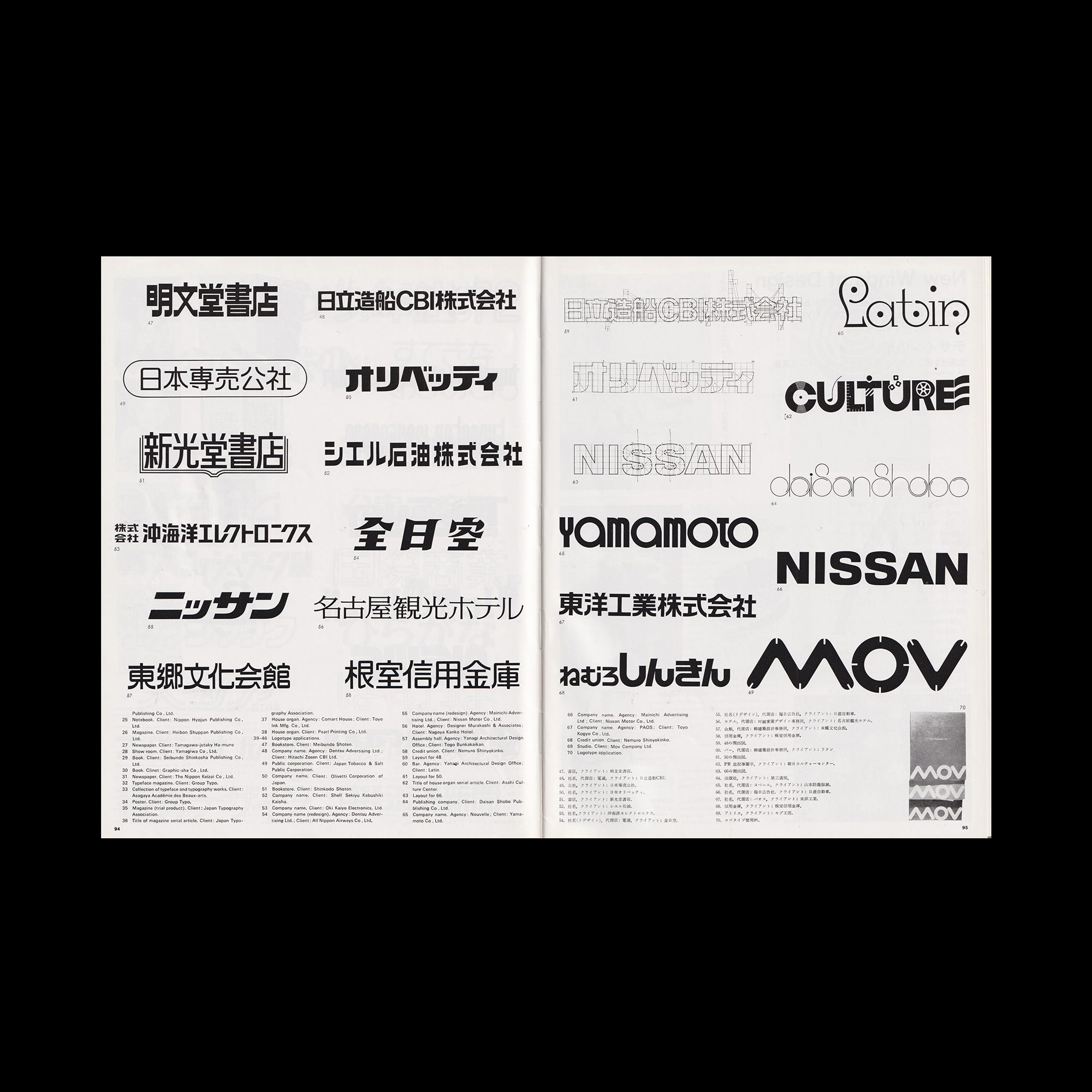
He has already established himself as a great typeface designer. He designs with relative ease multiple-letter corporate logos, which many other typeface designers find very difficult to do. At one time, his logotypes looked more like typefaces than logotypes. In recent years, however, many of his logotypes such as YumYum! link the figurative possibility in a limited letter arrangement directly with the theme.
It seems to me that the unlimited possibility thus obtained may become a strong springboard in designing typefaces under very severe conditions.
The D51 is now approaching a long uphill road. Kuwayama has yet to show his real ability in both his own creative activities and social activities. And he will certainly live up to many people's expectations.
Want more in-depth articles? Check out LogoHistories’ other articles on logos by Yasaburo Kuwayama →


Thank you for subscribing to Logo Histories. If you enjoy reading this short you may also enjoy these resources from the same team:
Brand Archive – Research tool for brand designers.
LogoArchive Website – Searchable modernist logo archive & research tool.
LogoArchive Shop – Vintage design books & LogoArchive Zines.
BP&O – Contemporary design editorial.