



Professor Otto Firle
The Lufthansa logo began life as the symbol of airline Deutsche Luft-Reederei, which was established in 1917 and began operations two years later in 1919.
In the intervening year of 1918, between its establishment and the beginning of commercial flights Professor Otto Firle designed the stylised and iconic crane in flight symbol.
Light and aerodynamic, the symbol delivered an efficient and elegant visual gesture, either alone, or sitting over the outline of sun or globe, bronze on blue.
In 1926 the German government forced the airline to merge with Junkers Luftverkehr, forming Deutsche Luft Hansa (Deutsche Lufthansa from 1933), which was the flag carrier of the Weimar Republic. This new airline took with it the crane.
At the end of WWII, following the defeat of Nazi Germany; all services of Deutsche Lufthansa were terminated. In 1953, in an effort to create a new national airline, and while West Germany had not yet been granted sovereignty over its airspace, Luftag was founded and started ordering new planes. It also acquired the name and logo of the liquidated Deutsche Lufthansa. On 1 April 1955 Lufthansa won approval to start scheduled domestic flights.

Go behind the logos. Explore 200+ more in-depth and meticulously researched logo histories that reveal the design decisions and ideas behind the world’s most iconic logos and important corporate identities.
→ free previews
→ join here

Between 1923 and the 1960s, the symbol would vary slightly in its drawing depending on its application, and was paired with different typefaces and different blue.
Otl Aicher
It wasn’t until 1963, during a period of expansion and modernisation, which introduced the jet engine to the Lufthansa fleet, that the logo was formalised and a new visual developed under the direction of German designer Otl Aicher. Before settling on an update, various degrees of abstraction, between a crane and an arrow were explored.
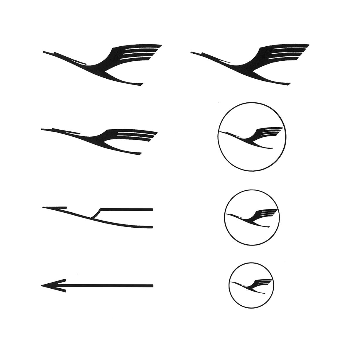

In the final design, small details such as a slightly heavier line weight, square terminals, and improved negative space rationalised the logo, increasing its flexibility across a growing number and diversity of applications.
In the spirt of the time, and under the influence of modernism and the Swiss International Style, Helvetica was used to construct the Lufthansa wordmark and became part of the design policy. Although the yellow and blue pre-dated Otl Aicher’s system, a warmer yellow was introduced as a way to feel more welcoming as more people began flying.

Martin et Karczinski
In 2018, the “Lufthansa Blue” project saw the airline’s yellow and blue tailfins replaced with just a deep blue for a more premium feel with yellow being used only as small accents elsewhere. Helvetica was dropped for the digital era and replaced with a custom typeface. Even after historical upheavals, the crane remains in, with only slight updates by Martin et Karczinski.

Want more in-depth articles? Check out LogoHistories’ other articles on airline logos and corporate identities →
Eastern Airlines, 1964

At the start of the 1960s, Eastern Airlines (Eastern) was in financial turmoil. The arrival of the jet age and greater competition had taken its toll, and was further compounded by being led by a CEO with little experience of running an airline. The start of the decade was also marred by tragedy, as several fatal plane crashes had killed over 200 passengers between 1960 and 1965. Alongside this, the North
The Bass Tulip

By the early 1970s United Airlines had grown to become the largest domestic airline in the USA. Its success had followed a period of financial hardship, so the general sentiment was one of achievement. To reflect the change and growth of the company, it was proposed that the airline embark on a new visual identity program. However, for many, this came u…
American Airlines Logo, 1967

This post is supported by LogoArchive – The home of historical logos. Discover over 5000 of history’s greatest designs from the world’s finest designers. Always find the logo inspiration you need for your next project here.
Thank you for subscribing to Logo Histories. If you enjoy reading this short you may also enjoy these resources from the same team:
Brand Archive – Research tool for brand designers.
LogoArchive Website – Searchable modernist logo archive & research tool.
LogoArchive Shop – Vintage design books & LogoArchive Zines.
BP&O – Contemporary design editorial.