
The ‘Hockey Stick’
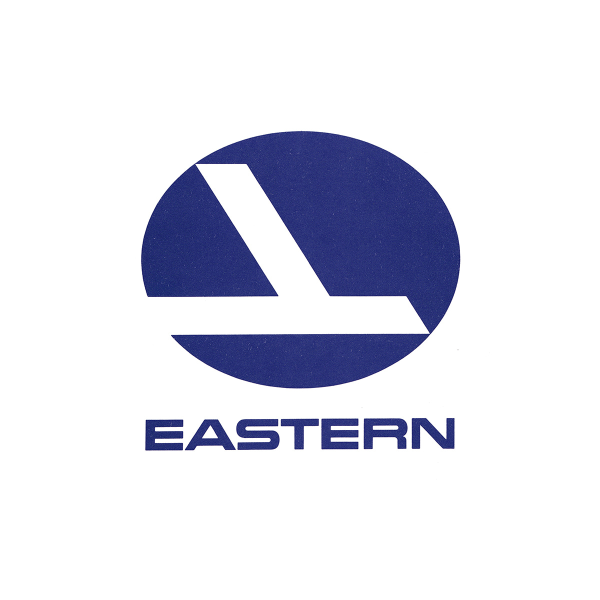
Lippincott & Margulies’ 1964 logo for Eastern Airlines


This post is supported by LogoArchive – The home of historical logos. Discover over 4700 of history’s greatest designs from the world’s finest designers. Always find the logo inspiration you need for your next project. Start here.
At the start of the 1960s, Eastern Airlines (Eastern) was in financial turmoil. The arrival of the jet age and greater competition had taken its toll, and was further compounded by being led by a CEO with little experience of running an airline. The start of the decade was also marred by tragedy, as several fatal plane crashes had killed over 200 passengers between 1960 and 1965. Alongside this, the North American airline had a reputation for bad service with delayed and cancelled flights and instances of missing luggage. Some had even considered the airline cursed. When Floyd Hall was hired as president in 1964, the airline was at its worst, with a deficit of $70 million.
Eager to restore the image of Eastern and show passengers that changes were being made, Floyd Hall reached out to Lippincott & Margulies (Amtrak, Coop). The consultancy was retained to conduct market research and produce a new, improved corporate identity that would encompass all aspects of the airline, from airplane liveries down to uniforms, tickets and in flight menus. This intended to, not only help shift perceptions amongst travellers, but also provide an opportunity for the airline to rethink its day-to-day running, streamline its managerial tasks and project a new sense of modernity and strength.


Lippincott & Margulies’ research had shown that Eastern was failing in key areas, with the data indicating that passengers considered the airline to have inaccurate take-off, landing and flight times, poor all-around service, and exhibited a lack of friendliness and safety. One promising insight, however, revealed that the ‘falcon’ motif, used since 1934, was a recognisable symbol.
Lippincott & Margulies devised a new brand image, building the visual language around an abstract interpretation of the falcon that had come before. By combining two straight lines, a silhouette reminiscent of both the falcon and an aircraft was formed, and sought to evoke a sense of speed and direction.
Abstraction was a common tool among designers of the time, and was often used as a visual shorthand for modernity and forward-thinking. This approach, particularly for airlines stood out when compared to the literal depictions of birds that came before, and was fitting for the sleek new jet age. This change also helped to outwardly show the internal changes being made to improve the overall customer experience. However, the abstraction of the falcon also drew comparisons with a hockey stick, which became its nickname.


Another priority was the repainting of aircraft, and highly visible sign of change for the airline. Working with researchers, psychologists and scientists a colour palette of ‘Ionosphere Blue’, ‘Caribbean Blue’ and a ‘refreshing white’ was created. This combination proved, through repeated studies and experiments, to haven given the overall impression of a ‘lively’ and ‘dynamic’ airline with a ‘friendly’ and ‘caring attitude’. It also helped to clearly distinguish Eastern from its competitors.
The logo was accompanied by a bold all-caps wordmark. The typographic forms intended to mirror the look and feel of the logo whilst also remaining legible and somewhat familiar. Its extended forms were designed to ‘straddle’ the length of aircraft, advertising, and exhibition stands, maximising available space. This was supported by Univers 65 and Helvetica Medium, a highly functional and flexible space that, alongside a formalised colour palette introduced consistency and various economies to Eastern’s communications.


Eastern Airlines introduced the design policy in late 1964. This wasn’t just a new lick of paint, but a reflection of a significant shift in the business as a whole, as the airline added new aircraft and technological systems, and more ground crew to manage the flight information system and passenger records, and addressing key failures. By the late 1960’s the airline was heading in a more promising direction with internationalisation and expansion on the horizon. The logo remained in use until 1991, when Eastern ceased operations.


Thank you for subscribing to Logo Histories. If you enjoy reading this you may also enjoy these resources from the same team:
New! Wittl – Job posting and applicant tracking tool.
LogoArchive Website – Searchable modernist logo archive & research tool.
LogoArchive Shop – Vintage design books & LogoArchive Zines.
BP&O – Contemporary design editorial.
Brand Archive – Research tool for brand designers.
I really enjoyed this look back at my favorite extinct airline. Aviation enthusiasts really enjoyed its application onto their bare metal aircraft fleet. For any aircraft that could be polished, the Eastern brand looked amazing.
Eastern and American are the only US airlines that stuck with the bare metal as long as they could. Eastern had it until they died in '91, and American only switched once they purchased the Boeing 787, since its carbon fiber reinforced polymer could not be polished to a shine. The aviation industry was heartbroken on both counts!