The Bass Tulip
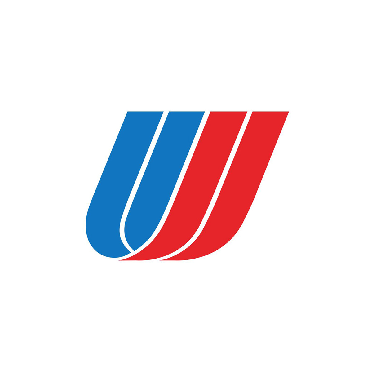
Saul Bass’ 1974 logo for United Airlines.
This post is supported by LogoArchive – The home of historical logos. Discover over 4000 of history’s best designs from the world’s finest designers. Always find the logo inspiration you need for your next project here.
By the early 1970s United Airlines had grown to become the largest domestic airline in the USA. Its success had followed a period of financial hardship, so the general sentiment was one of achievement. To reflect the change and growth of the company, it was proposed that the airline embark on a new visual identity program. However, for many, this came unexpectedly. "The traditionalists may contend that a company which has achieved an outstanding record like United's should not tamper with its symbols and colours," said Richard J. Ferris, group vice-president of marketing services. "We disagree."
They were keen to move away from their ‘conservative and stodgy’ image. Instead, they hoped a new, updated look would communicate that United Airlines as an “innovative, contemporary, warm, people-oriented airline.” As part of this, and in pursuit of simplicity, the airline changed its name from ‘United Air Lines’ to United Airlines, due to the pronunciation of ‘airlines’ as one word.
Leading the new visual identity program was Saul Bass, long-ranked as a leading American designer and renowned for his work in corporate identity programmes, films, and packaging. His Los Angeles-based design company, Bass and Associates was approached to analyse and assess the airline's needs, and devise a cohesive visual language that would best appeal to the target demographic. They worked with the airline for two years, researching the public opinion of the airline. Having defined the necessary objectives, the management advisory communications firm tested and analysed ‘hundreds’ of logos, typographic styles and colourways in pursuit of the right one.
A key change was moving away from the shield motif, which had been the airline’s trademark since 1936. At the time, the ‘shield’ logo shape was ubiquitous throughout other organisations as well as commercial and semi- governmental enterprises, therefore something more original was required.
The new logo consisted of two overlapping U-shapes, slanted at a 68 degree angle, rendered in the Patriotic colours of the United States flag: red, white and blue. The shape led to the nickname of ‘the tulip’, whilst the tilted angle suggested dynamism and movement.
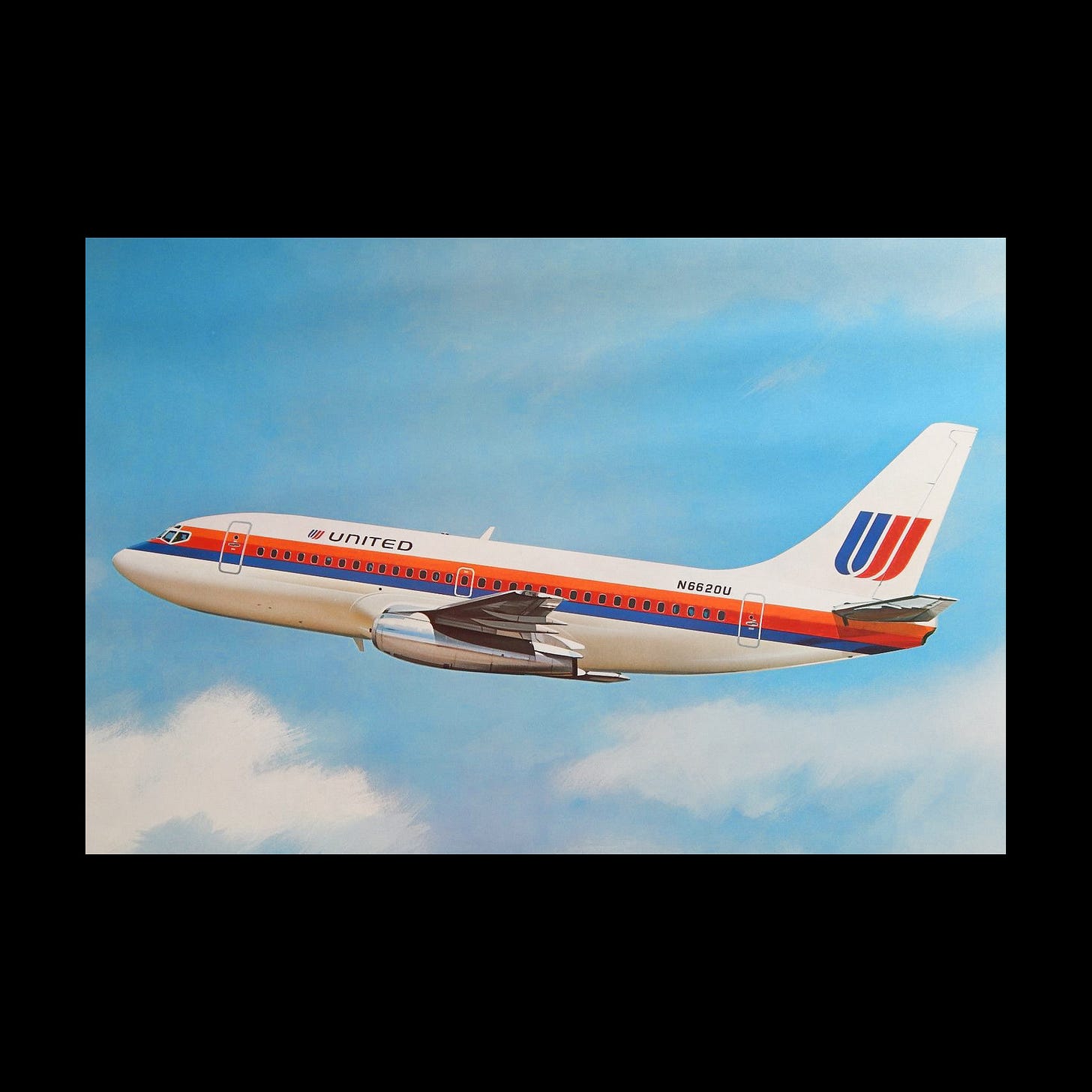
The motion-driven look was complemented by the addition of stripes to the aircraft livery which, according to the designers, was introduced to ‘give the plane a sense of thrust’.
This appeared as a vibrant orange, red, and blue cheatline passing through the windowline, fitting for the era and the age of jet air travel. The was a trope of the era, usually applied as a ‘cheat’ to make the economical wide-bodied nature of the aircraft of the time appear slimmer and sleeker.
Moving away from the decorative serif of the old wordmark, the identity also introduced a modern square-like sans-serif in all-caps for the airline’s titles.

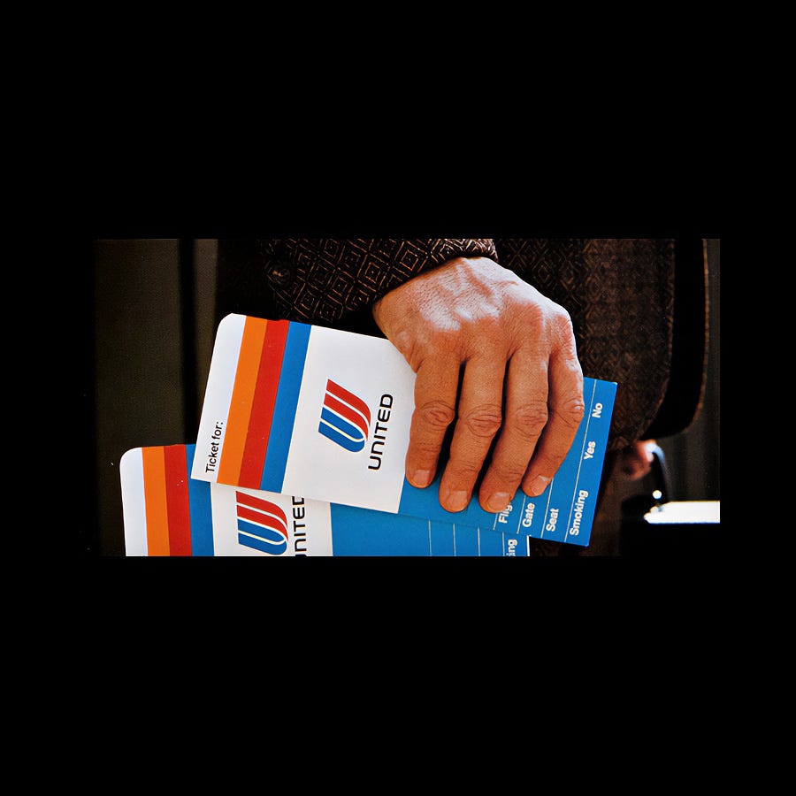
Bass and Associates’ corporate identity program helped to build a strong image for the airline, as it appeared across over 1,800 items: on all ground equipment, planes, ticket books and stationery. For many, the logo has become the defining image of the airline, and what comes to mind when they think about “United Airlines.”
On March 3, 2012, United and Continental merged their passenger service systems, frequent-flier programs, and websites. This saw the retiring of the Continental brand with the exception of its logo, which replaced the Saul Bass Tulip.
Key takeaways
Following a period of financial hardship United Airlines had become one of the largest domestic carriers in the United States. Rather sit on this success, the airline reinforced people’s perceptions of its as innovative and contemporary through a new design policy.
The airline had previously used a shield as a logo. As a ubiquitous motif across a broad range of semi-institutional and organisational bodies, its distinction was lost. A dynamic ‘U’ delivered a far more personable gesture. The name, ‘The Tulip’ is a testament to its sucess.
Repetition reinforces. Airlines provide many visible surfaces in which to reinforce their brand. United Airlines took advantage of this, applying the new identity to over 1800 items.
Thank you for subscribing to Logo Histories. If you enjoy reading this you may also enjoy these resources from the same team:
Brand Archive – Research tool for brand designers.
LogoArchive Website – Searchable modernist logo archive & research tool.
LogoArchive Shop – Vintage design books & LogoArchive Zines.
BP&O – Contemporary design editorial.


